
计算物理,FFT分析
计算物理,FFT分析
提问于 2016-04-08 23:48:42
我为一个计算作业解决了以下问题,我得到了一个非常糟糕的分数(67%),我想了解如何正确地处理这些问题,特别是Q1.b和Q3。请尽可能详细,我真的很想了解我的情书。
生成数据(正弦函数)。用fft分析: a)三波叠加,频率不变,但频率不同;A波,其频率依赖于时间,用适当的轴绘制出图、采样频率、幅值和功率谱。
使用练习1a中的三个波,但要改变它们的频率、相位和振幅。通过不断增加随机高斯分布的噪声来污染每一种噪声。1)对三种噪声污染波的叠加进行FFT运算。分析并绘制输出图。2)用高斯函数对信号进行滤波,绘制“干净”波,并对结果进行分析。结果波100%干净吗?解释一下。
#1(b)

tmin = -2*pi
tmax - 2*pi
delta = 0.01
t = arange(tmin, tmax, delta)
y = sin(2.5*t*t)
plot(t, y, '-')
title('Figure 2: Plotting a wave whose frequency depends on time ')
xlabel('Time (s)')
ylabel('Y(t)')
show()

#b.2
Fs = 150.0;  # sampling rate
Ts = 1.0/Fs; # sampling interval
t = np.arange(0,1,Ts) # time vector

ff = 5;   # frequency of the signal
y = np.sin(2*np.pi*ff*t)

n = len(y) # length of the signal
k = np.arange(n)
T = n/Fs
frq = k/T # two sides frequency range
frq = frq[range(n/2)] # one side frequency range

Y = np.fft.fft(y)/n # fft computing and normalization
Y = Y[range(n/2)]

#Time vs. Amplitude
plot(t,y)
title('Figure 2: Time vs. Amplitude')
xlabel('Time')
ylabel('Amplitude')
plt.show()

#Amplitude Spectrum
plot(frq,abs(Y),'r')
title('Figure 2a: Amplitude Spectrum')
xlabel('Freq (Hz)')
ylabel('amplitude spectrum')
plt.show()


#Power Spectrum
plot(frq,abs(Y)**2,'r')
title('Figure 2b: Power Spectrum')
xlabel('Freq (Hz)')
ylabel('power spectrum')
plt.show()
#Exercise 3:

#part 1
t = np.linspace(-0.5*pi,0.5*pi,1000)

#contaminating our waves with successively increasing white noise
y_1 = sin(15*t) + np.random.normal(0,0.2*pi,1000)
y_2 = sin(15*t) + np.random.normal(0,0.3*pi,1000)
y_3 = sin(15*t) + np.random.normal(0,0.4*pi,1000)
y = y_1 + y_2 + y_3 # superposition of three contaminated waves


#Plotting the figure
plot(t,y,'-')
title('A superposition of three waves contaminated with Gaussian Noise')
xlabel('Time (s)')
ylabel('Y(t)')
show()

delta = pi/1000.0
n = len(y)     ## calculate frequency in Hz
freq = fftfreq(n, delta)  # Computing the FFT


Freq = fftfreq(len(y), delta)  #Using Fast Fourier Transformation to         #calculate frequencies
N = len(Freq)
fr = Freq[1:len(Freq)/2.0]
A = fft(y)
XF = A[1:len(A)/2.0]/float(len(A[1:len(A)/2.0]))


# Amplitude spectrum for contaminated waves
plt.plot(fr, abs(XF))
title('Figure 3a : Amplitude spectrum with Gaussian Noise')
xlabel('frequency')
ylabel('Amplitude')
show()

# Power spectrum for contaminated waves
plt.plot(fr,abs(XF)**2)
title('Figure 3b: Power spectrum with Gaussian Noise')
xlabel('frequency(cycles/year)')
ylabel('Power')
show()

 # part 2
 F_v = exp(-(abs(freq)-2)**2/2*0.5**2)
 spectrum = A*F_v   #Applying the Gaussian Filter to clean our waves
 new_y = ifft(spectrum) #Computing the inverse FFT
 plot(t,new_y,'-')
 title('A superposition of three waves after Noise Filtering')
 xlabel('Time (s)')
 ylabel('Y(t)')
show()回答 1
Stack Overflow用户
回答已采纳
发布于 2016-04-11 02:58:21
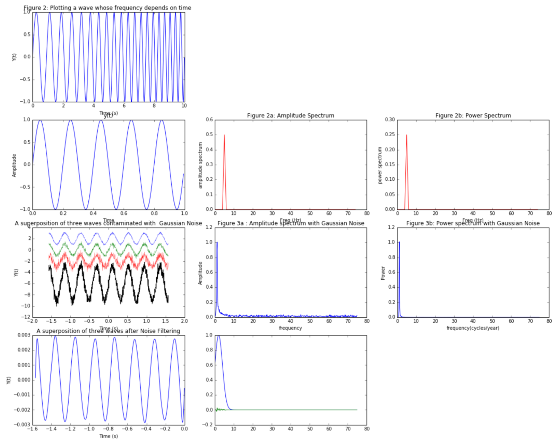
下面的代码/图像是可以预料到的。我偏离了这三个嘈杂波之和的图,展示了这三个波和和。注意,在噪声波的强度谱中,你看不到多少。对于这些情况,也可以画出频谱的对数(np.log),这样你就能更好地看到噪声。
在最后一幅图中,我绘制了高斯滤波器和频谱(不同大小) w/o的重新标度,以显示滤波器的应用位置。它实际上是一个低通滤波器(让低频率通过),通过将高频噪声与接近零的数字相乘来消除高频噪声。
import numpy as np
import matplotlib.pyplot as p
%matplotlib inline

#1(b)
p.figure(figsize=(20,16))
p.subplot(431)
t = np.arange(0,10, 0.001)  #units in seconds
#cleaner to show the frequency change explicitly than y = sin(2.5*t*t)
f= 1+ t*0.1  # linear up chirp, i.e. frequency goes up  , frequency units in Hz (1/sec)
y = np.sin(2* np.pi* f* t)
p.plot(t, y, '-')
p.title('Figure 2: Plotting a wave whose frequency depends on time ')
p.xlabel('Time (s)')
p.ylabel('Y(t)')


#b.2
Fs = 150.0;  # sampling rate
Ts = 1.0/Fs; # sampling interval
t = np.arange(0,1,Ts) # time vector

ff = 5;   # frequency of the signal
y = np.sin(2*np.pi*ff*t)

n = len(y) # length of the signal
k = np.arange(n)   ## ok, the FFT has as many points in frequency space, as the original in time
T = n/Fs    ## correct ;  T=sampling time,   the total frequency range is 1/sample time
frq = k/T # two sided frequency range
frq = frq[range(n/2)] # one sided frequency range
Y = np.fft.fft(y)/n # fft computing and normalization
Y = Y[range(n/2)]

# Amplitude vs. Time
p.subplot(434)
p.plot(t,y)
p.title('y(t)') # Amplitude vs Time is commonly said, but strictly not true, the amplitude is unchanging
p.xlabel('Time')
p.ylabel('Amplitude')

#Amplitude Spectrum
p.subplot(435)
p.plot(frq,abs(Y),'r')
p.title('Figure 2a: Amplitude Spectrum')
p.xlabel('Freq (Hz)')
p.ylabel('amplitude spectrum')

#Power Spectrum
p.subplot(436)
p.plot(frq,abs(Y)**2,'r')
p.title('Figure 2b: Power Spectrum')
p.xlabel('Freq (Hz)')
p.ylabel('power spectrum')

#Exercise 3:

#part 1
t = np.linspace(-0.5*np.pi,0.5*np.pi,1000)

# #contaminating our waves with successively increasing white noise
y_1 = np.sin(15*t) + np.random.normal(0,0.1,1000)   # no need to get pi involved in this amplitude
y_2 = np.sin(15*t) + np.random.normal(0,0.2,1000)
y_3 = np.sin(15*t) + np.random.normal(0,0.4,1000)
y = y_1 + y_2 + y_3 # superposition of three contaminated waves


#Plotting the figure
p.subplot(437)
p.plot(t,y_1+2,'-',lw=0.3)
p.plot(t,y_2,'-',lw=0.3)
p.plot(t,y_3-2,'-',lw=0.3)
p.plot(t,y-6 ,lw=1,color='black')
p.title('A superposition of three waves contaminated with  Gaussian Noise')
p.xlabel('Time (s)')
p.ylabel('Y(t)')


delta = np.pi/1000.0
n = len(y)     ## calculate frequency in Hz
# freq = np.fft(n, delta)  # Computing the FFT   <-- wrong, you don't calculate the FFT from a number, but from a time dep. vector/array
# Freq =  np.fftfreq(len(y), delta)  #Using Fast Fourier Transformation to         #calculate frequencies
# N = len(Freq)
# fr = Freq[1:len(Freq)/2.0]
# A = fft(y)
# XF = A[1:len(A)/2.0]/float(len(A[1:len(A)/2.0]))

# Why not do as before?
k = np.arange(n)   ## ok, the FFT has as many points in frequency space, as the original in time
T = n/Fs    ## correct ;  T=sampling time,   the total frequency range is 1/sample time
frq = k/T # two sided frequency range
frq = frq[range(n/2)] # one sided frequency range
Y = np.fft.fft(y)/n # fft computing and normalization
Y = Y[range(n/2)]


# Amplitude spectrum for contaminated waves
p.subplot(438)
p.plot(frq, abs(Y))
p.title('Figure 3a : Amplitude spectrum with Gaussian Noise')
p.xlabel('frequency')
p.ylabel('Amplitude')


# Power spectrum for contaminated waves
p.subplot(439)
p.plot(frq,abs(Y)**2)
p.title('Figure 3b: Power spectrum with Gaussian Noise')
p.xlabel('frequency(cycles/year)')
p.ylabel('Power')


# part 2

p.subplot(4,3,11)
F_v = np.exp(-(np.abs(frq)-2)**2/2*0.5**2) ## this is a Gaussian, plot it separately to see it; play with the values
cleaned_spectrum = Y*F_v   #Applying the Gaussian Filter to clean our waves ## multiplication in FreqDomain is convolution in time domain
p.plot(frq,F_v)
p.plot(frq,cleaned_spectrum)

p.subplot(4,3,10)
new_y = np.fft.ifft(cleaned_spectrum) #Computing the inverse FFT of the cleaned spectrum to see the cleaned wave
p.plot(t[range(n/2)],new_y,'-')
p.title('A superposition of three waves after Noise Filtering')
p.xlabel('Time (s)')
p.ylabel('Y(t)')
页面原文内容由Stack Overflow提供。腾讯云小微IT领域专用引擎提供翻译支持
原文链接:
https://stackoverflow.com/questions/36511068
复制相关文章
相似问题
腾讯云开发者

Copyright © 2013 - 2026 Tencent Cloud. All Rights Reserved. 腾讯云 版权所有
深圳市腾讯计算机系统有限公司 ICP备案/许可证号:粤B2-20090059 ![]() 粤公网安备44030502008569号
粤公网安备44030502008569号
腾讯云计算(北京)有限责任公司 京ICP证150476号 | 京ICP备11018762号