
用元数据着色稀疏曲线(纯素包) (phyloseq包)
第一次提问者在这里。我无法在其他帖子中找到这个问题的答案(爱stackexchange,顺便说一句)。
不管怎样..。我通过素食包创建了一个稀薄的曲线,我得到了一个非常混乱的地块,在图的底部有一个很厚的黑色条状图,它遮住了一些低多样性的样本线。理想情况下,我想用我的所有线条(169;我可以将它减少到144)生成一个地块,但我可以绘制一个合成图,按样本年着色,并为每个池塘绘制不同类型的线条(即:2个样本年份:2016年、2017年和3个池塘:1、2、5)。我使用phyloseq使用所有数据创建了一个对象,然后将OTU丰度表从我的元数据中分离为不同的对象(jt = OTU表和sampledata =元数据)。我现在的代码是:
 jt <- as.data.frame(t(j)) # transform it to make it compatible with the proceeding commands
rarecurve(jt
          , step = 100
          , sample = 6000
          , main = "Alpha Rarefaction Curve"
          , cex = 0.2
          , color = sampledata$PondYear)

# A very small subset of the sample metadata
                  Pond    Year
F16.5.d.1.1.R2     5      2016
F17.1.D.6.1.R1     1      2017
F16.1.D15.1.R3     1      2016
F17.2.D00.1.R2     2      2017
回答 1
Stack Overflow用户
发布于 2017-11-11 08:33:23
这里是一个例子,如何绘制一个稀薄的曲线与to图。我使用了从生物导体获得的帕洛塞克包中的数据。
安装phyloseq:
source('http://bioconductor.org/biocLite.R')
biocLite('phyloseq')
library(phyloseq)
其他需要的图书馆
library(tidyverse)
library(vegan)
数据:
mothlist <- system.file("extdata", "esophagus.fn.list.gz", package = "phyloseq")
mothgroup <- system.file("extdata", "esophagus.good.groups.gz", package = "phyloseq")
mothtree <- system.file("extdata", "esophagus.tree.gz", package = "phyloseq")
cutoff <- "0.10"
esophman <- import_mothur(mothlist, mothgroup, mothtree, cutoff)
提取OTU表,转置并转换为数据帧
otu <- otu_table(esophman)
otu <- as.data.frame(t(otu))
sample_names <- rownames(otu)

out <- rarecurve(otu, step = 5, sample = 6000, label = T)
现在您有了一个列表,每个元素对应于一个示例:
把清单整理一下:
rare <- lapply(out, function(x){
  b <- as.data.frame(x)
  b <- data.frame(OTU = b[,1], raw.read = rownames(b))
  b$raw.read <- as.numeric(gsub("N", "",  b$raw.read))
  return(b)
})
标签列表
names(rare) <- sample_names转换为数据框架:
rare <- map_dfr(rare, function(x){
  z <- data.frame(x)
  return(z)
}, .id = "sample")
让我们看看它的外观:
head(rare)
  sample       OTU raw.read
1      B  1.000000        1
2      B  5.977595        6
3      B 10.919090       11
4      B 15.826125       16
5      B 20.700279       21
6      B 25.543070       26
用ggplot2绘图
ggplot(data = rare)+
  geom_line(aes(x = raw.read, y = OTU, color = sample))+
  scale_x_continuous(labels =  scales::scientific_format())
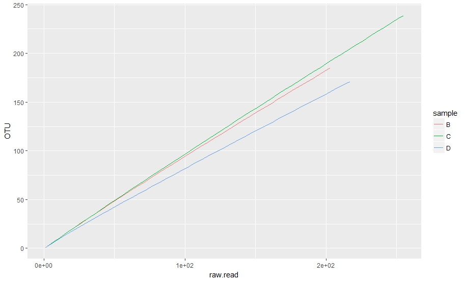
纯素情节:
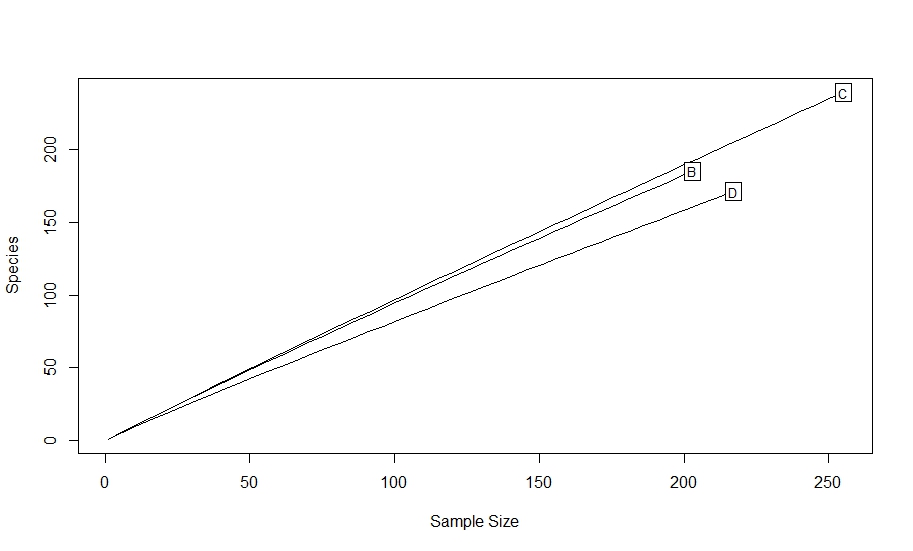
rarecurve(otu, step = 5, sample = 6000, label = T) #low step size because of low abundance
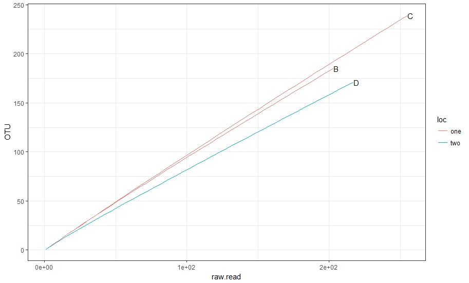
根据这一点,我们可以制作一个额外的分组和颜色列。
下面是一个如何添加另一个分组的示例。让我们假设您有一个表单的表:
groupings <- data.frame(sample = c("B", "C", "D"),
                       location = c("one", "one", "two"), stringsAsFactors = F)
groupings
  sample location
1      B      one
2      C      one
3 D two根据另一个特征对样本进行分组。您可以使用lapply或map_dfr来检查groupings$sample和标签rare$location。
rare <- map_dfr(groupings$sample, function(x){ #loop over samples
  z <- rare[rare$sample == x,] #subset rare according to sample
  loc <- groupings$location[groupings$sample == x] #subset groupings according to sample, if more than one grouping repeat for all
  z <- data.frame(z, loc) #make a new data frame with the subsets
  return(z)
})

head(rare)
  sample       OTU raw.read loc
1      B  1.000000        1 one
2      B  5.977595        6 one
3      B 10.919090       11 one
4      B 15.826125       16 one
5      B 20.700279       21 one
6      B 25.543070       26 one
让我们用这个做一个好的计划。
ggplot(data = rare)+
  geom_line(aes(x = raw.read, y = OTU, group = sample, color = loc))+
  geom_text(data = rare %>% #here we need coordinates of the labels
              group_by(sample) %>% #first group by samples
              summarise(max_OTU = max(OTU), #find max OTU
                        max_raw = max(raw.read)), #find max raw read
              aes(x = max_raw, y = max_OTU, label = sample), check_overlap = T, hjust = 0)+
  scale_x_continuous(labels =  scales::scientific_format())+
  theme_bw()
https://stackoverflow.com/questions/47234809
复制相似问题
腾讯云开发者

Copyright © 2013 - 2026 Tencent Cloud. All Rights Reserved. 腾讯云 版权所有
深圳市腾讯计算机系统有限公司 ICP备案/许可证号:粤B2-20090059 ![]() 粤公网安备44030502008569号
粤公网安备44030502008569号
腾讯云计算(北京)有限责任公司 京ICP证150476号 | 京ICP备11018762号