
R: circos图中的组交叉点,显示具有可变值的额外带。
我有一个数据框架,如下所示:
set.seed(1)
mydf <- data.frame()
for (g in LETTERS[1:4]){
    m <- data.frame(Group=g,
                    Gene=paste(sample(letters[1:4],25,replace=TRUE), sample(1:25,25,replace=FALSE), sep=''),
                    FoldChange=runif(25, -2, 2))
    mydf <- rbind(mydf, m)
}
mydf$UpDown <- "DOWN"
mydf$UpDown[which(mydf$FoldChange>0)] <- "UP"
head(mydf)

  Group Gene  FoldChange UpDown
1     A  b10 -0.08952151   DOWN
2     A   b1  1.44483791     UP
3     A   c9 -0.24761157   DOWN
4     A  d20 -1.02081089   DOWN
5     A   a8 -1.71728381   DOWN
6 A d25 -1.60213536 DOWN我想显示Genes在Groups之间的交集,所以我做了一个Venn图:
mylist <- split(as.character(mydf$Gene), list(mydf$Group))
venn.diagram(mylist, filename="test.png", height=1000, width=1000, imagetype="png", units="px")
但是,我真的很想以某种方式显示FoldChange (或至少是UpDown)值。我想这样做,把重叠的数字分成UP和DOWN Genes
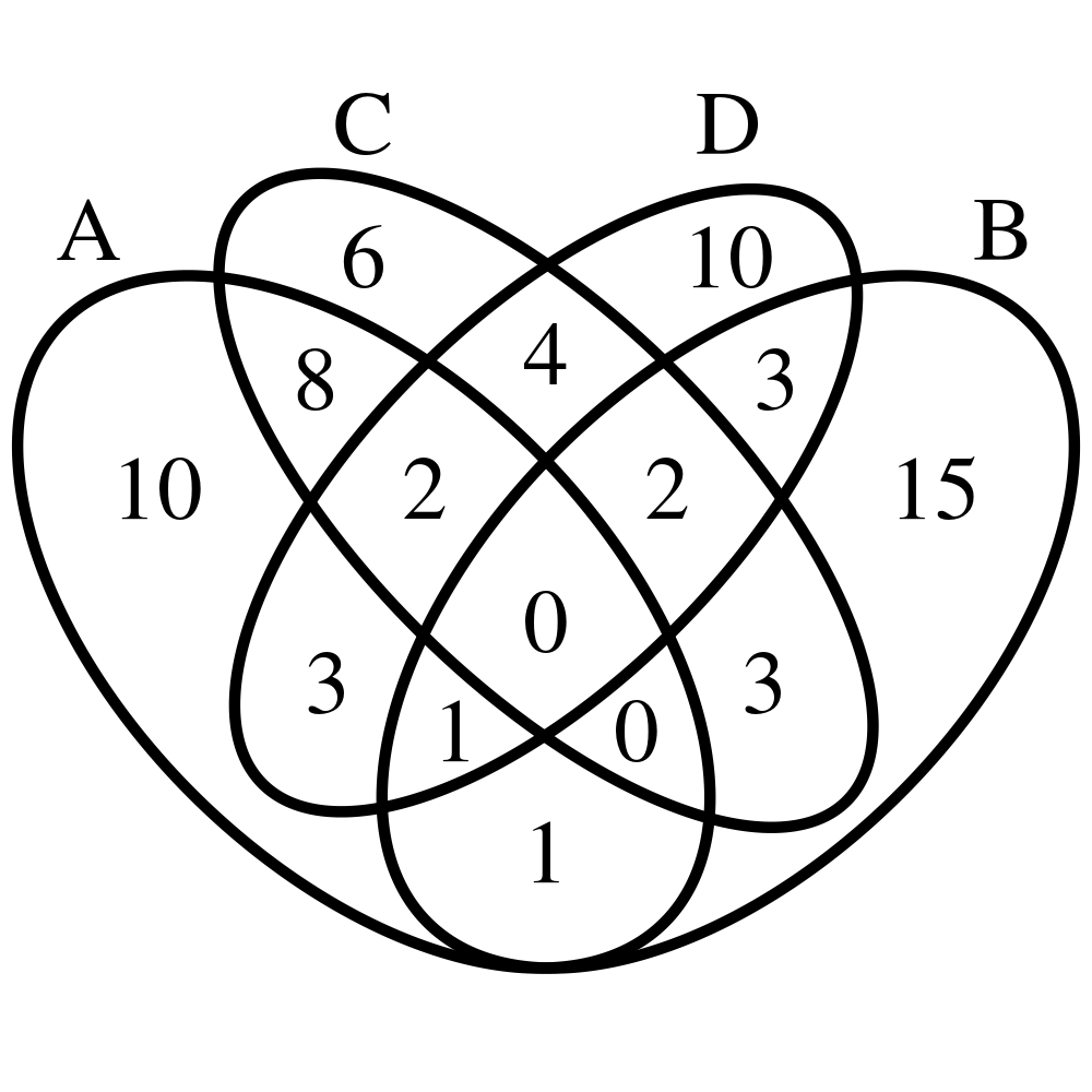
但是,给定的Gene在一个Group中仍然可以是UP,在另一个Group中可以是DOWN,所以上面的Venn图非常不准确.
subset(mydf, Gene=='b16')
   Group Gene FoldChange UpDown
16     A  b16 -0.9679329   DOWN
34     B  b16  0.5711820     UP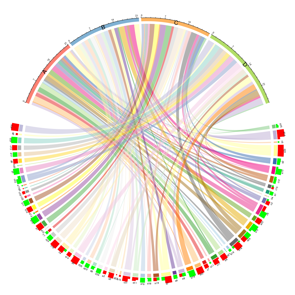
90 D b16 -1.1147763 DOWN我认为最好的方式来显示这将是一个马戏团阴谋代替。
它应该每个Group有一个部分,链接组之间的共享Genes,并包括FoldChange (或UpDown)信息。
我可以想出两种包括这些信息的方法:
1-A和B之间的连接线(例如)如果Gene在Groups中都是DOWN,则为红色,如果两者都是UP,则为蓝色。如果Gene在A中是DOWN,在B中是UP,那么它们就会变成蓝色,如果发生相反的情况,蓝色会变成红色(这有道理吗?)
2-包含一个额外的信息带到Circos图中,其中FoldChange值(红色表示负条,蓝色表示正条)。最好是重叠的Genes块都在一起(而不是到处都是细毛,而是根据FoldChange值排序)。与此类似的可能是:
然而,我真的不知道如何开始,我曾经尝试过用circlize包制作简单的Circos图,但是完全失败了。
我认为我想要实现的目标的概念很简单.有没有人知道如何在Circos的情节中清楚地表现出来(或者说,你可以建议的其他任何表现形式)?
非常感谢!
回答 1
Stack Overflow用户
发布于 2020-12-02 21:15:23
虽然这是一个老问题,但我会尽量回答,因为它仍然是一个未回答的问题。请注意,我使用您的问题来学习如何使用circlize,所以如果它不是最佳的或者有任何错误,我会感谢您的反馈。
我必须说,我没有按您建议的方式(连接组)进行求解,因为它需要按摩输入数据,将其转换为邻接矩阵连接组。
但是,可以用您提供的输入数据直接表示您想要观察的大多数信息,这可能很有帮助。
首先,我创建了一个颜色友好的向量,那些默认的颜色有时太暗了:
library(RColorBrewer)
qual_col_pals = brewer.pal.info[brewer.pal.info$category == 'qual',]
col_vector = unlist(mapply(brewer.pal, qual_col_pals$maxcolors, rownames(qual_col_pals)))
Nsectors = length(unique(mydf$Group))+length(unique(mydf$Gene))
col_vector = col_vector[1:Nsectors]导出其他格式的透明度存在问题,所以我将创建一个pdf。我首先创建一个没有注释的和弦图,因为基因的标签太多了,我稍后会添加它们。我将图表存储在一个名为cdm_res的变量中,它将帮助我稍后检索扇区的位置等。
pdf(file = "circlize_example.pdf",width = 10, height = 10)
# -- Create a chord diagram with no labels nor axis
cdm_res = chordDiagram(x = mydf[,c(2,1,3)],  # I change the order, largest groups on top
              annotationTrack = "grid", # I create it without sector names, it is too crowded
              grid.col = col_vector)
我们有联系的群体和基因。现在我添加组的标签。
# -- Add now labels, etc.
for(si in unique(mydf$Group)) { # Now I add the labels for Group and the axis
  xlim = get.cell.meta.data("xlim", sector.index = si, track.index = 1)
  ylim = get.cell.meta.data("ylim", sector.index = si, track.index = 1)
  circos.text(mean(xlim), mean(ylim), si, sector.index = si, track.index = 1,
              facing = "outside", cex=1.2, niceFacing = TRUE)
  circos.axis(h = "top", labels.cex = 0.5, sector.index = si,track.index=1)
}
接下来,我为每个观察结果创建一个矩形,其高度与FoldChange的绝对值成正比,如果为正,则为红色,如果为负值,则为绿色。通过这种方式,你可以看到同一基因何时发生变化。这可能是可以做到的,创造另一个轨道以及。
y1 = ylim[1] + 1.2* (ylim[2] - ylim[1]) # The rectangle will start at the top of the coloured sectors

  for(i in seq_len(nrow(cdm_res))) {
    circos.rect(cdm_res[i, "x1"], y1, cdm_res[i, "x1"] -
                  abs(cdm_res[i, "value1"]), y1 + abs(cdm_res[i, "value1"]),#(y2-y1)*0.45,
                col = ifelse(cdm_res[i,"value1"]>0,"red","green"),
                border = ifelse(cdm_res[i,"value1"]>0,"red","green"),
                sector.index = cdm_res$rn[i], track.index = 1)
  }
最后,在最高矩形的末尾添加标签。
for(si in unique(mydf$Gene)) { # For Gene I skip axis and reduce label's size
  xlim = get.cell.meta.data("xlim", sector.index = si, track.index = 1)
  #ylim = get.cell.meta.data("ylim", sector.index = si, track.index = 1)
  idx=which(cdm_res$rn == si) # which are the indxs for this sector?
  height=max(abs(cdm_res$value1[idx])) # we look for the maximum value
  y2_label=4+height # to locate our label at the top of the rect, a little bit further
  circos.text(mean(xlim), mean(ylim), si, sector.index = si, track.index = 1,
              facing = "outside",
              cex=0.5, # here the challenge, if the labels are large they will overlap
              adj=c(degree(0),degree(y2_label)), # increase the offset to make labels larger
              niceFacing = TRUE)

}

circos.clear()
dev.off()
这里的结果是:
https://stackoverflow.com/questions/47524965
复制相似问题
腾讯云开发者

Copyright © 2013 - 2026 Tencent Cloud. All Rights Reserved. 腾讯云 版权所有
深圳市腾讯计算机系统有限公司 ICP备案/许可证号:粤B2-20090059 ![]() 粤公网安备44030502008569号
粤公网安备44030502008569号
腾讯云计算(北京)有限责任公司 京ICP证150476号 | 京ICP备11018762号