
在ggplot2 + ggfortify中添加图例的问题
在ggplot2 + ggfortify中添加图例的问题
提问于 2017-11-19 15:32:14
我很难用
scale_colour_manual 图形的功能。我试过了
guide = "legend" 强制传说出现了,但不起作用。代表代码:
library(ggfortify)
library(ggplot2)
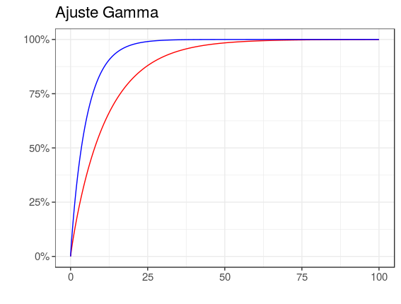
p <- ggdistribution(pgamma, seq(0, 100, 0.1), shape = 0.92, scale = 22,
colour = 'red')
p2 <- ggdistribution(pgamma, seq(0, 100, 0.1), shape = 0.9, scale = 5,
colour = 'blue', p=p)
p2 +
theme_bw(base_size = 14) +
theme(legend.position ="top") +
xlab("Precipitación") +
ylab("F(x)") +
scale_colour_manual("Legend title", guide = "legend",
values = c("red", "blue"), labels = c("Observado","Reforecast")) +
ggtitle("Ajuste Gamma")
回答 2
Stack Overflow用户
回答已采纳
发布于 2017-11-19 16:15:17
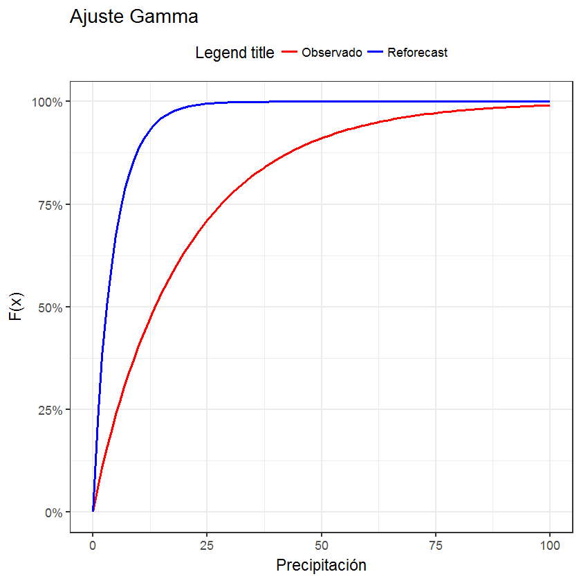
一种基于stat_function的解决方案
library(ggplot2)
library(scales)

cols <- c("LINE1"="red","LINE2"="blue")
df <- data.frame(x=seq(0, 100, 0.1))
ggplot(data=df, aes(x=x)) +
stat_function(aes(colour = "LINE1"), fun=pgamma, args=list(shape = 0.92, scale = 22)) +
stat_function(aes(colour = "LINE2"), fun=pgamma, args=list(shape = 0.9, scale = 5)) +
theme_bw(base_size = 14) +
theme(legend.position ="top") +
xlab("Precipitación") +
ylab("F(x)") +
scale_colour_manual("Legend title", values=c(LINE1="red",LINE2="blue"),
                    labels = c("Observado","Reforecast")) +
scale_y_continuous(labels=percent) +
ggtitle("Ajuste Gamma")
Stack Overflow用户
发布于 2020-11-08 15:47:09
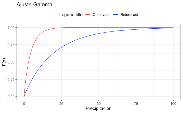
这似乎是ggfortify.*的一个bug,您只需使用来自ggplot2的geom_line()就可以获得相同的结果:
library(ggplot2)

# Sequence of values to draw from dist(s) for plotting
x = seq(0, 100, 0.1)

# Defining dists
d1 = pgamma(x, shape=0.92, scale=22)
d2 = pgamma(x, shape=0.90, scale=5)

# Plotting
p1 = ggplot() +
     geom_line(aes(x,d1,colour='red')) +
     geom_line(aes(x,d2,colour='blue')) +

     theme_bw(base_size = 14) +
     theme(legend.position="top") +

     ggtitle("Ajuste Gamma") +
     xlab("Precipitación") +
     ylab("F(x)") +

     scale_colour_manual("Legend title",
                         guide = "legend",
                         values = c("red", "blue"),
                         labels=c("Observado", "Reforecast"))
页面原文内容由Stack Overflow提供。腾讯云小微IT领域专用引擎提供翻译支持
原文链接:
https://stackoverflow.com/questions/47378577
复制相关文章
相似问题
腾讯云开发者

Copyright © 2013 - 2026 Tencent Cloud. All Rights Reserved. 腾讯云 版权所有
深圳市腾讯计算机系统有限公司 ICP备案/许可证号:粤B2-20090059 ![]() 粤公网安备44030502008569号
粤公网安备44030502008569号
腾讯云计算(北京)有限责任公司 京ICP证150476号 | 京ICP备11018762号