
R g图中的kolmogorov-smirnov图
R g图中的kolmogorov-smirnov图
提问于 2016-08-26 08:49:51
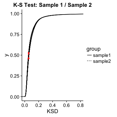
我试图在r中做一个KS图,而且一切似乎都进行得很好--除了我只能用颜色来显示两个不同的样本,而不是线条类型。
我尝试了以下几点:
sample1<-SD13009
sample2<-SD13009PB

group <- c(rep("sample1", length(sample1)), rep("sample2", length(sample2)))
dat <- data.frame(KSD = c(sample1,sample2), group = group)
cdf1 <- ecdf(sample1)
cdf2 <- ecdf(sample2)

minMax <- seq(min(sample1, sample2), max(sample1, sample2), length.out=length(sample1))
x0 <- minMax[which( abs(cdf1(minMax) - cdf2(minMax)) == max(abs(cdf1(minMax) - cdf2(minMax))) )]
y0 <- cdf1(x0)
y1 <- cdf2(x0)
#尝试1
plot<-ggplot(dat, aes(x = KSD, group = group, colour = group, linetype=group))+
  stat_ecdf(size=1) +
  mytheme + xlab("mm") +scale_x_continuous(limits=c(0,1))+
    ylab("Cumulitive Distibution") +
    #geom_line(aes(group=group,size=1)) +
    geom_segment(aes(x = x0[1], y = y0[1], xend = x0[1], yend = y1[1]),
        linetype = "dashed", color = "red") +
    geom_point(aes(x = x0[1] , y= y0[1]), color="red", size=1) +
    geom_point(aes(x = x0[1] , y= y1[1]), color="red", size=1) +
    ggtitle("K-S Test: Sample 1 / Sample 2")
#尝试2
 cdf <- ggplot(dat, aes(x=KSD, group=group,linetype=group)) + stat_ecdf(aes(linetype=group)) + coord_cartesian(xlim = c(0, 0.8)) + geom_segment(aes(x = x0[1], y = y0[1], xend = x0[1], yend = y1[1]),
            linetype = "dashed", color = "red") +
        geom_point(aes(x = x0[1] , y= y0[1]), color="red", size=1) +
        geom_point(aes(x = x0[1] , y= y1[1]), color="red", size=1) +
        ggtitle("K-S Test: Sample 1 / Sample 2")
我得到的是:
回答 1
Stack Overflow用户
回答已采纳
发布于 2016-08-26 09:13:45
我不能用下面的代码来再现这一点:
# Make two random samples
sample1<-rnorm(1000)
sample2<-rnorm(1000, 2, 2)

group <- c(rep("sample1", length(sample1)), rep("sample2", length(sample2)))
dat <- data.frame(KSD = c(sample1,sample2), group = group)
cdf1 <- ecdf(sample1)
cdf2 <- ecdf(sample2)

minMax <- seq(min(sample1, sample2), max(sample1, sample2), length.out=length(sample1))
x0 <- minMax[which( abs(cdf1(minMax) - cdf2(minMax)) == max(abs(cdf1(minMax) - cdf2(minMax))) )]
y0 <- cdf1(x0)
y1 <- cdf2(x0)


ggplot(dat, aes(x = KSD, group = group, colour = group, linetype=group))+
  stat_ecdf(size=1) +
  xlab("mm") +
  ylab("Cumulitive Distibution") +
  geom_segment(aes(x = x0[1], y = y0[1], xend = x0[1], yend = y1[1]),
               linetype = "dashed", color = "red") +
  geom_point(aes(x = x0[1] , y= y0[1]), color="red", size=1) +
  geom_point(aes(x = x0[1] , y= y1[1]), color="red", size=1) +
  ggtitle("K-S Test: Sample 1 / Sample 2")
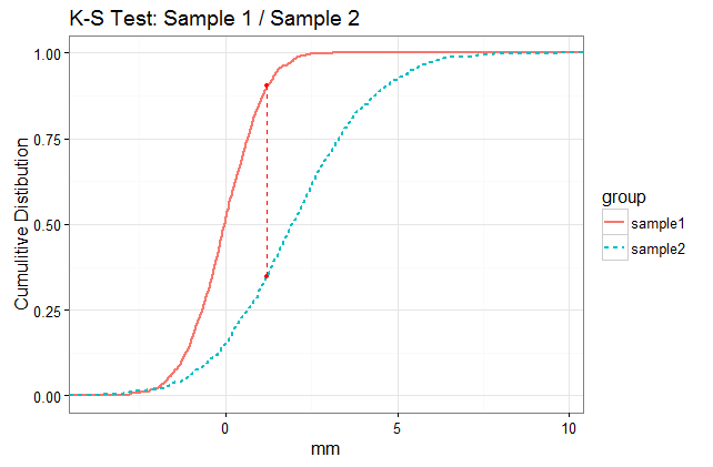
在你的情节中,线似乎是如此的接近以至于你看不出它们是不同的线型,但是它们是。
页面原文内容由Stack Overflow提供。腾讯云小微IT领域专用引擎提供翻译支持
原文链接:
https://stackoverflow.com/questions/39162178
复制相关文章
相似问题
腾讯云开发者

Copyright © 2013 - 2026 Tencent Cloud. All Rights Reserved. 腾讯云 版权所有
深圳市腾讯计算机系统有限公司 ICP备案/许可证号:粤B2-20090059 ![]() 粤公网安备44030502008569号
粤公网安备44030502008569号
腾讯云计算(北京)有限责任公司 京ICP证150476号 | 京ICP备11018762号