
R: ggfortify:“不受自动绘图支持的prcomp类型的对象”
R: ggfortify:“不受自动绘图支持的prcomp类型的对象”
提问于 2015-05-05 14:43:18
我试图使用ggfortify来可视化我使用prcomp完成的PCA的结果。
样本代码:
iris.pca <- iris[c(1, 2, 3, 4)]
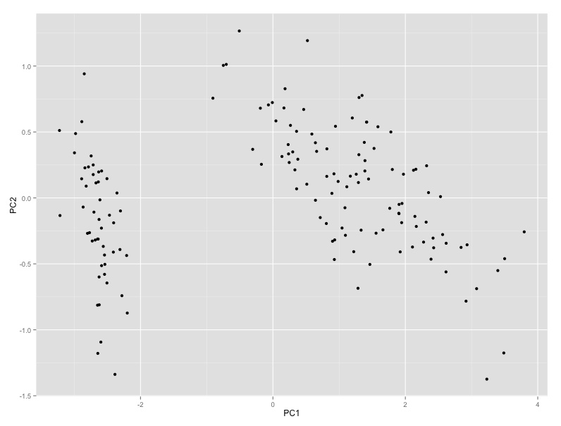
autoplot(prcomp(iris.pca)) 错误:自动绘图不支持prcomp类型的对象。请使用qplot()或ggplot()代替。
奇怪的是,自动绘图是专门为处理prcomp的结果而设计的,qplot不能处理这样的对象。我正在运行RV3.2,刚刚从github下载了ggfortify这个AM
有人能解释一下这个消息吗?
回答 2
Stack Overflow用户
发布于 2015-05-05 15:18:44
我猜您没有加载所需的库,下面的代码是:
library(devtools)
install_github('sinhrks/ggfortify')
library(ggfortify); library(ggplot2)
data(iris)
iris.pca <- iris[c(1, 2, 3, 4)]
autoplot(prcomp(iris.pca))
行得通
Stack Overflow用户
发布于 2018-05-23 10:40:23
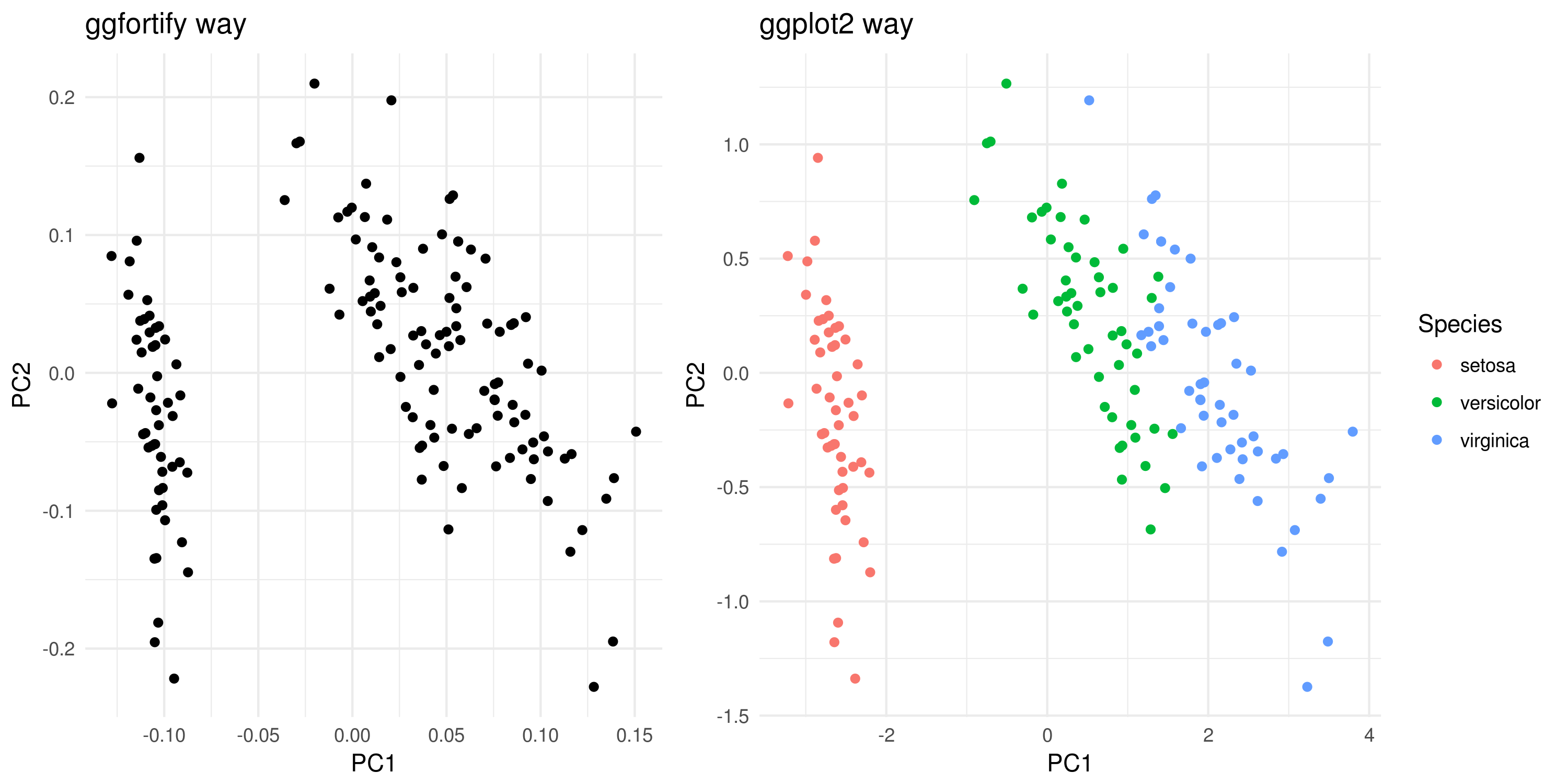
即使ggfortify简单易用,我也不鼓励它与标准ggplot2函数(例如警告replacing previous import ‘dplyr::vars’ by ‘ggplot2::vars’ when loading ‘ggfortify’)重叠使用。一个明智的解决办法是直接使用ggplot2。
在这里,我提出这两个版本及其结果。
# creating the PCA obj using iris data set
iris.pca <- iris[c(1, 2, 3, 4)]
pca.obj <- prcomp(iris.pca)

# ggfortify way - w coloring
library(ggfortify)
autoplot(pca.obj) + theme_minimal()


# ggplot2 way - w coloring
library(ggplot2)
dtp <- data.frame('Species' = iris$Species, pca.obj$x[,1:2]) # the first two componets are selected (NB: you can also select 3 for 3D plottings or 3+)
ggplot(data = dtp) +
       geom_point(aes(x = PC1, y = PC2, col = Species)) +
       theme_minimal()
注意:简单的ggplot2数据帧结构的着色要容易得多。
页面原文内容由Stack Overflow提供。腾讯云小微IT领域专用引擎提供翻译支持
原文链接:
https://stackoverflow.com/questions/30056144
复制相关文章
相似问题
腾讯云开发者

Copyright © 2013 - 2026 Tencent Cloud. All Rights Reserved. 腾讯云 版权所有
深圳市腾讯计算机系统有限公司 ICP备案/许可证号:粤B2-20090059 ![]() 粤公网安备44030502008569号
粤公网安备44030502008569号
腾讯云计算(北京)有限责任公司 京ICP证150476号 | 京ICP备11018762号