
Matplotlib和numpy histogram2d轴问题
Matplotlib和numpy histogram2d轴问题
提问于 2014-05-14 19:38:15
我在努力把轴线弄对:
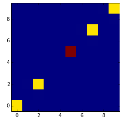
我已经得到了x和y值,并希望将它们绘制成二维直方图(以检查相关性)。为什么在每个轴上都有一个以0-9为限的直方图?如何让它显示实际值范围?
这是一个很小的例子,我希望在(3, 3)看到红色的“星星”
import numpy as np
import matplotlib.pyplot as plt

x = (1, 2, 3, 4, 5, 1, 2, 3, 4, 5, 3)
y = (1, 2, 3, 4, 5, 1, 2, 3, 4, 5, 3)
xedges = range(5)
yedges = range(5)
H, xedges, yedges = np.histogram2d(y, x)
im = plt.imshow(H, origin='low')
plt.show()
回答 2
Stack Overflow用户
回答已采纳
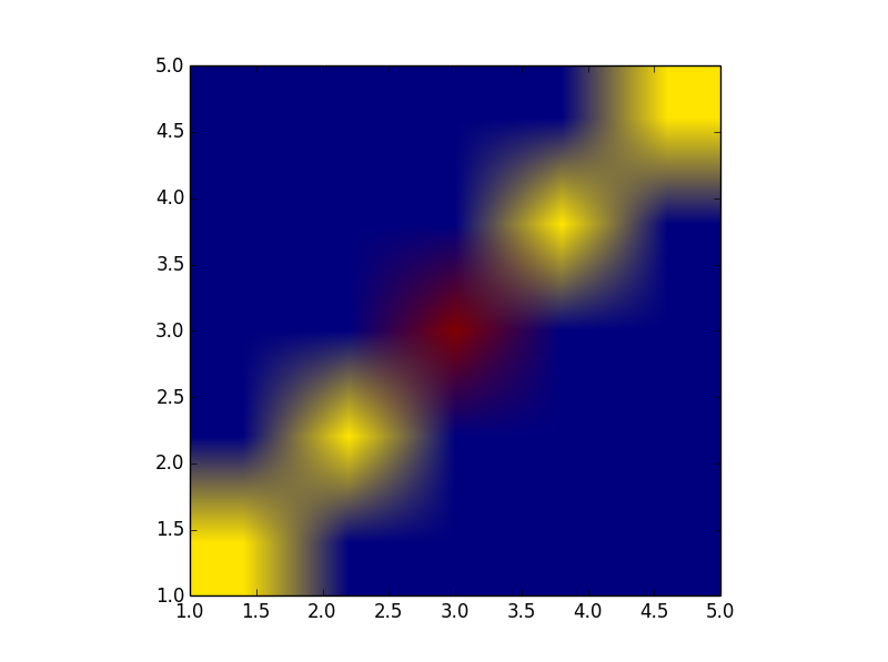
发布于 2014-05-14 21:09:11
我认为问题有两个:
首先,您应该在直方图中包含5个回收箱(默认设置为10个):
H, xedges, yedges = np.histogram2d(y, x,bins=5)其次,要设置轴值,可以使用extent参数,如 man pages所示
im = plt.imshow(H, interpolation=None, origin='low',
                extent=[xedges[0], xedges[-1], yedges[0], yedges[-1]])
Stack Overflow用户
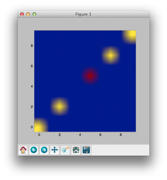
发布于 2014-05-14 19:43:06
如果我正确理解,您只需设置interpolation='none'
import numpy as np
import matplotlib.pyplot as plt

x = (1, 2, 3, 4, 5, 1, 2, 3, 4, 5, 3)
y = (1, 2, 3, 4, 5, 1, 2, 3, 4, 5, 3)
xedges = range(5)
yedges = range(5)
H, xedges, yedges = np.histogram2d(y, x)
im = plt.imshow(H, origin='low', interpolation='none')
看上去对吗?
页面原文内容由Stack Overflow提供。腾讯云小微IT领域专用引擎提供翻译支持
原文链接:
https://stackoverflow.com/questions/23663646
复制相关文章
相似问题
腾讯云开发者

Copyright © 2013 - 2026 Tencent Cloud. All Rights Reserved. 腾讯云 版权所有
深圳市腾讯计算机系统有限公司 ICP备案/许可证号:粤B2-20090059 ![]() 粤公网安备44030502008569号
粤公网安备44030502008569号
腾讯云计算(北京)有限责任公司 京ICP证150476号 | 京ICP备11018762号