
如何创建一种颜色的微生物区系数据条形图,以获得较高的分类等级和梯度颜色
我的OTU表和纳税表有一个Phyloseq对象。我想创造一个酒吧的情节,例如,在家庭层面,但属于同一门的家庭将以相同的颜色显示,并被区分为这个颜色的梯度。
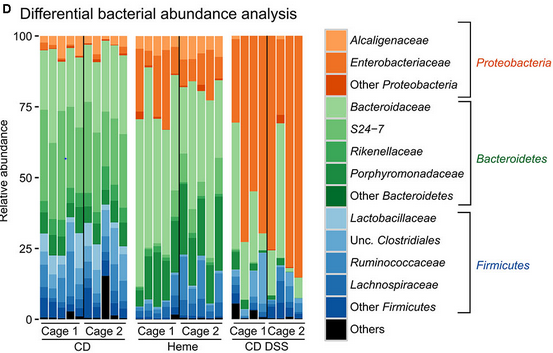
最后的结果应与此类似:
我使用psmelt()将phyloseq对象转换为数据格式,并尝试修改本文中的代码:Stacked barplot with colour gradients for each bar。
但我目前无法创建正确的图表。
library(phyloseq)
library(ggplot2)

df <- psmelt(GlobalPatterns)
df$group <- paste0(df$Phylum, "-", df$Family, sep = "")
colours <-ColourPalleteMulti(df, "Phylum", "Family")
ggplot(df, aes(Sample)) +
  geom_bar(aes(fill = group), colour = "grey") +
  scale_fill_manual("Subject", values=colours, guide = "none")
Erreur :手工标度中的值不足。395人需要,但只提供334人。
提前感谢您的帮助!
编辑:这里是数据的dput
    dput(head(df, 10))
structure(list(OTU = c("549656", "279599", "549656", "549656",
"360229", "331820", "94166", "331820", "329744", "189047"), Sample = c("AQC4cm",
"LMEpi24M", "AQC7cm", "AQC1cm", "M31Tong", "M11Fcsw", "M31Tong",
"M31Fcsw", "SLEpi20M", "TS29"), Abundance = c(1177685, 914209,
711043, 554198, 540850, 452219, 396201, 354695, 323914, 251215
), X.SampleID = structure(c(2L, 10L, 3L, 1L, 16L, 11L, 16L, 14L,
20L, 26L), .Label = c("AQC1cm", "AQC4cm", "AQC7cm", "CC1", "CL3",
"Even1", "Even2", "Even3", "F21Plmr", "LMEpi24M", "M11Fcsw",
"M11Plmr", "M11Tong", "M31Fcsw", "M31Plmr", "M31Tong", "NP2",
"NP3", "NP5", "SLEpi20M", "SV1", "TRRsed1", "TRRsed2", "TRRsed3",
"TS28", "TS29"), class = "factor"), Primer = structure(c(14L,
11L, 15L, 13L, 9L, 5L, 9L, 4L, 12L, 23L), .Label = c("ILBC_01",
"ILBC_02", "ILBC_03", "ILBC_04", "ILBC_05", "ILBC_07", "ILBC_08",
"ILBC_09", "ILBC_10", "ILBC_11", "ILBC_13", "ILBC_15", "ILBC_16",
"ILBC_17", "ILBC_18", "ILBC_19", "ILBC_20", "ILBC_21", "ILBC_22",
"ILBC_23", "ILBC_24", "ILBC_25", "ILBC_26", "ILBC_27", "ILBC_28",
"ILBC_29"), class = "factor"), Final_Barcode = structure(c(14L,
11L, 15L, 13L, 9L, 5L, 9L, 4L, 12L, 23L), .Label = c("AACGCA",
"AACTCG", "AACTGT", "AAGAGA", "AAGCTG", "AATCGT", "ACACAC", "ACACAT",
"ACACGA", "ACACGG", "ACACTG", "ACAGAG", "ACAGCA", "ACAGCT", "ACAGTG",
"ACAGTT", "ACATCA", "ACATGA", "ACATGT", "ACATTC", "ACCACA", "ACCAGA",
"ACCAGC", "ACCGCA", "ACCTCG", "ACCTGT"), class = "factor"), Barcode_truncated_plus_T = structure(c(6L,
10L, 8L, 25L, 19L, 9L, 19L, 20L, 14L, 16L), .Label = c("AACTGT",
"ACAGGT", "ACAGTT", "ACATGT", "ACGATT", "AGCTGT", "ATGTGT", "CACTGT",
"CAGCTT", "CAGTGT", "CCGTGT", "CGAGGT", "CGAGTT", "CTCTGT", "GAATGT",
"GCTGGT", "GTGTGT", "TCATGT", "TCGTGT", "TCTCTT", "TCTGGT", "TGATGT",
"TGCGGT", "TGCGTT", "TGCTGT", "TGTGGT"), class = "factor"), Barcode_full_length = structure(c(4L,
7L, 3L, 13L, 26L, 8L, 26L, 21L, 2L, 11L), .Label = c("AGAGAGACAGG",
"AGCCGACTCTG", "ATGAAGCACTG", "CAAGCTAGCTG", "CACGTGACATG", "CATCGACGAGT",
"CATGAACAGTG", "CGACTGCAGCT", "CGAGTCACGAT", "CTAGCGTGCGT", "CTAGTCGCTGG",
"GAACGATCATG", "GACCACTGCTG", "GATGTATGTGG", "GCATCGTCTGG", "GCCATAGTGTG",
"GCTAAGTGATG", "GTACGCACAGT", "GTAGACATGTG", "TAGACACCGTG", "TCGACATCTCT",
"TCGCGCAACTG", "TCTGATCGAGG", "TGACTCTGCGG", "TGCGCTGAATG", "TGTGGCTCGTG"
), class = "factor"), SampleType = structure(c(3L, 2L, 3L, 3L,
9L, 1L, 9L, 1L, 2L, 1L), .Label = c("Feces", "Freshwater", "Freshwater (creek)",
"Mock", "Ocean", "Sediment (estuary)", "Skin", "Soil", "Tongue"
), class = "factor"), Description = structure(c(2L, 10L, 3L,
1L, 16L, 11L, 16L, 14L, 21L, 25L), .Label = c("Allequash Creek, 0-1cm depth",
"Allequash Creek, 3-4 cm depth", "Allequash Creek, 6-7 cm depth",
"Calhoun South Carolina Pine soil, pH 4.9", "Cedar Creek Minnesota, grassland, pH 6.1",
"Even1", "Even2", "Even3", "F1, Day 1,  right palm, whole body study ",
"Lake Mendota Minnesota, 24 meter epilimnion ", "M1, Day 1, fecal swab, whole body study ",
"M1, Day 1, right palm, whole body study ", "M1, Day 1, tongue, whole body study ",
"M3, Day 1, fecal swab, whole body study", "M3, Day 1, right palm, whole body study",
"M3, Day 1, tongue, whole body study ", "Newport Pier, CA surface water, Time 1",
"Newport Pier, CA surface water, Time 2", "Newport Pier, CA surface water, Time 3",
"Sevilleta new Mexico, desert scrub, pH 8.3", "Sparkling Lake Wisconsin, 20 meter eplimnion",
"Tijuana River Reserve, depth 1", "Tijuana River Reserve, depth 2",
"Twin #1", "Twin #2"), class = "factor"), Kingdom = c("Bacteria",
"Bacteria", "Bacteria", "Bacteria", "Bacteria", "Bacteria", "Bacteria",
"Bacteria", "Bacteria", "Bacteria"), Phylum = c("Cyanobacteria",
"Cyanobacteria", "Cyanobacteria", "Cyanobacteria", "Proteobacteria",
"Bacteroidetes", "Proteobacteria", "Bacteroidetes", "Actinobacteria",
"Firmicutes"), Class = c("Chloroplast", "Nostocophycideae", "Chloroplast",
"Chloroplast", "Betaproteobacteria", "Bacteroidia", "Gammaproteobacteria",
"Bacteroidia", "Actinobacteria", "Clostridia"), Order = c("Stramenopiles",
"Nostocales", "Stramenopiles", "Stramenopiles", "Neisseriales",
"Bacteroidales", "Pasteurellales", "Bacteroidales", "Actinomycetales",
"Clostridiales"), Family = c(NA, "Nostocaceae", NA, NA, "Neisseriaceae",
"Bacteroidaceae", "Pasteurellaceae", "Bacteroidaceae", "ACK-M1",
"Ruminococcaceae"), Genus = c(NA, "Dolichospermum", NA, NA, "Neisseria",
"Bacteroides", "Haemophilus", "Bacteroides", NA, NA), Species = c(NA,
NA, NA, NA, NA, NA, "Haemophilusparainfluenzae", NA, NA, NA),
    group = c("Cyanobacteria-NA", "Cyanobacteria-Nostocaceae",
    "Cyanobacteria-NA", "Cyanobacteria-NA", "Proteobacteria-Neisseriaceae",
    "Bacteroidetes-Bacteroidaceae", "Proteobacteria-Pasteurellaceae",
    "Bacteroidetes-Bacteroidaceae", "Actinobacteria-ACK-M1",
    "Firmicutes-Ruminococcaceae"), group = c("Cyanobacteria-NA",
    "Cyanobacteria-Nostocaceae", "Cyanobacteria-NA", "Cyanobacteria-NA",
    "Proteobacteria-Neisseriaceae", "Bacteroidetes-Bacteroidaceae",
    "Proteobacteria-Pasteurellaceae", "Bacteroidetes-Bacteroidaceae",
    "Actinobacteria-ACK-M1", "Firmicutes-Ruminococcaceae")), row.names = c(406582L,
241435L, 406580L, 406574L, 329873L, 300794L, 494797L, 300772L,
298689L, 114279L), class = "data.frame")
编辑2:我们走的是好路,
因此,您的代码在颜色方面似乎工作得很好,但我对条形图的值(每个家庭的百分比)有一些怀疑。
我用以下代码绘制了数据的比例条形图:
GlobalPatterns_prop = transform_sample_counts(GlobalPatterns, function(x)       100 * x/sum(x))
plot_bar(GlobalPatterns_prop , fill = "Phylum")
并取得了以下成果:
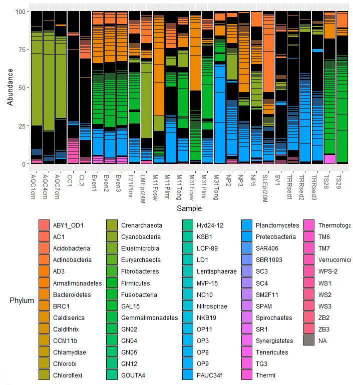
如果我理解得很好,用你的方法,大多数门和杆的高度应该是“别人”。我对我的数据也做了同样的工作,我清楚地看到了门比例丰度的差异。
我暂时不知道发生了什么.
回答 3
Stack Overflow用户
发布于 2020-06-29 06:07:40
其中涉及到几个步骤。
首先,定义“他人”。
phylums <- c('Proteobacteria','Bacteroidetes','Firmicutes')

df$Phylum[!df$Phylum %in% phylums] <- "Others"
df$Family[!df$Phylum %in% phylums] <- "Others"

df$Family[df$Phylum=="Proteobacteria" &
 !df$Family %in% c('Alcaligenaceae','Enterobacteriaceae')] <- "Other Protobacteria"

df$Family[df$Phylum=="Bacteroidetes" &
 !df$Family %in% c('Bacteroidaceae','Rikenellaceae','Porphyromonadaceae')] <- "Other Bacteroidetes"

df$Family[df$Phylum=="Firmicutes" &
!df$Family %in% c('Lactobacillaceae','Clostridiaceae','Ruminococcaceae','Lachnospiraceae')] <- "Other Firmicutes"然后,将Phylum转换为一个因子,以便(1)图例中的“其他”放在最后;(2)我们可以根据Family的底层因子级别以及家庭是否包含“其他人”重新排序Phylum变量。这确保了颜色梯度的正确分配。
library(forcats)
library(dplyr)
df2 <- select(df, Sample, Phylum, Family) %>%
  mutate(Phylum=factor(Phylum, levels=c(phylums, "Others")),
         Family=fct_reorder(Family, 10*as.integer(Phylum) + grepl("Others", Family))) %>%

  group_by(Family) %>%  # For this dataset only
sample_n(100) # Otherwise, unnecessary最后两行是实际数据所不需要的额外行,但在这里,我在每个Family中选择了一个100个样本,这样图看起来就更漂亮了。否则,有太多的“其他人”,在图中,他们淹没了其他。
创建颜色梯度的自定义函数可以在接受的this问题答案中找到(正如您提到的)。
colours <- ColourPalleteMulti(df2, "Phylum", "Family")最后,我们可以使用group变量来代替您的Family变量,这样标签就简洁了。
library(ggplot2)
ggplot(df2, aes(x=Sample, fill = Family)) +
  geom_bar(position="fill", colour = "grey") +  # Stacked 100% barplot
  scale_fill_manual("", values=colours) +
  theme(axis.text.x=element_text(angle=90, vjust=0.5)) +  # Vertical x-axis tick labels
  scale_y_continuous(labels = scales::percent_format()) +
  labs(y="Relative abundance")
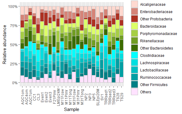
我无法设法在传说的右边加上门的标签。也许您可以手动添加它们。
Stack Overflow用户
发布于 2022-08-12 15:33:57
我创建了一个名为fantaxtic的包,它创建了这样的情节。它为较高的分类水平创造了颜色相对丰富的地块,为较低的分类水平创造了每种颜色的梯度。虽然它使用了一个稍微不同的方法来标记菲拉,我认为结果非常接近你想要的。请参见下面使用来自GlobalPatterns的phyloseq的示例。
devtools::install_github("gmteunisse/fantaxtic")
require("fantaxtic")
require("phyloseq")

# Load the data
data(GlobalPatterns)

# Get the most abundant phyla and the most abundant families within those phyla
top_nested <- nested_top_taxa(GlobalPatterns,
                              top_tax_level = "Phylum",
                              nested_tax_level = "Family",
                              n_top_taxa = 3,
                              n_nested_taxa = 3)

# Plot the relative abundances at two levels.
plot_nested_bar(ps_obj = top_nested$ps_obj,
                top_level = "Phylum",
                nested_level = "Family")
Stack Overflow用户
发布于 2021-09-24 08:38:55
伟大的问题,我真的很高兴有两个层次的着色解决方案,伟大的工作爱德华!
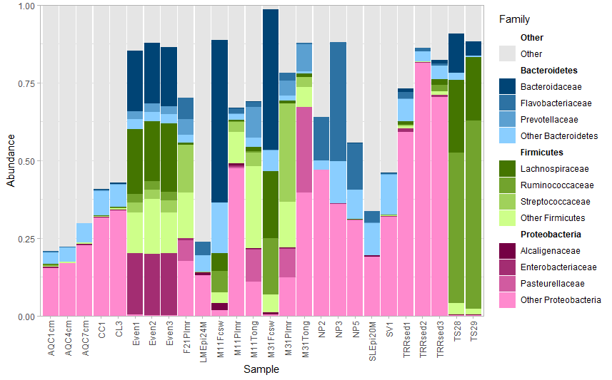
添加到您问题的注释部分。作为一项工作;您可以制作一个单独的图形,显示图例的颜色和正确的注释。看看这个例子,数字显示我离得很近了。我从这个链接上拿了这个。
https://coderedirect.com/questions/217402/add-annotation-and-segments-to-groups-of-legend-elements
首先,你想要做一个数据,听你的分类水平低于对方。我们将为分类级别和“Phyla括号”创建简明的x和y坐标。首先,为家庭级别安排正确的顺序和坐标。
coord_fam = df %>% select(Phylum, Family) %>% unique(
)  %>% ungroup()%>%mutate(x= c(rep(1,nrow(.))), y=1:nrow(.))
现在我们要计算每个组的顶部、中部和底部,这样我们就可以添加门名和Phylan括号。
coord_phylum = coord_fam %>% group_by(Phylum) %>% summarise(x=mean(x),ymid= mean(y),
                                                           ymin=min(y), ymax=max(y))
最后,您要正确地绘制坐标。
v=0.3
p2 = coord_fam %>% ggplot()+
  geom_point(aes(0.05,y, col= Family), size=8 )+
  scale_x_continuous(limits = c(0, 2)) +
  geom_segment(data = coord_phylum,
               aes(x = x + 0.1, xend = x + v, y= ymax, yend=ymax), col="black")+

  geom_segment(data = coord_phylum,
               aes(x = x + 0.1, xend = x + v, y= ymin, yend=ymin))+

  geom_segment(data = coord_phylum,
               aes(x = x + v, xend = x + v, y= ymin, yend=ymax))+

  geom_text(data = coord_phylum, aes(x = x + v+0.5, y = ymid, label = Phylum)) +
  geom_text(data = coord_fam, aes( x=0.6, y=y, label=Family, col=Family))+
  geom_text(data = coord_fam, aes( x=0.6, y=y, label=Family), alpha=0.9,col="grey50")+
  scale_colour_manual(values = colours)+
  theme_void()+theme(legend.position = "none")+
  scale_y_reverse()

p2
V用于确定括号的长度。
当您将这个补丁和barplot放在一起时,要为所有的geom_sizes找到合适的大小可能是个难题,所以从小开始。
library(patchwork)
(p1+p1)
我希望这能帮到你!你可能已经发表了你的数据,但可能是下一份手稿。
科学快乐,你们!
https://stackoverflow.com/questions/62627480
复制相似问题
腾讯云开发者

Copyright © 2013 - 2026 Tencent Cloud. All Rights Reserved. 腾讯云 版权所有
深圳市腾讯计算机系统有限公司 ICP备案/许可证号:粤B2-20090059 ![]() 粤公网安备44030502008569号
粤公网安备44030502008569号
腾讯云计算(北京)有限责任公司 京ICP证150476号 | 京ICP备11018762号