
使用Ape包根据R中定义的组更改Dendrogram "Type = Fan“上的提示标签
发行:
我有一个名为Sub_Whistle_Count (见下文)的数据框架。我试图使用hclust()进行层次分析,但我无法自定义正确的标签名Whistle_Type_Sub (海豚产生的28个不同的哨子类型)以显示在树状图中,只有数字标识符(见下文)。
 #Data frame structure

'data.frame':   62 obs. of  3 variables:
 $ Country         : Factor w/ 3 levels "Italy","Turkey",..: 1 1 1 1 1 1 1 1 1 1 ...
 $ Whistle_Type_Sub: Factor w/ 28 levels "A","AA","AA1",..: 1 24 25 11 2 18 7 5 9 13 ...
 $ N

: int 25 64 31 5 4 5 3 10 2 1 ...我试图用行type fan更改从Ape package创建的树状图(Ape package)中的标签,并按Country -对N进行集群。在本例中,我尝试使用colour包和使用plot(as.phylo(), type = "fan") plot的系统发育类型图的边缘(行)的Dark2调色板合并plot(as.phylo(), type = "fan") plot。
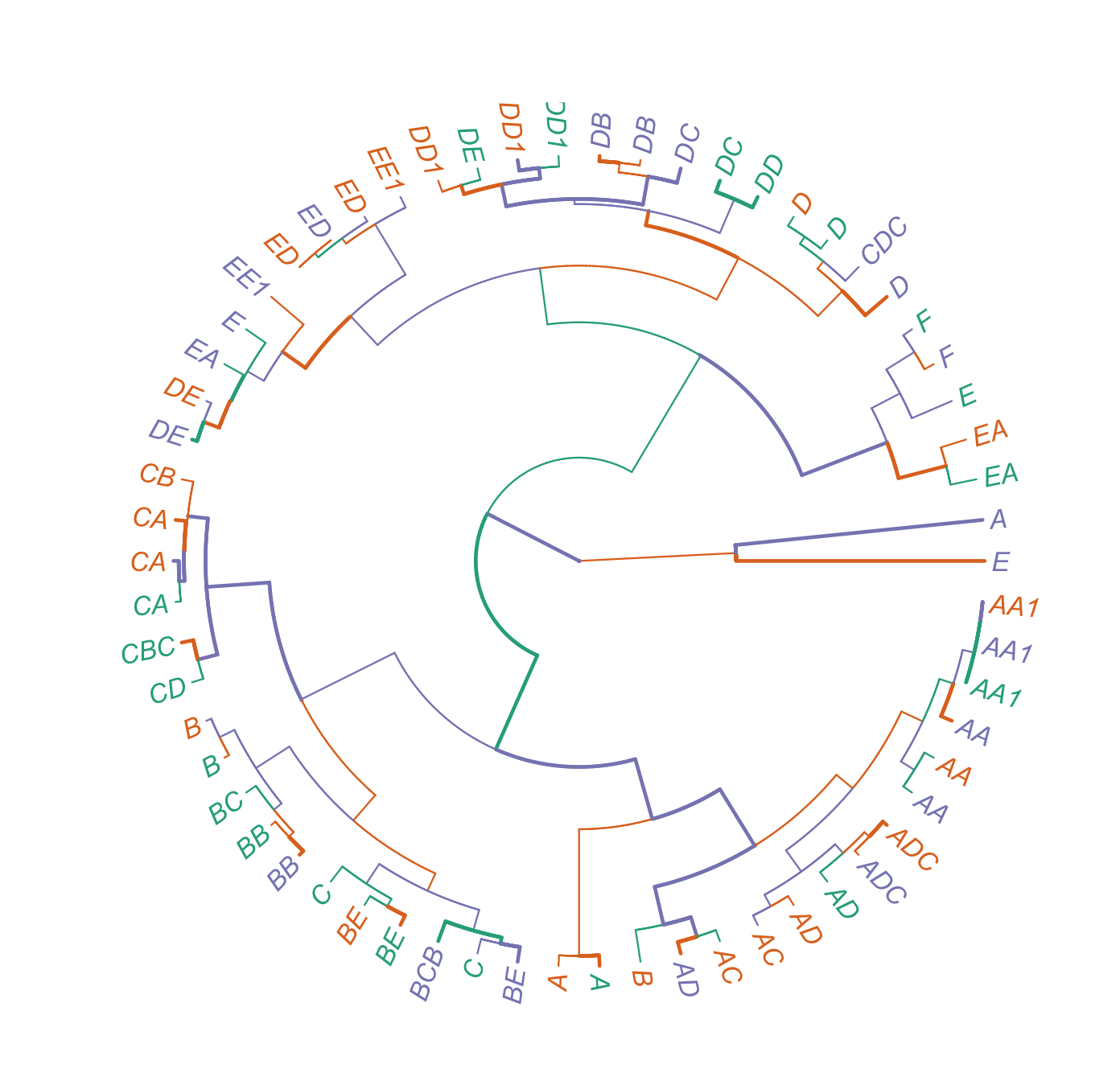
#Desired labels

mylabels<- c("A", "E", "EA", "BE", "AA","D", "B", "AD", "BC", "CA", "AA1", "DD1", "ED", "DC", "C", "AC", "ADC", "DE",
             "EA",  "A", "E", "DE", "F", "BE", "D", "EE1", "B", "CA", "DB",  "BB", "AA1", "ED", "AD",  "DD1", "AA",
             "A","ED", "E","DD", "DD1","CDC", "C", "AC", "D",  "F", "EE1","BCB", "DC", "ADC", "DE",  "CA", "AA",  "BE",
"CBC", "B", "EA", "AA1", "AD", "BB", "CD", "CB", "DB")我还试图在edges (lines)、branches和leaf提示中添加色彩,以突出国家间不同的哨子子类型(Country)。我想根据它们与土耳其、黑山或意大利聚在一起的组在树状图中给'Whistle_Type_Sub`名称‘着色,当树状图中的分支与给定的组相关联时,边缘与终端端颜色相匹配。
使用tips (labels)命令为(Whistle Sub Type and Country)组添加颜色似乎不是什么大问题,尽管我不能百分之百地肯定我已经正确地完成了这个部分。
然而,当我试图为树状图定制标签Whistle_Type_Sub时,我无法解决这个问题,因为show.tip.label命令实际上需要一个true and false响应(请参阅下面我想要的输出)。
有人能伸出援手吗?
任何帮助都是感激的。
I tried:

#Attempt 1
#Create labels
labels <- def(Sub_Whistle_Count$tip.label, Sub_Whistle_Count$Whistle_Type_Sub)
(mylabels<-brewer.pal(3, "Dark2")[labels])
character(0)

#Attempt 2
labels <- def(dend$tip.label, Sub_Whistle_Count$Whistle_Type_Sub)
Warning messages:
1: In get(results[[i]], packages[[i]]) :
  restarting interrupted promise evaluation
2: In get(results[[i]], packages[[i]]) :
  internal error -3 in R_decompress1
R-代码:
library(data.table)
library(cluster) #agnes function
library(usedist) #change label names
library(ape) #create fan data frame
library('dendextend')
library(RColorBrewer) #Customise the colour palette
library(phytools)

#DENDROGRAM
Cluster.Country.Dist<-dist(cbind(Sub_Whistle_Count[1, 3], 2*(as.numeric(Sub_Whistle_Count$Whistle_Type_Sub)-2)))
Cluster.Country.Dist

Cluster.Country.hcl<-hclust(Cluster.Country.Dist)
Cluster.Country.hcl

dend = as.dendrogram(Cluster.Country.hcl)
dend
#Connecting label color with the country label
geo <- factor(c("Montenegro", "Turkey", "Italy"))
(mycol<-brewer.pal(3, "Dark2")[geo])

#Select the colour of the branch
X <- brewer.pal(3, "Dark2")

#Open a new graphics window
dev.new()

#Plot the dednrogram
plot(as.phylo(dend), type="fan", cex=0.9, label.offset = 0.8,
     edge.color = sample(X, length(Sub_Whistle_Count$Country)/2, replace = TRUE),
     edge.width = sample(2:3, length(Sub_Whistle_Count$Country)/2, replace = TRUE),
     show.tip.label = sample(2:3, length(Sub_Whistle_Count$Whistle_Type_Sub)/2, replace = TRUE),
     show.node.label = TRUE,
     tip.color=mycol, lwd=1)
R码输出
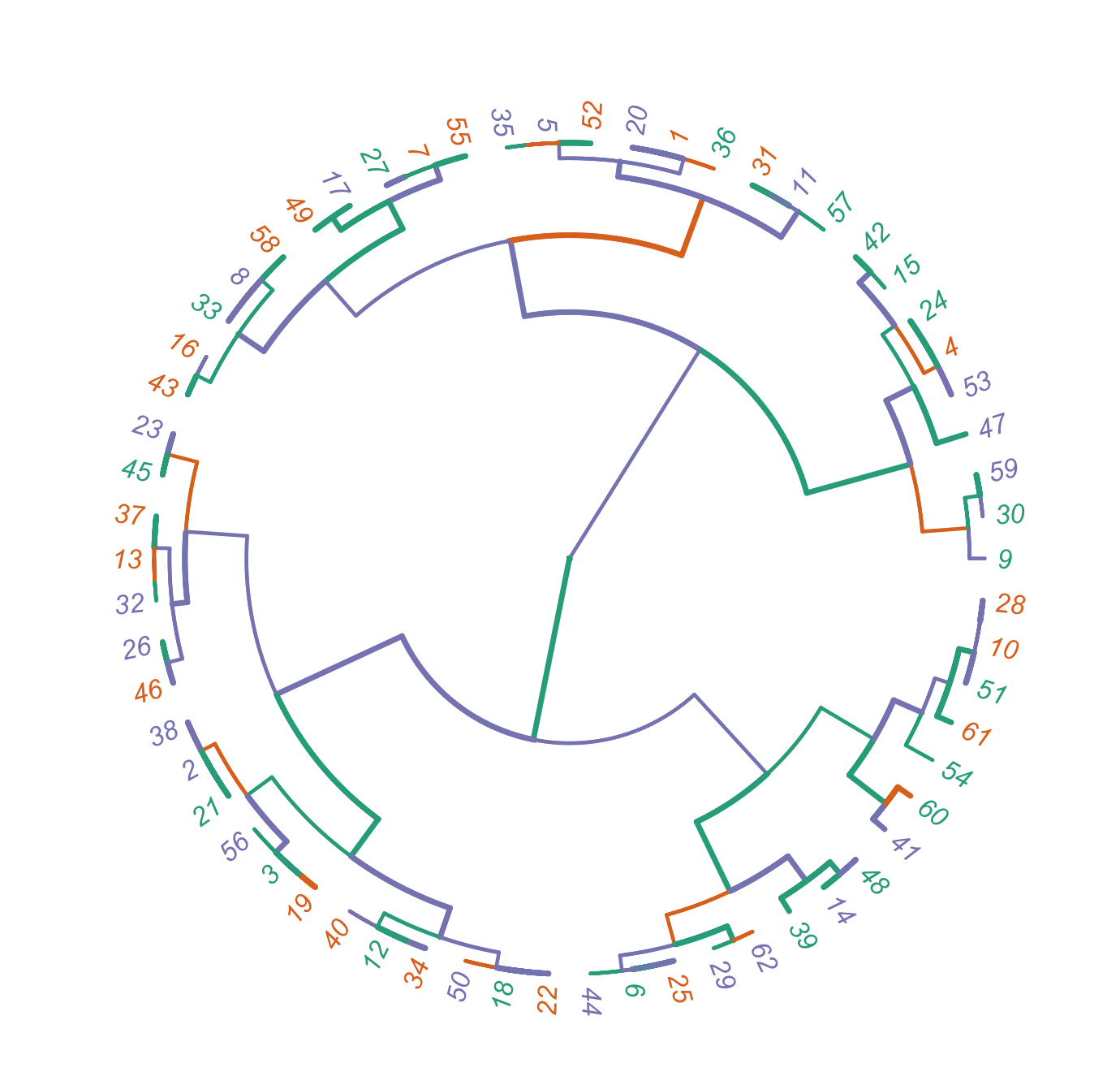
期望输出
数据
structure(list(Country = structure(c(1L, 1L, 1L, 1L, 1L, 1L,
1L, 1L, 1L, 1L, 1L, 1L, 1L, 1L, 1L, 1L, 1L, 1L, 2L, 2L, 2L, 2L,
2L, 2L, 2L, 2L, 2L, 2L, 2L, 2L, 2L, 2L, 2L, 2L, 2L, 3L, 3L, 3L,
3L, 3L, 3L, 3L, 3L, 3L, 3L, 3L, 3L, 3L, 3L, 3L, 3L, 3L, 3L, 3L,
3L, 3L, 3L, 3L, 3L, 3L, 3L, 3L), .Label = c("Italy", "Turkey",
"Montenegro"), class = "factor"), Whistle_Type_Sub = structure(c(1L,
24L, 25L, 11L, 2L, 18L, 7L, 5L, 9L, 13L, 3L, 22L, 26L, 20L, 12L,
4L, 6L, 23L, 25L, 1L, 24L, 23L, 28L, 11L, 18L, 27L, 7L, 13L,
19L, 8L, 3L, 26L, 5L, 22L, 2L, 1L, 26L, 24L, 21L, 22L, 17L, 12L,
4L, 18L, 28L, 27L, 10L, 20L, 6L, 23L, 13L, 2L, 11L, 15L, 7L,
25L, 3L, 5L, 8L, 16L, 14L, 19L), .Label = c("A", "AA", "AA1",
"AC", "AD", "ADC", "B", "BB", "BC", "BCB", "BE", "C", "CA", "CB",
"CBC", "CD", "CDC", "D", "DB", "DC", "DD", "DD1", "DE", "E",
"EA", "ED", "EE1", "F"), class = "factor"), N = c(25L, 64L, 31L,
5L, 4L, 5L, 3L, 10L, 2L, 1L, 2L, 3L, 2L, 1L, 1L, 3L, 2L, 4L,
26L, 54L, 20L, 10L, 18L, 7L, 7L, 10L, 2L, 3L, 2L, 2L, 2L, 1L,
1L, 1L, 1L, 23L, 1L, 13L, 10L, 5L, 4L, 8L, 9L, 9L, 20L, 1L, 1L,
9L, 1L, 9L, 2L, 6L, 3L, 1L, 10L, 9L, 2L, 3L, 1L, 2L, 2L, 3L)), row.names = c(NA,
-62L), class = "data.frame")回答 1
Stack Overflow用户
发布于 2022-06-18 05:21:00
R码
library(data.table)
library(cluster) #agnes function
library(usedist) #change label names
library(ape) #create fan data frame
library('dendextend')
library(RColorBrewer) #Customise the colour palette
library(phytools)

#Create a data frame object
Sub_Whistle_Count<-as.data.frame(Yeo.Whistle.Count_Reorder)
Sub_Whistle_Count

#Check the structure of Yeo.Whistle.Count
str(Sub_Whistle_Count)

#DENDROGRAM
Cluster.Country.Dist<-dist(cbind(Sub_Whistle_Count[1:2], 2*(as.numeric(Sub_Whistle_Count$Whistle_Type_Sub)-2)))
Cluster.Country.Dist

##tip labels
mylabels<- c("A", "E", "EA", "BE", "AA","D", "B", "AD", "BC", "CA", "AA1", "DD1", "ED", "DC", "C", "AC", "ADC", "DE",
             "EA",  "A", "E", "DE", "F", "BE", "D", "EE1", "B", "CA", "DB",  "BB", "AA1", "ED", "AD",  "DD1", "AA",
             "A","ED", "E","DD", "DD1","CDC", "C", "AC", "D",  "F", "EE1","BCB", "DC", "ADC", "DE",  "CA", "AA",  "BE",
             "CBC", "B", "EA",  "AA1", "AD",  "BB",  "CD", "CB",  "DB")


#Change the rows and column label names in the dist object
NewLabels<-dist_setNames(Cluster.Country.Dist, mylabels[1:62])
NewLabels

#Hierarchical Clustering algorithm on the dataset using hclust()
Cluster.Country.hcl<-hclust(NewLabels)
Cluster.Country.hcl

#Create a dendrogram object
dend = as.dendrogram(Cluster.Country.hcl)
dend

#Connecting label color with the country label
geo <- factor(c("Montenegro", "Turkey", "Italy"))
(mycol<-brewer.pal(3, "Dark2")[geo])

#Select the color of the branch
X <- brewer.pal(3, "Dark2")

#Open a new graphics window
dev.new()

#Plot the dendrogram
plot(as.phylo(dend), type="fan", cex=0.9, label.offset = 0.8,
     edge.color = sample(X, length(Sub_Whistle_Count$Country)/2, replace = TRUE),
     edge.width = sample(1:2, length(Sub_Whistle_Count$Country)/2, replace = TRUE),
     show.tip.label = TRUE,
     tip.color=mycol, lwd=1)
图
https://stackoverflow.com/questions/72633222
复制相似问题
腾讯云开发者

Copyright © 2013 - 2026 Tencent Cloud. All Rights Reserved. 腾讯云 版权所有
深圳市腾讯计算机系统有限公司 ICP备案/许可证号:粤B2-20090059 ![]() 粤公网安备44030502008569号
粤公网安备44030502008569号
腾讯云计算(北京)有限责任公司 京ICP证150476号 | 京ICP备11018762号