空间单细胞转录组cell2location分析流程学习
原创

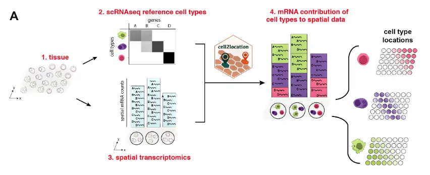
Cell2location 是一个用于空间转录组学数据分析的工具。它是一个基于贝叶斯统计模型的Python包,旨在利用空间转录组数据和单细胞转录组数据来进行细胞类型的空间解构。通过将单细胞转录组数据中的细胞类型信息投射到空间转录组数据中,Cell2location 可以估算不同细胞类型在空间位置中的丰度分布。
主要功能:
- 细胞类型空间解构:Cell2location的主要功能是通过整合单细胞 RNA-seq 数据(提供细胞类型的转录特征)和空间转录组学数据,预测每个空间位置中细胞类型的组成和丰度。这种方法帮助我们理解在组织切片中的不同位置上,哪种细胞类型占据主导地位。
- 贝叶斯模型:Cell2location基于贝叶斯框架来推断空间位置中每种细胞类型的相对丰度。贝叶斯方法的优势在于它可以处理数据中的不确定性并生成可信区间,使得推断的结果更加可靠。
- 结合单细胞和空间数据:Cell2location允许用户结合单细胞RNA-seq数据与空间转录组数据,使得在细胞分辨率不高的空间数据中可以更好地推断出各类细胞的分布模式。
- 高分辨率推断:该工具的一个强大之处在于它可以在较高的分辨率上推断出不同细胞类型在组织中的分布情况,尤其适用于像Visium空间转录组这类数据。
典型使用场景:
- 细胞类型定位:使用已知的单细胞 RNA-seq 数据,推断特定组织切片中每个spot处不同细胞类型的相对丰度。
- 肿瘤微环境分析:分析肿瘤微环境中的细胞组成,识别免疫细胞、癌细胞及其他微环境细胞的空间分布。
- 器官发育和疾病研究:分析不同发育阶段或病变中的细胞类型分布,帮助理解器官的组织架构和病理变化。
分析流程
1.导入
# Loading packages
import sys

import scanpy as sc
import numpy as np
import matplotlib.pyplot as plt
import matplotlib as mpl

import cell2location

from matplotlib import rcParams
rcParams['pdf.fonttype'] = 42 # enables correct plotting of text for PDFs
2.加载Visium空间数据
# 加载Visium空间数据
adata_vis = sc.read_h5ad("./RawData/GSE6716963/adata_coad.h5ad")
3.加载单细胞数据集
# 加载单细胞数据集
adata_ref = sc.read_h5ad("./scRNA_V5.h5ad")
4.把基因名称设置为Ensembl 基因 ID
因为基因名称不够准确
# 理论上需要将数据的genes转为ENSEMBL ID,与空间数据对应同样的id
# 如果没有这个数据那就用genes
# 两个数据都需要这么修改

# adata_ref.var['SYMBOL'] = adata_ref.var.index
# rename 'GeneID' as necessary for your data
# adata_ref.var.set_index('GeneID', drop=True, inplace=True)
5.去除线粒体基因
官方推荐需要把线粒体基因去除,不然在mapping的时候会影响结果
# find mitochondria-encoded (MT) genes
# 下面这句代码的参数需要自行修改
# adata.var['mt'] = [gene.startswith('MT-') for gene in adata.var['SYMBOL']]

# remove MT genes for spatial mapping (keeping their counts in the object)
adata.obsm['mt'] = adata[:, adata.var['mt'].values].X.toarray() # 这里是把线粒体基因的表达信息嵌入到每个细胞中
adata = adata[:, ~adata.var['mt'].values] # ~是反操作,选择那些不是线粒体基因的列
6.过滤reference中的基因
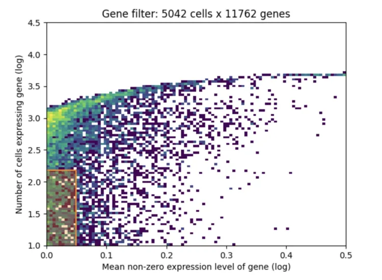
from cell2location.utils.filtering import filter_genes
selected = filter_genes(adata_ref, cell_count_cutoff=5, cell_percentage_cutoff2=0.03, nonz_mean_cutoff=1.12)

# filter the object
adata_ref = adata_ref[:, selected].copy()1、X轴(Mean non-zero expression level of gene (log)):
X轴表示基因的平均非零表达水平,即对于那些在至少一个细胞中有表达的基因,计算它们的平均表达值,使用对数缩放。
从图中可以看到,从0到0.5的区间表示的是基因的表达水平,越往右意味着基因的表达量越高,越往左则表示表达量越低。
2、Y轴(Number of cells expressing gene (log)):
Y轴表示的是每个基因被多少细胞表达,同样是对数缩放。
越往上意味着这个基因在更多的细胞中有表达,越往下表示这个基因只在很少的细胞中有表达。
3、颜色表示基因的密度分布:
颜色从黄色到深紫色,表示在该区域的基因数量密度。黄色表示有较多的基因集中在这个区间,紫色表示基因数量较少。
在图的左下方的区域(即低表达和少数细胞中表达的区域)可以看到有一个更加密集的分布。
4、数据过滤后的信息(图标题:Gene filter: 5042 cells x 11762 genes):
标题表明经过基因过滤后,保留了5042个细胞和11762个基因。
基因过滤通常会基于两个标准:基因的表达量和基因在多少个细胞中有表达。这个过滤步骤会移除在大多数细胞中几乎没有表达的基因或表达量非常低的基因,因为这些基因可能对后续分析贡献较少或者是噪声。
7.提取参考数据集的信息构建回归模型
# prepare anndata for the regression model
cell2location.models.RegressionModel.setup_anndata(adata=adata_ref,
                        # 10X reaction / sample / batch
                        batch_key='Sample',
                        # cell type, covariate used for constructing signatures
                        labels_key='celltype',
                        # multiplicative technical effects (platform, 3' vs 5', donor effect)
                        categorical_covariate_keys= None # 其他影响结果的参数,如果有需要写成['type']
)# create the regression model
from cell2location.models import RegressionModel
mod = RegressionModel(adata_ref)
# view anndata_setup as a sanity check
mod.view_anndata_setup()8.接下来要开始训练模型进行映射
# 如果是浮点数需要转换
# 将浮点数四舍五入并转换为整数
adata_vis.X = np.round(adata_vis.X).astype(int)
adata_ref.X = np.round(adata_ref.X).astype(int)mod.train(max_epochs=150, batch_size=1000,accelerator='cpu')
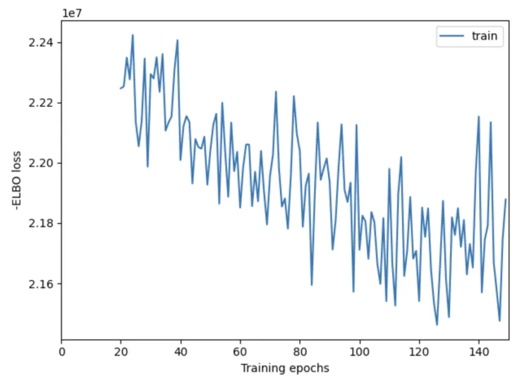
# mod.train(max_epochs=250, batch_size=2500,use_gpu=True) mod.plot_history(20)
plt.savefig('01-mod.plot_history.pdf') # 保存为Pdf格式X轴:表示训练的轮数(epochs),也就是模型迭代更新的次数。通常,更多的训练轮数可以帮助模型逐渐改善其性能,收敛到一个较好的解。
Y轴:表示 负 ELBO 损失。ELBO 损失是用于评估变分推断模型的一个指标,负 ELBO 损失越小,表示模型的拟合效果越好。
这个结果是不合格的啦~
9.评估结果
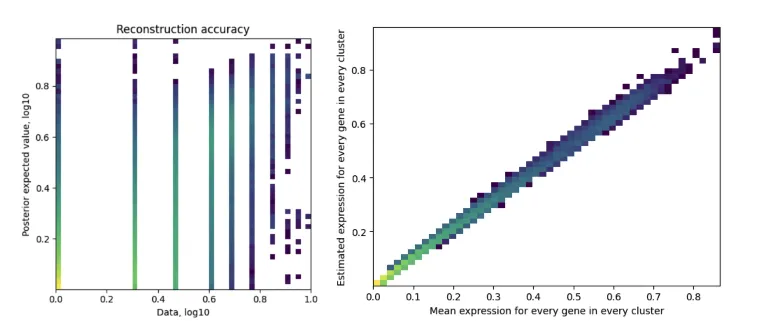
mod.plot_QC()
plt.savefig('02-mod.plot_QC.pdf') # 保存为Pdf格式
左图:Reconstruction accuracy(重建精度)
X轴(Data, log10):表示原始数据的基因表达值,使用了对数10缩放。
Y轴(Posterior expected value, log10):表示模型估计出的后验期望值,也使用了对数10缩放。
颜色:颜色表示数据点的密度。颜色从浅色到深色,表示从低密度到高密度的数据分布。
图中的点应该大致沿着对角线分布,这意味着模型的重构结果与原始数据接近,表示模型可以准确地重构基因表达值。如果点偏离对角线较多,则表示模型重构有较大的误差。
这幅图展示了模型估计出的基因表达值与实际数据的匹配程度。点在对角线上的密集度越高,表示模型对数据的拟合越好。
右图:Estimated expression for every gene in every cluster(每个基因在每个簇中的估计表达值)
X轴(Mean expression for every gene in every cluster):表示每个基因在每个簇的平均表达值。
Y轴(Estimated expression for every gene in every cluster):表示模型对每个基因在每个簇中的估计表达值。
颜色:同样,颜色表示数据点的密度。
理想情况下,图中的点应该沿着对角线分布,表示模型估计的基因表达值与实际数据高度一致。
这是一个散点图,通过展示模型估计的表达值与实际的均值表达值之间的关系,来衡量模型的表现。点越接近对角线,表示模型的估计越准确。
10.基因对细胞亚群的贡献
# export estimated expression in each cluster
if 'means_per_cluster_mu_fg' in adata_ref.varm.keys():
    inf_aver = adata_ref.varm['means_per_cluster_mu_fg'][[f'means_per_cluster_mu_fg_{i}'
                            for i in adata_ref.uns['mod']['factor_names']]].copy()
else:
    inf_aver = adata_ref.var[[f'means_per_cluster_mu_fg_{i}'
                            for i in adata_ref.uns['mod']['factor_names']]].copy()

inf_aver.columns = adata_ref.uns['mod']['factor_names']
inf_aver.iloc[0:12, 0:12]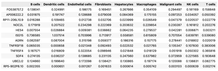
11.查找共享基因,并对子集化后的 AnnData 和参考特征进行处理
# find shared genes and subset both anndata and reference signatures
intersect = np.intersect1d(adata_vis.var_names, inf_aver.index)
adata_vis = adata_vis[:, intersect].copy()
inf_aver = inf_aver.loc[intersect, :].copy()

# prepare anndata for cell2location model
cell2location.models.Cell2location.setup_anndata(adata=adata_vis, batch_key="slice") # batch_key需要自行修改
这一步挺慢的
mod.train(max_epochs=30000,
          # train using full data (batch_size=None)
          batch_size=None,
          # use all data points in training because
          # we need to estimate cell abundance at all locations
          train_size=1,
          # use_gpu=True,
          # use_gpu=False,
          accelerator='cpu'
          )

# plot ELBO loss history during training, removing first 100 epochs from the plot
mod.plot_history(1000)
plt.legend(labels=['full data training']);
plt.savefig('03-mod.plot_history.pdf')  # 保存为PDF格式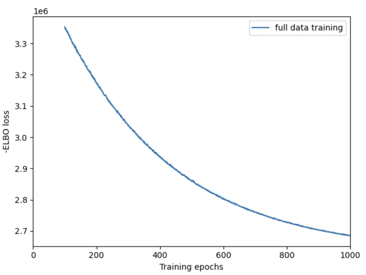
12.计算后验概率保存数据
# In this section, we export the estimated cell abundance (summary of the posterior distribution).
adata_vis = mod.export_posterior(
    adata_vis, sample_kwargs={'num_samples': 1000, 'batch_size': mod.adata.n_obs, 'accelerator': 'cpu'} # use_gpu=True
)

# Save model
run_name = './RawData/GSE6716963/'
mod.save(f"{run_name}", overwrite=True)

# mod = cell2location.models.Cell2location.load(f"{run_name}", adata_vis)

# Save anndata object with results
adata_file = f"{run_name}/sp.h5ad"
adata_vis.write(adata_file)
adata_file
13.QC
mod.plot_QC()
plt.savefig('04-mod.plot_QC.png') # 保存为PNG格式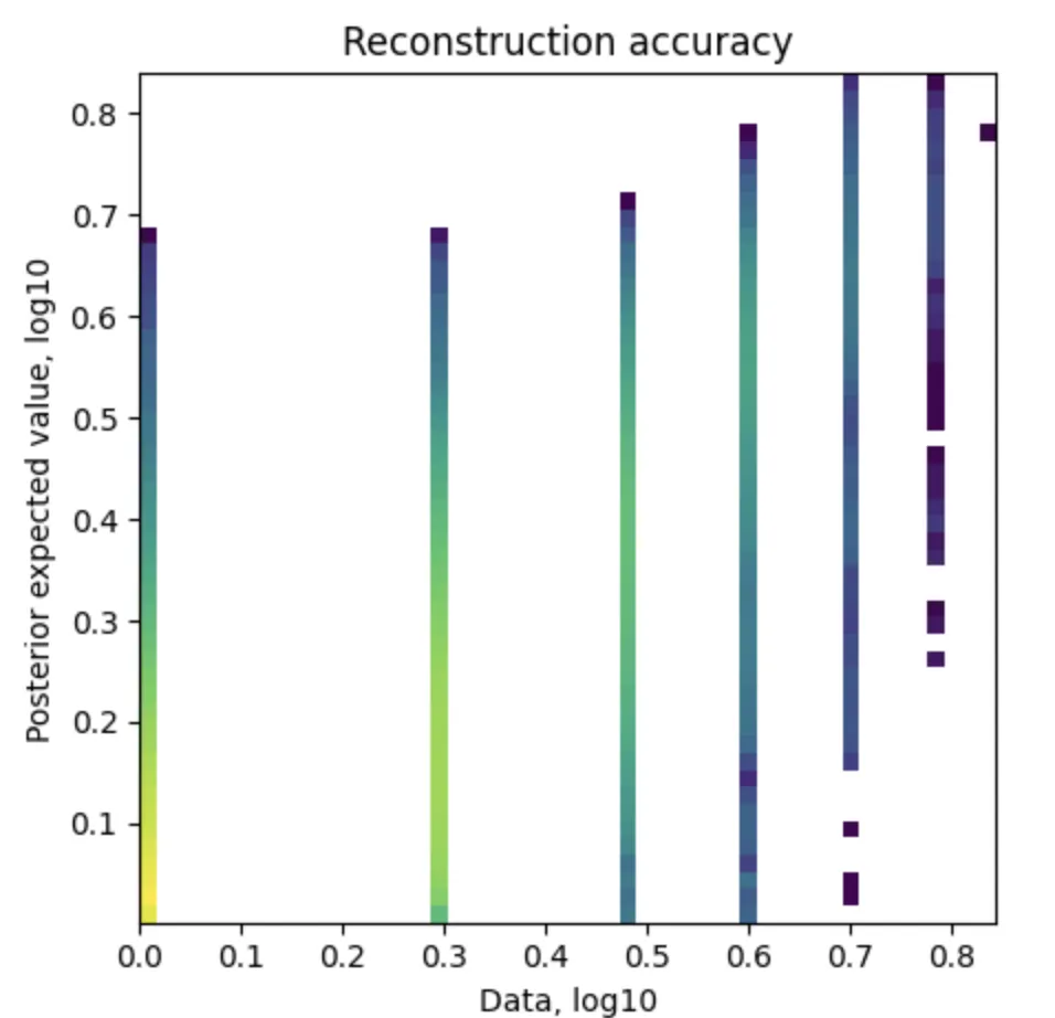
14.可视化细胞丰度
adata_vis.obsm['means_cell_abundance_w_sf']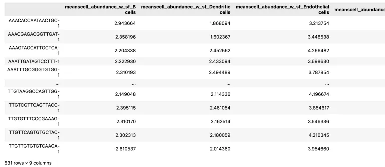
adata_vis.uns['spatial'].keys() # 帮助我们去确定下边的select_slide中需要填写的参数名称# add 5% quantile, representing confident cell abundance, 'at least this amount is present',
# to adata.obs with nice names for plotting
adata_vis.obs[adata_vis.uns['mod']['factor_names']] = adata_vis.obsm['q05_cell_abundance_w_sf'] # obsm中数据有很多可自行选择
# select one slide
from cell2location.utils import select_slide
slide = select_slide(adata_vis, '19G081', batch_key='slice')
# plot in spatial coordinates
with mpl.rc_context({'axes.facecolor':'black','figure.figsize': [4.5, 5]}):
sc.pl.spatial(slide, cmap='magma',
# show first cell types
color=['B cells', 'Dendritic cells', 'Endothelial cells', 'Fibroblasts','Hepatocytes',
'Macrophages', 'Malignant cells', 'NK cells', 'T cells'],
ncols=4, size=1.3,img_key='hires',
# limit color scale at 99.2% quantile of cell abundance
vmin=0, vmax='p99.2'
)
plt.savefig('05-sc.pl.spatial.pdf') # 保存为PNG格式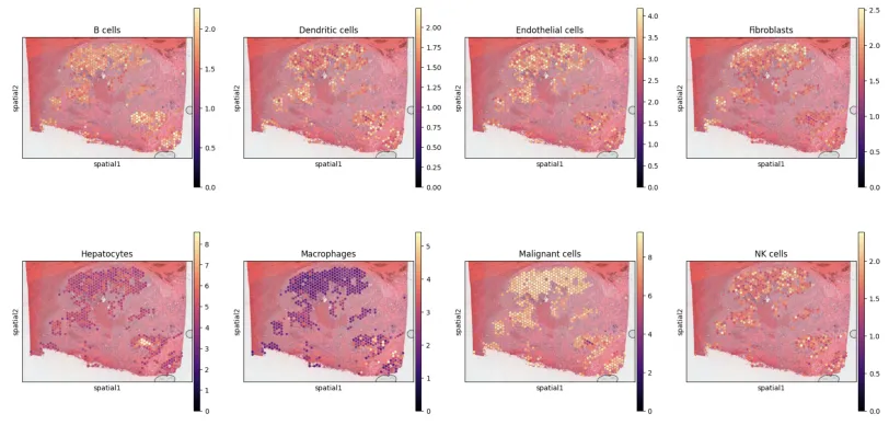
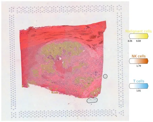
# Now we use cell2location plotter that allows showing multiple cell types in one panel
from cell2location.plt import plot_spatial

# select up to clusters
clust_labels = ['Malignant cells', 'NK cells', 'T cells']
clust_col = ['' + str(i) for i in clust_labels] # in case column names differ from labels

slide = select_slide(adata_vis, '19G081', batch_key='slice')

with mpl.rc_context({'figure.figsize': (15, 15)}):
    fig = plot_spatial(
    adata=slide,
        # labels to show on a plot
        color=clust_col, labels=clust_labels,
        show_img=True,
        # 'fast' (white background) or 'dark_background'
        style='fast',
        # limit color scale at 99.2% quantile of cell abundance
        max_color_quantile=0.992,
        # size of locations (adjust depending on figure size)
        circle_diameter=6,
        colorbar_position='right'
        )
plt.savefig('06-sc.pl.spatial.pdf') # 保存为Pdf格式
多种细胞类型同时展示
既往推文: 单细胞空间转录组RCTD去卷积分析学习和整理: https://mp.weixin.qq.com/s/_Zdxu9bn-ldoMQJXK8uwIA
单细胞空间转录组分析流程学习python版(三): https://mp.weixin.qq.com/s/wt4nVi8pTFwQMNN8Ipj_mA
单细胞空间转录组分析流程学习(二): https://mp.weixin.qq.com/s/8AFeq50Dc91cI_6jdQZfFg
单细胞空间转录组分析流程学习(一) https://mp.weixin.qq.com/s/E4WuPokBOxKRbBF6CEB5aA
参考资料:
- Cell2location maps fine-grained cell types in spatial transcriptomics. Nat Biotechnol. 2022 May;40(5):661-671.
- github:https://github.com/BayraktarLab/cell2location
- 生信菜鸟团:https://mp.weixin.qq.com/s/KttnUlZJ6sxPZ3Gz_3601w https://mp.weixin.qq.com/s/lF7z_2NDqBskSKD8jjwdxA
- 生信小博士:https://mp.weixin.qq.com/s/5MekQ0dXxPTI_lqgVBin4g
- 生信随笔:https://mp.weixin.qq.com/s/s2aPTUxujlh7OPTzCG2dWQ https://mp.weixin.qq.com/s/Y1rBQh-G7R_EaEdNMENHdA
注:若对内容有疑惑或者有发现明确错误的朋友,请联系后台(欢迎交流)。更多内容可关注公众号:生信方舟
- END -
原创声明:本文系作者授权腾讯云开发者社区发表,未经许可,不得转载。
如有侵权,请联系 cloudcommunity@tencent.com 删除。
原创声明:本文系作者授权腾讯云开发者社区发表,未经许可,不得转载。
如有侵权,请联系 cloudcommunity@tencent.com 删除。
评论
登录后参与评论
推荐阅读
目录
腾讯云开发者

Copyright © 2013 - 2026 Tencent Cloud. All Rights Reserved. 腾讯云 版权所有
深圳市腾讯计算机系统有限公司 ICP备案/许可证号:粤B2-20090059 ![]() 粤公网安备44030502008569号
粤公网安备44030502008569号
腾讯云计算(北京)有限责任公司 京ICP证150476号 | 京ICP备11018762号