
MaterialDatePicker不在Android上工作
我想将我的项目的日期选择器更改为Android材料组件提供的日期选择器,但它不起作用。
这是我尝试过的代码:
MaterialDatePicker.Builder<Long> builder = MaterialDatePicker.Builder.datePicker();

MaterialDatePicker<Long> picker = builder.build();

picker.show(getSupportFragmentManager(), picker.toString());
这就是它的样子:
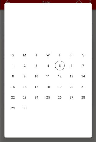
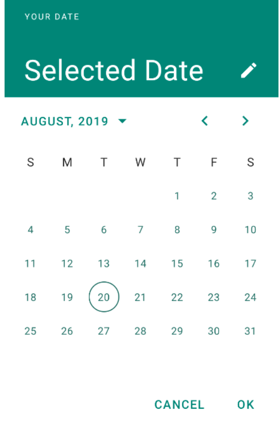
A这就是它应该看起来的样子:
有人能告诉我少了什么吗?
谢谢
回答 5
Stack Overflow用户
发布于 2019-09-12 16:36:39
问题出在colorPrimary上。
我的项目对colorPrimary的默认颜色是“白色”,材料日期选择器样式使用该colorPrimary为按钮的背景和文本着色。由于标题文本的颜色也是白色的,所以当有所有内容时,似乎什么都没有。
我通过将样式文件导入到我的项目中并对项目中的样式做了一些调整来解决这个问题。
谢谢大家的回答,他们都帮助我们找到了问题!
Stack Overflow用户
发布于 2019-09-05 14:55:59
使用Android的材料组件,您可以使用新的MaterialDatePicker。
要想正常工作,在应用程序中必须使用材料成分主题。
通过这种方式,您可以继承选择者的样式和主题。
要选择单日期,只需使用:
MaterialDatePicker.Builder<Long> builder = MaterialDatePicker.Builder.datePicker();
builder.setTitleText(R.string.your_text);
MaterialDatePicker<Long> picker = builder.build();
picker.show(getSupportFragmentManager(), picker.toString());若要选择范围日期,可以使用DateRange选择器:
MaterialDatePicker.Builder<Pair<Long, Long>> builder =
                    MaterialDatePicker.Builder.dateRangePicker();
CalendarConstraints.Builder constraintsBuilder = new CalendarConstraints.Builder();
builder.setCalendarConstraints(constraintsBuilder.build());
MaterialDatePicker<?> picker = builder.build();
picker.show(getSupportFragmentManager(), picker.toString());
检查主题中使用的颜色。
这些属性定义了您的样式。您的不需要来添加它们,它们在默认情况下是与材料组件主题一起提供的。
<!-- Picker styles and themes. -->
<item name="materialCalendarStyle">@style/Widget.MaterialComponents.MaterialCalendar</item>
<item name="materialCalendarFullscreenTheme">@style/ThemeOverlay.MaterialComponents.MaterialCalendar.Fullscreen</item>
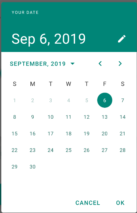
<item name="materialCalendarTheme">@style/ThemeOverlay.MaterialComponents.MaterialCalendar</item>根据这些样式,选择器使用的颜色如下:
HeaderLaoyout     -> background:colorPrimary, textColor:colorOnPrimary
HeaderSelection   -> background:colorPrimary, textColor:colorOnPrimary
ConfirmButtons    -> background:colorPrimary, textColor:colorOnPrimary
Buttons           -> background:colorPrimary, textColor:colorOnSurface
HeaderToggleButton->                          textColor:colorOnPrimary
Day               ->                          text:colorOnSurface  stroke:colorOnSurface
SelectedDay       -> background:colorPrimary, textColor:colorOnPrimary
RangeFillColor -> background:colorPrimaryStack Overflow用户
发布于 2021-06-03 16:04:59
我也有同样的问题,我的主要颜色是白色。
简单的解决方案是以Calendar样式覆盖primaryColor:
基本主题:
<style name="Base.Theme.YV.Bible" parent="Theme.MaterialComponents.DayNight.NoActionBar">
  <item name="materialCalendarStyle">@style/Theme.YV.Bible.DatePicker</item>
  <item name="android:datePickerDialogTheme">@style/Theme.YV.Bible.DatePicker</item>
</style>
日历/数据交换主题
<style name="Theme.YV.Bible.DatePicker" parent="ThemeOverlay.MaterialComponents.MaterialCalendar">
  <item name="colorPrimary">?colorPrimaryDark</item> // this is the key, we need to use a dark color instead of our theme's primary color
</style>
使用
val picker = MaterialDatePicker.Builder
    .datePicker()
    .setCalendarConstraints(CalendarConstraints.Builder().setStart(now().time).build())
    .setSelection(c.timeInMillis)
    .setTheme(com.bible.base.R.style.Theme_YV_Bible_DatePicker)
    .build()
picker.show(fragmentManager, null)https://stackoverflow.com/questions/57807103
复制相似问题
腾讯云开发者

Copyright © 2013 - 2026 Tencent Cloud. All Rights Reserved. 腾讯云 版权所有
深圳市腾讯计算机系统有限公司 ICP备案/许可证号:粤B2-20090059  粤公网安备44030502008569号
腾讯云计算(北京)有限责任公司 京ICP证150476号 | 京ICP备11018762号