
如何使条形图符合时间序列,但对来自不同因素的条形图使用不同的颜色
如何使条形图符合时间序列,但对来自不同因素的条形图使用不同的颜色
提问于 2019-07-16 16:01:46
我希望这个标题不要太混乱。我有10个日期的数据,每个数据点都标为“灌溉”或“降水”。我想要制作一个条形图,它有一个按时间顺序排列的条形图,标有标有日期的条形图,但也希望条形图的颜色被编码(例如,“灌溉”中的所有条形图都是红色的,而来自“沉淀”的条形图则是蓝色的)。
我对R相当陌生,这有可能吗?如果是这样的话,任何帮助都将不胜感激。
这是我的数据:
dput(head(data))
     structure(list(Date = structure(4:9, .Label = c("7/11/2019",
     "7/13/2019", "7/15/2019", "7/2/2019", "7/3/2019", "7/4/2019",
     "7/5/2019", "7/6/2019", "7/7/2019", "7/9/2019"), class = "factor"),
         Inches = c(1.6, 0.02, 0.35, 0.64, 0.07, 0.35), Type = structure(c(2L,
    2L, 1L, 2L, 2L, 1L), .Label = c("Irrigation", "Precipitation"
), class = "factor")), row.names = c(NA, 6L), class = "data.frame")回答 1
Stack Overflow用户
回答已采纳
发布于 2019-07-16 16:13:05
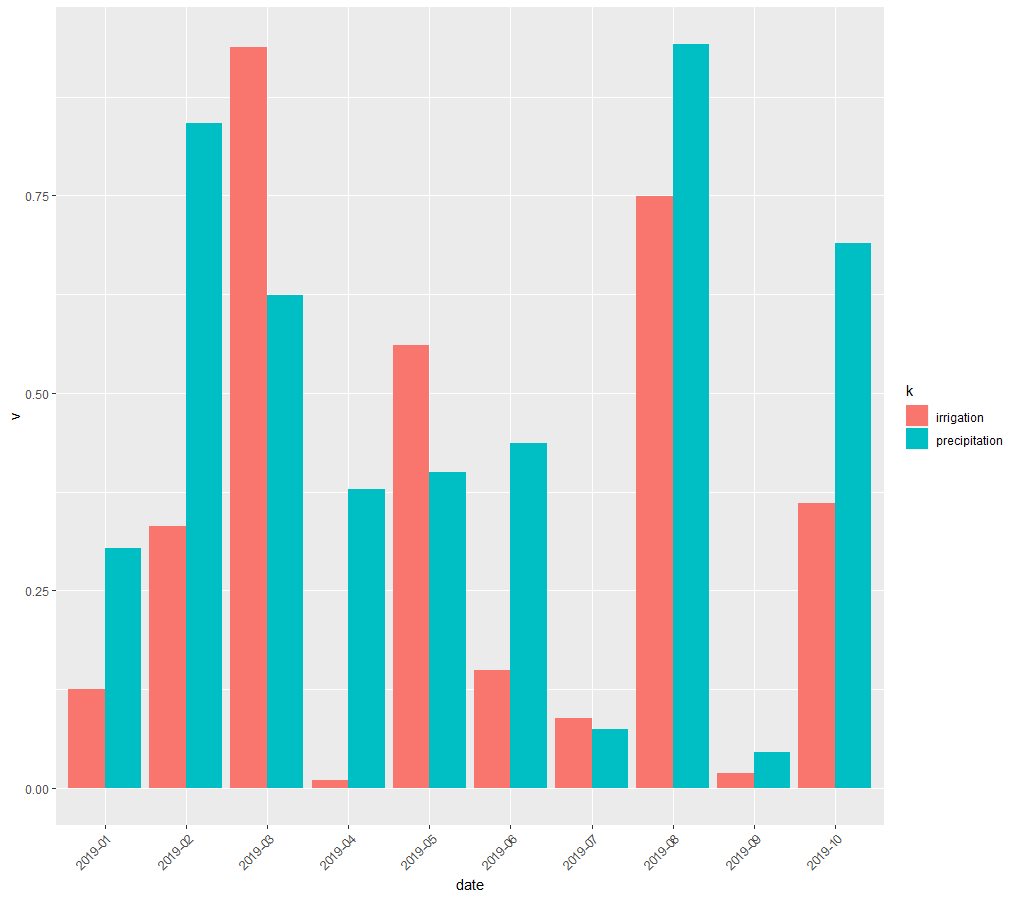
您可以使用dplyr和ggplot2来生成条形图。stat='identity'调用意味着每个条形图高度都使用数据中的对应值,而position='dodge'则将条形图并排放置,而不是堆叠。
df <- data.frame(date=c(paste0('2019-0',1:9),'2019-10'),
                 precipitation=runif(10),irrigation=runif(10))
df

df %>% gather(k,v,-date) %>%
  ggplot(aes(date,v,fill=k)) + geom_bar(stat='identity',position = 'dodge') +
  theme(axis.text.x = element_text(angle = 45,hjust=1))
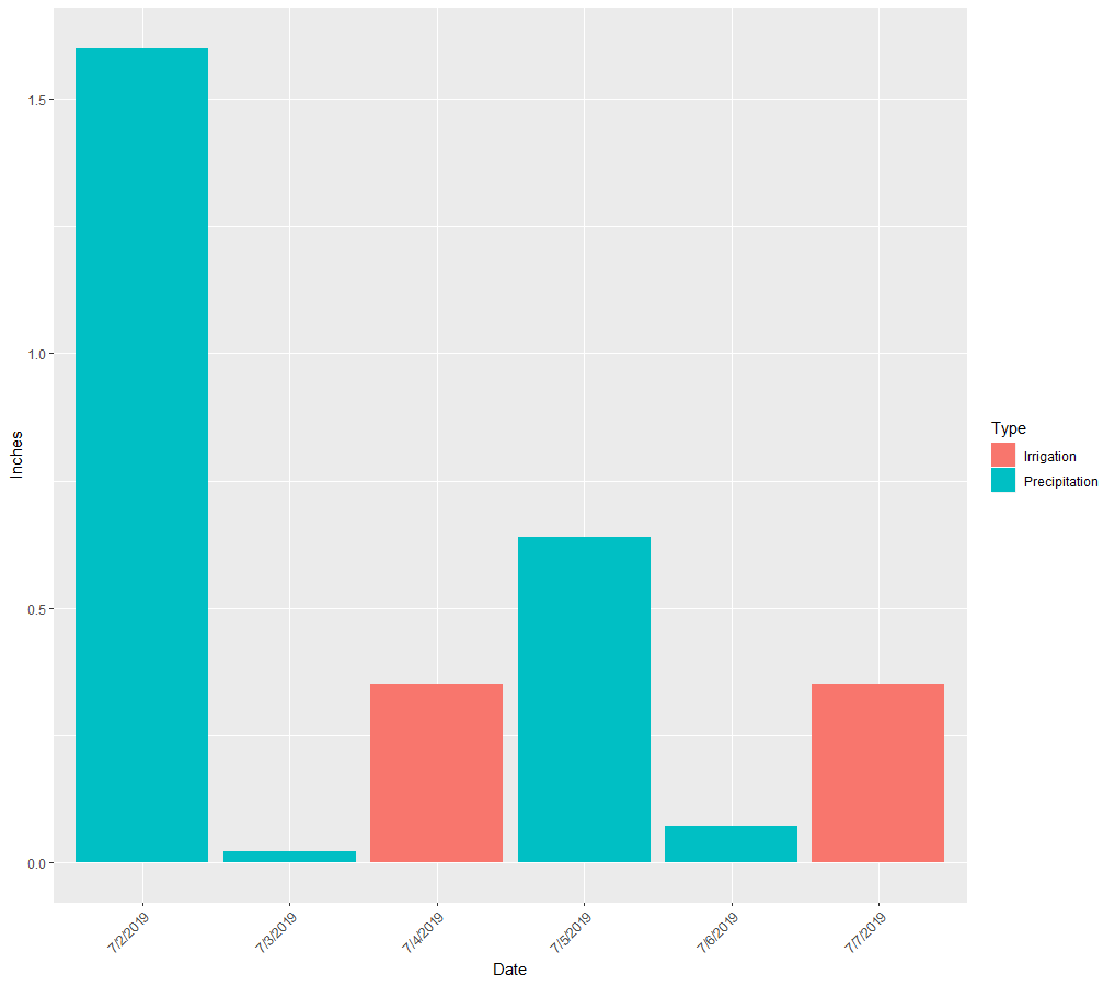
编辑
下面是使用您从dput提供的数据的条形图。我不知道你的数据已经被分组在一列里了。
df <- structure(list(Date = structure(4:9, .Label = c("7/11/2019",
                                                "7/13/2019", "7/15/2019", "7/2/2019", "7/3/2019", "7/4/2019",
                                                "7/5/2019", "7/6/2019", "7/7/2019", "7/9/2019"), class = "factor"),
               Inches = c(1.6, 0.02, 0.35, 0.64, 0.07, 0.35), Type = structure(c(2L,
                                                                                 2L, 1L, 2L, 2L, 1L), .Label = c("Irrigation", "Precipitation"
                                                                                 ), class = "factor")), row.names = c(NA, 6L), class = "data.frame")
df %>% ggplot(aes(Date,Inches,fill=Type)) + geom_bar(stat='identity',position = 'dodge') +
  theme(axis.text.x = element_text(angle = 45,hjust=1))
页面原文内容由Stack Overflow提供。腾讯云小微IT领域专用引擎提供翻译支持
原文链接:
https://stackoverflow.com/questions/57061354
复制相关文章
相似问题
腾讯云开发者

Copyright © 2013 - 2026 Tencent Cloud. All Rights Reserved. 腾讯云 版权所有
深圳市腾讯计算机系统有限公司 ICP备案/许可证号:粤B2-20090059 ![]() 粤公网安备44030502008569号
粤公网安备44030502008569号
腾讯云计算(北京)有限责任公司 京ICP证150476号 | 京ICP备11018762号