
当我滚动到页面底部时,无法访问固定导航条
当我滚动到页面底部时,无法访问固定导航条
提问于 2019-06-27 14:33:01
我在处理一个我从未见过的奇怪的问题。我的页面上有一个固定的导航栏,上面有一些链接。通常情况下,我可以点击这些链接,我可以使用我的Chrome工具中的检查器访问导航栏。但是,当我一直滚动到页面底部时,会发生一些事情。突然,我的肚脐停止了反应,我甚至无法与我的检查员选择它。我仍然能看到它,但表现得好像它根本不存在。我甚至不知道该为你们提供什么样的代码,因为我完全被潜在的问题吓呆了。
图片:
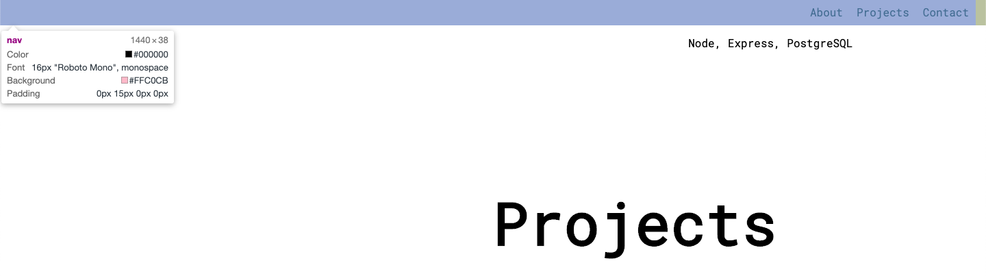
在这里,它起作用了。我在页面中间的某个地方,我可以很好地访问导航栏。
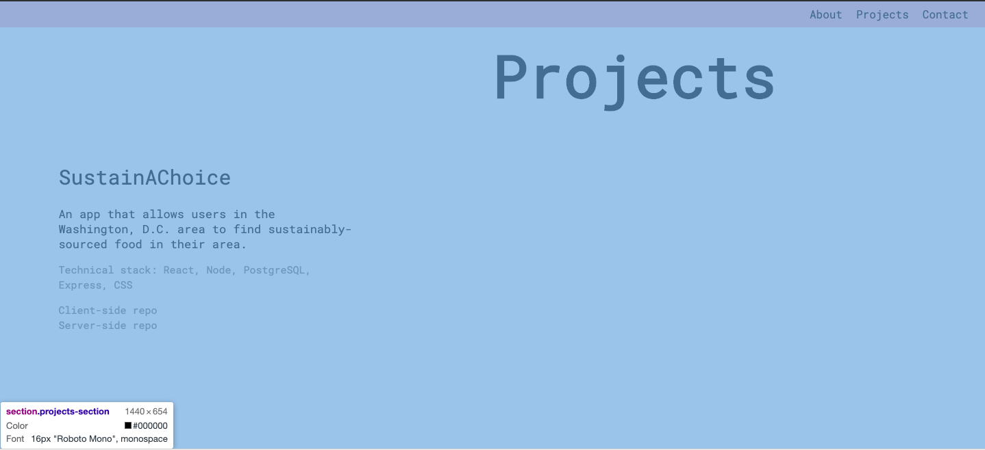
在这里,我的滚动条位于最底层,现在我无法访问导航条。我只能得到整个区域。
这是我的密码。抱歉,如果我在弃码,我只是不知道该展示什么。
<div id="main-page">
      <nav>
        <div id="about-top">About</div>
        <div id="projects-top">Projects</div>
        <div id="contact-top">Contact</div>
      </nav>

        <section class="header" id="contact">
            <header role="banner">

              <div class="name">
                <h1>Farah Gustafson</h1>
              </div>
              <div class="occupation">
                <h2>Full stack developer</h2>
              </div>

              <div class="contact">
                <div class="phone">
                  <p class="contact-title">phone</p>
                  <p class="contact-info">(301) ******</p>
                </div>
                <div class="email">
                  <p class="contact-title">email</p>
                  <p class="contact-info">f------</p>
                </div>
                <div class="location">
                  <p class="contact-title">location:</p>
                  <p class="contact-info">Washington</p>
                </div>
                <div class="find-me">
                  <p class="contact-title">find me</p>
                  <a class="contact-info" href="https://github.com/Farahgus10">GitHub</a>
                  <a class="contact-info" href="https://www.linkedin.com/in/farah-gustafson/">Linkedin</a>
                </div>
              </div>

            </header>
        </section>

        <section class="about-me">
          <div class="about" id="about">
            <div class="about-box">
              <h1>About</h1>
            </div>
            <div class="bio-box">
              <h3>Bio</h3>
              <p class="bio-text">I'm a full-stack developer who values collaborative work, open minds, and a desire to keep learning above all else.</p>
              <p class="bio-text">Besides coding, a typical week consists of exploring the great outdoors with my dog, learning new cooking skills, or curled up with a good book. </p>
              <p class="bio-text">If you're interested in working with me, or just want to say hello, feel free to contact me through phone, email, or Linkedin.</p>
            </div>
            <div class="skills-box">
              <h3>Skills</h3>
              <p class="skills-text">JavaScript, HTML5, CSS3</p>
              <p class="skills-text">React, jQuery</p>
              <p class="skills-text">Node, Express, PostgreSQL</p>
            </div>
          </div>
        </section>

        <section class="projects-section">
          <div class="projects" id="projects">
            <div class="project-main"><h1>Projects</h1></div>

            <a class="project-link" href="https://farah-sustainachoice-app.now.sh">
              <div class="project-picture"></div>
            </a>

            <div class="project-title">SustainAChoice</div>
            <div class="project-description">An app that allows users in the Washington, D.C. area to find sustainably-sourced food in their area.</br>
              <p class="tech-stack">Technical stack: React, Node, PostgreSQL, Express, CSS</p>

              <a href="">Client-side repo</a></br>
              <a href="">Server-side repo</a></br>
            </div>

          </div>
        </section>

    </div>
CSS:
 * { box-sizing: border-box; }

html, body{
    width: 100%;
    height: 100%;
    padding: 0;
    margin: 0;
}

body{
    display: flex;
    flex-direction: column;
}

section{
    width: 100%;
    height: 100%;
}

nav {
    position: fixed;
    display: flex;
    justify-content: flex-end;
    padding-right: 15px;
    width: 100%;
    top: 0;
    background-color: pink;
    font-family: 'Roboto Mono', monospace;
  }

nav>div {
    margin: 5px;
    padding: 5px;
}
nav div:hover {
    cursor: pointer;
    text-decoration: underline;
}

.projects-section{
    display: flex;
    flex-direction: column;
    position: relative;
    height: 100vh;
    width: 100%;
    font-family: 'Roboto Mono', monospace;
}

.project-main{
    text-align: right;
    margin-top: 20px;
    margin-left: 35%;
    font-size: 20px;
    width: fit-content;
    font-family: 'Roboto Mono', monospace;
}

.project-picture{
    top: 60px;
    height: 200px;
    width: 100%;
    margin-top: 5%;
    background-image: url('./Images/NavbarHeader.png');
    background-size: cover;
    background-position: center;
}

.project-title{
    margin-top: 3%;
    margin-left: auto;
    margin-right: auto;
    width: fit-content;
    font-size: 20px;
    /* font-family: 'Chivo', sans-serif; */
}

.project-description{
    margin-top: 3%;
    margin-left: auto;
    margin-right: auto;
    width: 300px;
    line-height: 20px;
    font-size: 13px;
}
.tech-stack{
    font-size: 13px;
    color: grey;
}
.project-description a {
    font-size: 13px;
    text-decoration: none;
    color: grey;
}
.project-description a:hover {
    cursor: pointer;
    text-decoration: underline;
}
.project-link a:hover{
    cursor: pointer;
}- 链接到JsFiddle
什么给予??
回答 2
Stack Overflow用户
发布于 2019-06-27 14:57:00
您的相对位置projects-section部分会妨碍您的导航条。相对位置似乎没必要吗?或者,您可以在导航栏中添加一个z索引。
Stack Overflow用户
发布于 2019-06-27 14:58:07
将导航栏上的z索引设置为高值(比如999 ),这应该可以修复它。
页脚部分是重叠的肚脐。
页面原文内容由Stack Overflow提供。腾讯云小微IT领域专用引擎提供翻译支持
原文链接:
https://stackoverflow.com/questions/56793350
复制相关文章
相似问题
腾讯云开发者

Copyright © 2013 - 2026 Tencent Cloud. All Rights Reserved. 腾讯云 版权所有
深圳市腾讯计算机系统有限公司 ICP备案/许可证号:粤B2-20090059  粤公网安备44030502008569号
腾讯云计算(北京)有限责任公司 京ICP证150476号 | 京ICP备11018762号