
如何在一个混合在一起的三角形中设置3个点创建svg梯度
<svg id="color-gradient" width="400" height="400" version="1.1" xmlns="http://www.w3.org/2000/svg">
  <defs>
      <linearGradient id="gradient" x1="0" x2="0" y1="0" y2="1">
        <stop offset="0%" stop-color="red"/>
        <stop offset="50%" stop-color="blue" />
        <stop offset="100%" stop-color="yellow"/>
      </linearGradient>
  </defs>
    <circle cx="200" cy="200" r="100" fill="url(#gradient)"/>
</svg>
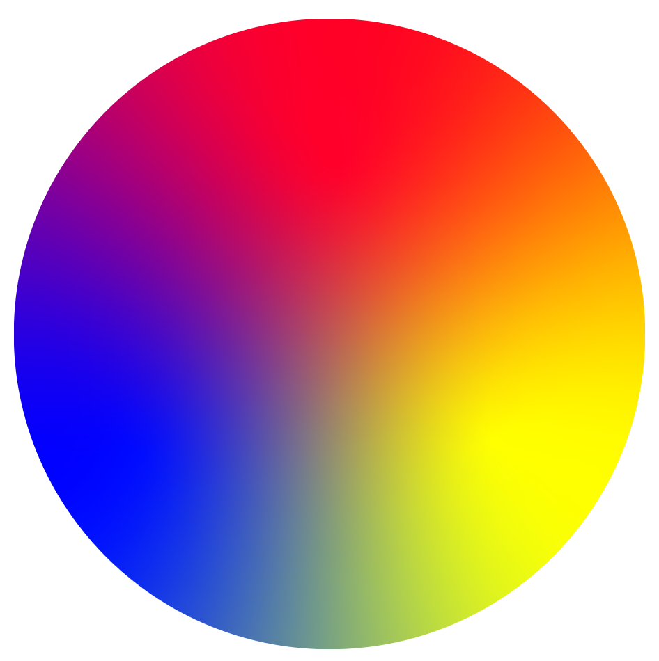
我想要创建一个svg梯度在一个圆,有3个点的颜色,设置在一个三角形,像这样。
<svg id="color-gradient" width="400" height="400" version="1.1" xmlns="http://www.w3.org/2000/svg">
  <defs>
      <linearGradient id="gradient" x1="0" x2="0" y1="0" y2="1">
        <stop offset="0%" stop-color="red"/>
        <stop offset="50%" stop-color="blue" />
        <stop offset="100%" stop-color="yellow"/>
      </linearGradient>
  </defs>
    <circle cx="200" cy="200" r="100" fill="url(#gradient)"/>
</svg>
我尝试过用三个停止创建一个线性梯度,但我不知道如何定位我需要它们的位置(左上角)。
回答 3
Stack Overflow用户
发布于 2019-06-22 10:02:21
这个话题的灵感来源于@Paul LeBeau这个答案
这个问题的作者没有问关于动画的问题。但我认为这些选择对某些人是有用的。
- 梯度旋转
为一组元素添加了一个动画命令:
circle cx="50" cy="50" r="5" fill="white" stroke="silver">
     <animateTransform attributeName="transform" type="rotate" xlink:href="#gr1" dur="2s" values="0 50 50;360   50 50" repeatcount="indefinite"/>
   </circle>
<style>
svg {
  width: 400px;
}
</style>
<svg viewBox="0 0 100 100">
  <defs>
    <filter id="blur" color-interpolation-filters="linear" x="-50%" y="-50%" width="200%" height="200%">
      <feGaussianBlur in="SourceGraphic" stdDeviation="10"/>
    </filter>
    <mask id="circle">
      <circle cx="50" cy="50" r="50" fill="white">

	   </circle>
    </mask>
  </defs>
  <g id="gr1" mask="url(#circle)" filter="url(#blur)">
    <rect x="-10" width="110" height="110" fill="blue"/>
    <rect x="50" width="60" height="110" fill="yellow"/>
    <polygon points="50,50, 60,110, 40,110" fill="#0f8"/>
    <polygon points="0,0, 100,0, 100,20, 50,50, 0,20" fill="red"/>
    <polygon points="0,10, 50,50, 0,30" fill="#f0f"/>
    <polygon points="100,10, 100,30, 50,50" fill="#f80"/>
  </g>
   <circle cx="50" cy="50" r="5" fill="white" stroke="silver">
     <animateTransform attributeName="transform" type="rotate" xlink:href="#gr1" dur="2s" values="0 50 50;360   50 50" repeatcount="indefinite"/>
   </circle>

   </svg>
- 动画轨迹
添加了圆圈半径的动画命令。
<circle cx="50" cy="50" r="5" fill="none" stroke-width="0.25" stroke="gray" >
     <animate id="an1" attributeName="r" values="5;50" dur="2s" begin="0s" repeatcount="indefinite" />
    </circle>
<style>
svg {
  width: 400px;
}
</style>
<svg viewBox="0 0 100 100">
  <defs>
    <filter id="blur" color-interpolation-filters="linear" x="-50%" y="-50%" width="200%" height="200%">
      <feGaussianBlur in="SourceGraphic" stdDeviation="10"/>
    </filter>
    <mask id="circle">
      <circle cx="50" cy="50" r="50" fill="white">
	    </circle>
    </mask>
  </defs>
  <g id="gr1" mask="url(#circle)" filter="url(#blur)">
    <rect x="-10" width="110" height="110" fill="blue"/>
    <rect x="50" width="60" height="110" fill="yellow"/>
    <polygon points="50,50, 60,110, 40,110" fill="#0f8"/>
    <polygon points="0,0, 100,0, 100,20, 50,50, 0,20" fill="red"/>
    <polygon points="0,10, 50,50, 0,30" fill="#f0f"/>
    <polygon points="100,10, 100,30, 50,50" fill="#f80"/>
  </g>
   <circle cx="50" cy="50" r="5" fill="white" stroke="silver">
     <animateTransform attributeName="transform" type="rotate" xlink:href="#gr1" dur="2s" values="0 50 50;360   50 50" repeatcount="indefinite"/>
   </circle>
   <circle cx="50" cy="50" r="5" fill="none" stroke-width="0.25" stroke="gray" >
     <animate id="an1" attributeName="r" values="5;50" dur="2s" begin="0s" repeatcount="indefinite" />
	</circle>
  <circle cx="50" cy="50" r="5" fill="none" stroke-width="0.25" stroke="gray" >
     <animate id="an2" attributeName="r" values="5;50" dur="2s" begin="0.5s" repeatcount="indefinite" />
   </circle>
   <circle cx="50" cy="50" r="5" fill="none" stroke-width="0.25" stroke="gray" >
     <animate id="an3" attributeName="r" values="5;50" dur="2s" begin="1s" repeatcount="indefinite" />
   </circle>
     <circle cx="50" cy="50" r="5" fill="none" stroke-width="0.25" stroke="gray" >
     <animate id="an3" attributeName="r" values="5;50" dur="2s" begin="1.5s" repeatcount="indefinite" />
   </circle>
 <circle cx="50" cy="50" r="5" fill="none" stroke-width="0.25" stroke="gray" >
     <animate id="an3" attributeName="r" values="5;50" dur="2s" begin="2s" repeatcount="indefinite" />
   </circle>
   </svg>
Stack Overflow用户
发布于 2019-06-21 15:59:13
这是你能得到的最接近的地方。
svg {
  width: 400px;
}<svg viewBox="0 0 100 100">
<defs>
<filter id="blur" color-interpolation-filters="linear" x="-50%" y="-50%" width="200%" height="200%">
<feGaussianBlur in="SourceGraphic" stdDeviation="9"/>
</filter>
<mask id="circle">
<circle cx="50" cy="50" r="50" fill="white"/>
</mask>
</defs>
<g mask="url(#circle)" filter="url(#blur)">
<rect x="-10" width="110" height="110" fill="blue"/>
<rect x="50" width="60" height="110" fill="yellow"/>
<polygon points="50,50, 60,110, 40,110" fill="#0f8"/>
<polygon points="0,0, 100,0, 100,20, 50,50, 0,20" fill="red"/>
<polygon points="0,10, 50,50, 0,30" fill="#f0f"/>
<polygon points="100,10, 100,30, 50,50" fill="#f80"/>
</g>
</svg>
因为在CSS/SVG中得到的混合完全是通过分别组合RGB颜色的红色、绿色和蓝色通道来工作的,所以它不知道当我们混合蓝色和黄色时,我们会看到绿色。相反,你只会有一片模糊的灰色。
所以在上面的例子中,我“作弊”,在我们的三种主要颜色之间添加了“正确”的颜色。例如,我在蓝色和黄色之间放了一小块绿色。
如果我不这样做,上面的示例如下所示:
svg {
  width: 400px;
}<svg viewBox="0 0 100 100">
<defs>
<filter id="blur" color-interpolation-filters="linear" x="-50%" y="-50%" width="200%" height="200%">
<feGaussianBlur in="SourceGraphic" stdDeviation="7"/>
</filter>
<mask id="circle">
<circle cx="50" cy="50" r="50" fill="white"/>
</mask>
</defs>
<g mask="url(#circle)" filter="url(#blur)">
<rect x="-10" width="110" height="110" fill="blue"/>
<rect x="50" width="60" height="110" fill="yellow"/>
<polygon points="0,0, 100,0, 100,20, 50,50, 0,20" fill="red"/>
</g>
</svg>
Stack Overflow用户
发布于 2022-06-21 21:47:40
我也想试试。
根据浏览器的不同,结果是非常不同的,例如firefox不会产生非常好的结果。(虽然其他解决方案也是如此,但我认为)
但它不需要手动插入复合颜色,并在Safari和Chrome…上产生非常均匀的效果
<svg viewBox="0 0 100 100">
    <defs>
        <filter id="colorblend">
            <feColorMatrix in="SourceGraphic" result="red" type="matrix" values="
            1 0 0 0 0
            0 0 0 0 0
            0 0 0 0 0
            1 0 0 0 0" />
            <feColorMatrix in="SourceGraphic" result="green" type="matrix" values="
            0 0 0 0 0
            0 1 0 0 0
            0 0 0 0 0
            0 1 0 0 0" />
            <feColorMatrix in="SourceGraphic" result="blue" type="matrix" values="
            0 0 0 0 0
            0 0 0 0 0
            0 0 1 0 0
            0 0 1 0 0" />

            <feGaussianBlur in="red" stdDeviation="20" result="red" />
            <feGaussianBlur in="green" stdDeviation="20" result="green" />
            <feGaussianBlur in="blue" stdDeviation="20" result="blue" />

            <feBlend mode="screen" in="red" in2="green" result="redplusgreen" />
            <feBlend mode="screen" in="redplusgreen" in2="blue" result="rainbow" />

            <!--fix alpha -->
            <feColorMatrix in="rainbow" result="rainbow" type="matrix" values="
            1 0 0 0 0
            0 1 0 0 0
            0 0 1 0 0
            0 0 0 20 0" />

            <!-- increase brightness -->
            <feBlend in="rainbow" in2="rainbow" mode="screen" result="rainbow" />

            <!-- remove artefacts -->
            <feGaussianBlur in="rainbow" stdDeviation="1" />
        </filter>

        <mask id="mask">
            <circle cx="50" cy="50" r="50" fill="white"></circle>
        </mask>
    </defs>
    <g mask="url(#mask)" filter="url(#colorblend)">
        <rect x="-10" width="110" height="110" fill="red" />
        <rect x="50" width="60" height="110" fill="lime" />
        <polygon points="0,0, 100,0, 100,30, 50,50, 0,30" fill="blue" />
    </g>
</svg>
https://stackoverflow.com/questions/56701484
复制相似问题
腾讯云开发者

Copyright © 2013 - 2026 Tencent Cloud. All Rights Reserved. 腾讯云 版权所有
深圳市腾讯计算机系统有限公司 ICP备案/许可证号:粤B2-20090059  粤公网安备44030502008569号
腾讯云计算(北京)有限责任公司 京ICP证150476号 | 京ICP备11018762号