
如何创建在Python中每个变量的值之间存在空白的堆叠条形图
如何创建在Python中每个变量的值之间存在空白的堆叠条形图
提问于 2019-05-30 12:47:15
我在用Python创建一个堆叠条形图时遇到了问题。我有3个变量的数据如下:
A=[3,5,7]
B=[4,5,7]
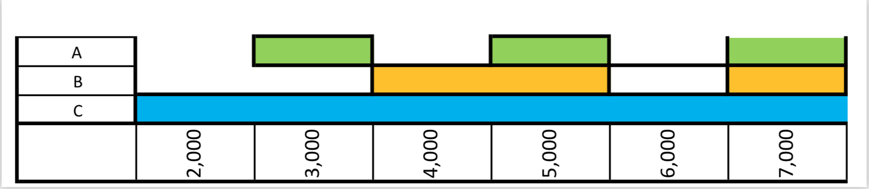
C=[2,3,4,5,6,7]我想要创建一个条形图,每个变量的值之间存在空白,如下所示
条形图,每个变量的值之间存在差距:
有人能帮我处理这张图吗?非常感谢。
回答 1
Stack Overflow用户
回答已采纳
发布于 2019-05-31 08:48:30
实际上,您想要绘制一个颜色表或接近甘特图的东西。我不知道用Python做这件事真的很方便。
一种解决方案是使用matplotlib.pyplot.grid (医生)。这个讨论提供了一个解决方案。
另一个解决方案是研究plotly包。它为表图和甘特图(医生)提供了非常漂亮的输出。
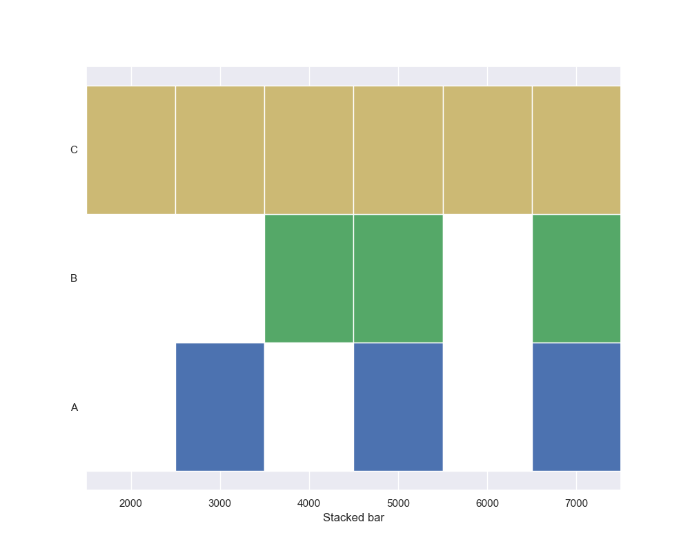
这里,我将向您展示一个类似的输出,使用来自hbar matplotlib的。主要的想法是重建一个细胞网格。每一行代表一个类(例如A、B或C)。每一行由相同数量的单元格组成。每个单元格具有相同的宽度。单元格的颜色由数据的二进制转换定义。
要调整x-axis标签,只需手动移动它们。
# Import module
import seaborn
import matplotlib.pyplot as plt
import numpy as np

##########################
#       Your input       #
##########################

A = [3, 5, 7]
B = [4, 5, 7]
C = [2, 3, 4, 5, 6, 7]


##########################
# Prepra the data        #
##########################
my_list = [A, B, C]
segments = 8
cell_width = 1000
nb_x_range = [i * cell_width for i in range(2, segments)]
classes = ["A", "B", "C"]
colors_def = {'A': {0: "w", 1: "b"},
              'B': {0: "w", 1: "g"},
              'C': {0: "w", 1: "y"},
              }

def create_data(my_list):
    data = np.zeros((segments + 1, len(classes)))
    for i, sub_list in enumerate(my_list):
        for elt in sub_list:
            data[elt, i] = 1
    return data

data = create_data(my_list)
print(data)
# [[0. 0. 0.]
#  [0. 0. 0.]
#  [0. 0. 1.]
#  [1. 0. 1.]
#  [0. 1. 1.]
#  [1. 1. 1.]
#  [0. 0. 1.]
#  [1. 1. 1.]
#  [0. 0. 0.]]

y_pos = np.arange(len(classes))
# left alignment of data starts at zero
left = np.zeros(len(my_list)) - cell_width/2


##########################
#       Create plot      #
##########################
# Set sea born for prettier graph
seaborn.set()
# create figure
fig = plt.figure(figsize=(10, 8))
ax = fig.add_subplot(111)
# Set X axis (shifted)
ax.set_xlim((min(nb_x_range)-cell_width/2, max(nb_x_range)+cell_width/2))

# For each cell
for d in data:
    # Define color for each row
    colors = [colors_def[classes[i]][bi] for i, bi in enumerate(d)]
    # e.g. colors = [colors_def["A"][d[0]], colors_def["B"][d[1]], colors_def["C"][d[2]]]

    # Draw cell
    ax.barh(y_pos, cell_width,
            height=1,           # Heights of horizontal bars
            color=colors,       # Colors
            left=left)          # Left padd from y-axis
    # Update margin
    left += cell_width

# Axis graduation
ax.set_yticks(y_pos)
ax.set_xticks(nb_x_range)
ax.set_yticklabels(classes)
ax.set_xlabel('Stacked bar')

plt.show()
输出如下所示:
页面原文内容由Stack Overflow提供。腾讯云小微IT领域专用引擎提供翻译支持
原文链接:
https://stackoverflow.com/questions/56378621
复制相关文章
相似问题
腾讯云开发者

Copyright © 2013 - 2026 Tencent Cloud. All Rights Reserved. 腾讯云 版权所有
深圳市腾讯计算机系统有限公司 ICP备案/许可证号:粤B2-20090059 ![]() 粤公网安备44030502008569号
粤公网安备44030502008569号
腾讯云计算(北京)有限责任公司 京ICP证150476号 | 京ICP备11018762号