
将图例中的颜色顺序与叠层条形图中的颜色顺序相对应
将图例中的颜色顺序与叠层条形图中的颜色顺序相对应
提问于 2019-05-02 12:53:12
我有下面的数据:
Target_Category<-c("Adhesion","Cytochrome")
Validated<-c(5,12)
Candidate<-c(10,23)
Exploratory<-c(7,6)
Unknown<-c(9,4)
dataf<-data.frame(Target_Category,Validated,Candidate,Exploratory,Unknown)
我在下面创建了堆叠的条形图:
library(tidyverse)

d<-dataf %>%
  gather(col, value, -Target_Category) %>%
  ggplot() +
  geom_bar(aes(Target_Category, value, fill = col), stat="identity")
d+scale_fill_manual(values=c("orange","gray48","black","green4"),
                    breaks = c("Validated", "Candidate",
                               "Exploratory", "Unknown"))
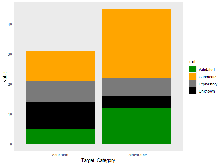
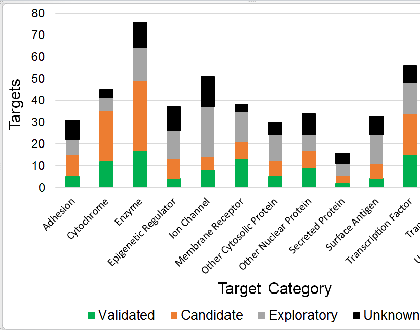
问题是颜色值和断点不能正确对应,因为正确的输出应该是绿色、橙色、灰色、黑色,对应应该像下面的图像。图例名称的顺序是正确的,但不是情节中的颜色顺序。
即使我用
d<-dataf %>%
  gather(col, value, -Target_Category) %>%
  mutate(col=factor(col, levels = c("Validated", "Candidate",
                                    "Exploratory", "Unknown"))) %>%
  ggplot() +
  geom_bar(aes(Target_Category, value, fill = col), stat="identity")

d+scale_fill_manual(values=c("orange","gray48","black","green4"),
                    breaks = c("Validated", "Candidate",
                               "Exploratory", "Unknown"))
输出结果与第二幅图像中的预期输出不一样。
回答 1
Stack Overflow用户
回答已采纳
发布于 2019-05-02 13:06:17
正如camille所解释的,您可以使用因子来控制颜色的顺序:
    d<-dataf %>%
  gather(col, value, -Target_Category) %>%
  mutate(col=factor(col, levels = c("Unknown", "Exploratory", "Candidate", "Validated"))) %>%
  ggplot() +
  geom_bar(aes(Target_Category, value, fill = col), stat="identity")

d+scale_fill_manual(values=c("black", "gray48", "orange", "green4"),
                    breaks = c("Validated", "Candidate",
"Exploratory", "Unknown"))页面原文内容由Stack Overflow提供。腾讯云小微IT领域专用引擎提供翻译支持
原文链接:
https://stackoverflow.com/questions/55952934
复制相关文章
相似问题
腾讯云开发者

Copyright © 2013 - 2026 Tencent Cloud. All Rights Reserved. 腾讯云 版权所有
深圳市腾讯计算机系统有限公司 ICP备案/许可证号:粤B2-20090059 ![]() 粤公网安备44030502008569号
粤公网安备44030502008569号
腾讯云计算(北京)有限责任公司 京ICP证150476号 | 京ICP备11018762号