
简洁的方式添加线段到图形中(用python/jupyter笔记本)?
我想要创建一个棒棒糖图与几个水平线段,像这样- https://python-graph-gallery.com/184-lollipop-plot-with-2-group。我想巧妙地使用,因为我更喜欢图形(和简单的交互性),但找不到简洁的方法。
有两个行图(https://plot.ly/python/line-charts/),您可以在布局(https://plot.ly/python/shapes/#vertical-and-horizontal-lines-positioned-relative-to-the-axes)中添加行,但这两种解决方案都要求单独添加每个线段,每一行代码大约有4-8行。虽然我可以只是为了-循环这个,但是如果有人能告诉我任何内置矢量化的东西,比如matplotlib解决方案(第一个链接),我会很感激!
编辑:还尝试了下面的代码,首先使图ala matplotlib,然后转换成平缓。线段在过程中消失。开始觉得这是不可能的。
mpl_fig = plt.figure()

# make matplotlib plot - WITH HLINES
plt.rcParams['figure.figsize'] = [5,5]
ax = mpl_fig.add_subplot(111)
ax.hlines(y=my_range, xmin=ordered_df['value1'], xmax=ordered_df['value2'],
color='grey', alpha=0.4)
ax.scatter(ordered_df['value1'], my_range, color='skyblue', alpha=1,
label='value1')
ax.scatter(ordered_df['value2'], my_range, color='green', alpha=0.4 ,
label='value2')
ax.legend()

# convert to plotly
plotly_fig = tls.mpl_to_plotly(mpl_fig)
plotly_fig['layout']['xaxis1']['showgrid'] = True
plotly_fig['layout']['xaxis1']['autorange'] = True
plotly_fig['layout']['yaxis1']['showgrid'] = True
plotly_fig['layout']['yaxis1']['autorange'] = True

# plot: hlines disappear :/
iplot(plotly_fig)回答 2
Stack Overflow用户
发布于 2019-06-24 18:04:29
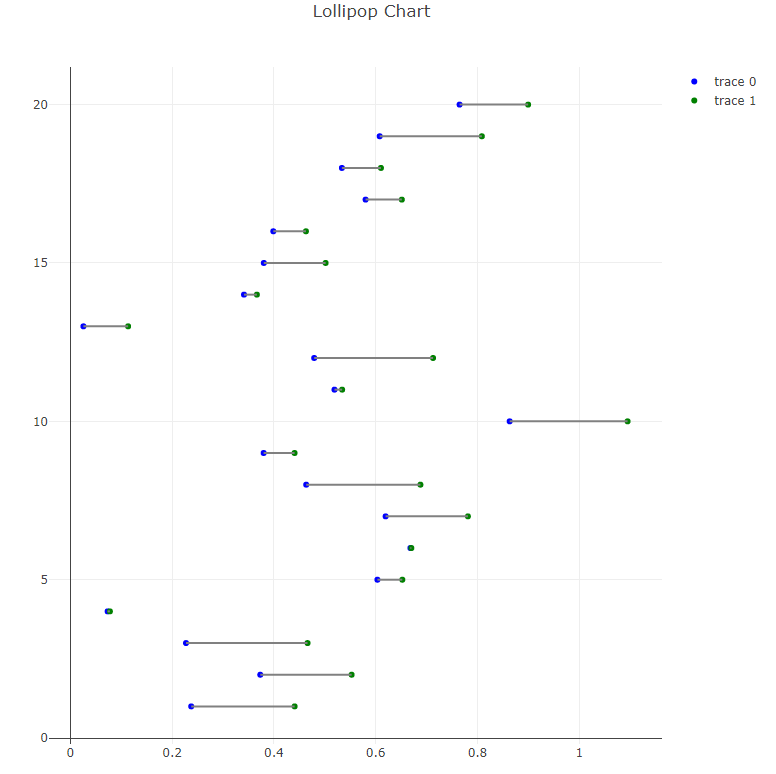
实际上并没有为这种图表提供内置的矢量化,因为它可以很容易地自己完成,请参阅我的示例,基于您提供的链接:
import pandas as pd
import numpy as np
import plotly.offline as pyo
import plotly.graph_objs as go

# Create a dataframe
value1 = np.random.uniform(size = 20)
value2 = value1 + np.random.uniform(size = 20) / 4
df = pd.DataFrame({'group':list(map(chr, range(65, 85))), 'value1':value1 , 'value2':value2 })

my_range=range(1,len(df.index)+1)

# Add title and axis names
data1 = go.Scatter(
        x=df['value1'],
        y=np.array(my_range),
        mode='markers',
        marker=dict(color='blue')
    )


data2 = go.Scatter(
        x=df['value2'],
        y=np.array(my_range),
        mode='markers',
        marker=dict(color='green')
    )

# Horizontal line shape
shapes=[dict(
        type='line',
        x0 = df['value1'].loc[i],
        y0 = i + 1,
        x1 = df['value2'].loc[i],
        y1 = i + 1,
        line = dict(
            color = 'grey',
            width = 2
        )
    ) for i in range(len(df['value1']))]


layout = go.Layout(
    shapes = shapes,
    title='Lollipop Chart'
)

# Plot the chart
fig = go.Figure([data1, data2], layout)

pyo.plot(fig)
结果我得到了:
Stack Overflow用户
发布于 2021-07-15 18:20:10
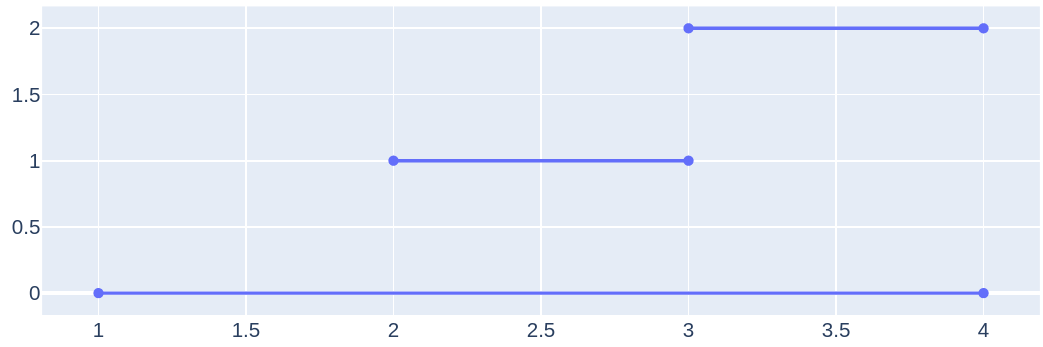
您可以在这样的数据中使用None:
import plotly.offline as pyo
import plotly.graph_objs as go

fig = go.Figure()

x = [1, 4, None, 2, 3, None, 3, 4]
y = [0, 0, None, 1, 1, None, 2, 2]

fig.add_trace(
    go.Scatter(x=x, y=y))

pyo.plot(fig)
https://stackoverflow.com/questions/55939775
复制相似问题
腾讯云开发者

Copyright © 2013 - 2026 Tencent Cloud. All Rights Reserved. 腾讯云 版权所有
深圳市腾讯计算机系统有限公司 ICP备案/许可证号:粤B2-20090059 ![]() 粤公网安备44030502008569号
粤公网安备44030502008569号
腾讯云计算(北京)有限责任公司 京ICP证150476号 | 京ICP备11018762号