
删除g-图条形图中的空轮廓
删除g-图条形图中的空轮廓
提问于 2019-04-23 09:51:33
我有这样一个数据框架:
df <- data.frame(time = rep(1:10, 2),
                 value = c(0,0,0,0, abs(rnorm(6)),
                           0,0,0,0,0, abs(rnorm(5))),
                 group = c(rep("B", 10),
                         rep("A", 10)),
                 group_fill = c(rep("no", 7),
                              rep("B", 3),
                              rep("no", 7),
                              rep("A", 3)) )
我把这画成一个堆叠的条形图:
ggplot(df, aes(x = time, y = value, color= group, fill = group_fill)) +
  geom_bar(stat = "identity") +
  scale_color_manual(values=c("#E69F00", "#56B4E9", "#333333")) +
  scale_fill_manual(values=c("#E69F00", "#56B4E9", "#FFFFFF")) +
  scale_x_continuous(breaks = 1:10) +
  theme_bw()
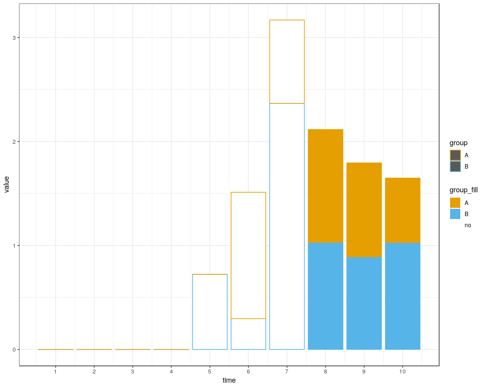
从数据集可以明显看出,"B“的前5次观测和"A”的前4次观测完全为零。
然而,ggplot为这些值添加了一个橙色的轮廓。
我如何删除第一个1:5观测中"A“的橙色轮廓?
重要的是,我希望时间5-7没有填充,即只有轮廓。
第二个问题是,我怎样才能让这个“集团”传奇充满蓝色和橙色,而不是灰色?
回答 3
Stack Overflow用户
回答已采纳
发布于 2019-04-23 09:56:19
编辑,把零转换成NA,这似乎是可行的。
df <- data.frame(time = rep(1:10, 2),
                 value = c(0,0,0,0, abs(rnorm(6)),
                           0,0,0,0,0, abs(rnorm(5))),
                 group = c(rep("B", 10),
                           rep("A", 10)),
                 group_fill = c(rep("no", 7),
                                rep("B", 3),
                                rep("no", 7),
                                rep("A", 3)) )

 df[df == 0] <- NA

  ggplot(df, aes(x = time, y = value, color = group, fill = group_fill)) +
  geom_bar(stat = "identity") +
  scale_color_manual(values=c("#E69F00", "#56B4E9", "#333333"), guide = F) +
  scale_fill_manual(values=c("#E69F00", "#56B4E9", "#FFFFFF")) +
  scale_x_continuous(breaks = 1:10) +
theme_bw()Stack Overflow用户
发布于 2019-04-23 09:57:35
子集数据帧以排除零subset(df, value != 0),并用guide = FALSE删除颜色图例
set.seed(1)
df <- data.frame(time = rep(1:10, 2),
                 value = c(0,0,0,0, abs(rnorm(6)),
                           0,0,0,0,0, abs(rnorm(5))),
                 group = c(rep("B", 10),
                         rep("A", 10)),
                 group_fill = c(rep("no", 7),
                              rep("B", 3),
                              rep("no", 7),
                              rep("A", 3)) )
    ggplot(subset(df, value != 0), aes(x = time, y = value, color= group, fill = group_fill)) +
          geom_bar(stat = "identity") +
          scale_color_manual(values = c("#E69F00", "#56B4E9", "#333333"),  guide = FALSE) +
          scale_fill_manual(values = c("#E69F00", "#56B4E9", "#FFFFFF")) +
          scale_x_discrete(breaks = 1:10) +
          theme_bw()

Stack Overflow用户
发布于 2019-04-23 11:34:39
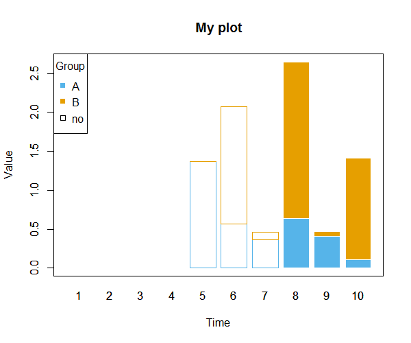
如果您还想在没有任何条形线的情况下显示空时间,则可以使用基本barplot。首先,我们需要宽格式的数据,可以使用reshape (您也可以查看?data.table::dcast)实现数据,并创建两个克隆。
dat1 <- reshape(dat[-4], idvar="group", direction="wide")
dat1[] <- lapply(dat1, function(x) if (all(x == 0)) NA else x)  # set zeros to NA
dat1.1 <- dat1.2 <- dat1 # create clones在一个克隆中,我们将“没有时间”设置为NA,而在另一个克隆中则设置为相反。
no.times <- paste0("value.", 1:7)

dat1.1[names(dat1) %in% no.times] <- NA
dat1.2[-which(names(dat1) %in% no.times)] <- NA现在,我们可以用不同的border和col设置来绘制一个图而另一个图(使用选项col)。
barplot(as.matrix(dat1.1[-1]), names.arg=1:10,
        ylim=c(-.1, max(colSums(dat1[-1]), na.rm=TRUE) + .1),
        border=0, col=c("#56B4E9", "#E69F00"),
        main="My plot", xlab="Time", ylab="Value")
barplot(as.matrix(dat1.2[-1]), names.arg=1:10,
        border=c("#56B4E9", "#E69F00"), col=NA, add=TRUE)
box()  # add box around plot
legend("topleft", legend=c("A", "B", "no"), pch=c(15, 15, 0),  # add legend
       col=c("#56B4E9", "#E69F00", "black"), title="Group")
结果
数据
dat <- structure(list(time = c(1L, 2L, 3L, 4L, 5L, 6L, 7L, 8L, 9L, 10L,
1L, 2L, 3L, 4L, 5L, 6L, 7L, 8L, 9L, 10L), value = c(0, 0, 0,
0, 1.37095844714667, 0.564698171396089, 0.363128411337339, 0.63286260496104,
0.404268323140999, 0.106124516091484, 0, 0, 0, 0, 0, 1.51152199743894,
0.0946590384130976, 2.01842371387704, 0.062714099052421, 1.30486965422349
), group = structure(c(2L, 2L, 2L, 2L, 2L, 2L, 2L, 2L, 2L, 2L,
1L, 1L, 1L, 1L, 1L, 1L, 1L, 1L, 1L, 1L), .Label = c("A", "B"), class = "factor"),
    group_fill = structure(c(3L, 3L, 3L, 3L, 3L, 3L, 3L, 2L,
    2L, 2L, 3L, 3L, 3L, 3L, 3L, 3L, 3L, 1L, 1L, 1L), .Label = c("A",
    "B", "no"), class = "factor")), class = "data.frame", row.names = c(NA,
-20L))页面原文内容由Stack Overflow提供。腾讯云小微IT领域专用引擎提供翻译支持
原文链接:
https://stackoverflow.com/questions/55808533
复制相关文章
相似问题
腾讯云开发者

Copyright © 2013 - 2026 Tencent Cloud. All Rights Reserved. 腾讯云 版权所有
深圳市腾讯计算机系统有限公司 ICP备案/许可证号:粤B2-20090059 ![]() 粤公网安备44030502008569号
粤公网安备44030502008569号
腾讯云计算(北京)有限责任公司 京ICP证150476号 | 京ICP备11018762号