
如何在r中的条形图中,在x轴下在2行中创建2个变量(不使用ggplot)
如何在r中的条形图中,在x轴下在2行中创建2个变量(不使用ggplot)
提问于 2019-03-28 15:51:04
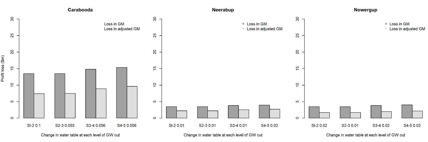
我试着在条形图中创建一个更清晰的x轴,但不知道怎么做。有人能帮忙吗?
用我当前的代码,我可以画一个在x轴上有两个变量的条形图。但是,两个变量的值是站在一起的,这使读者不清楚。我想要x轴中每个变量的每一行。这是我当前的代码和结果
我的预期结果是:在x轴中,第一行是0.1,0.0555等,第二行是S1-2,S2-3。
mxCarabooda <- structure(c(13.47258, 7.430879, 13.47151, 7.53012, 14.83685,
                           8.940968, 15.37691, 9.617533), .Dim = c(2L, 4L), .Dimnames = list(
                             c("ChangeNP", "ChangeNP.1"), c("Sl-2 0.1", "S2-3 0.055",
                                                            "S3-4 0.056", "S4-5 0.056")))
mxNeerabup <- structure(c(3.499426, 2.232676, 3.499596, 2.239664, 3.836086,
                          2.566649, 3.995115, 2.725839), .Dim = c(2L, 4L), .Dimnames = list(
                            c("ChangeNP", "ChangeNP.1"), c("Sl-2 0.01", "S2-3 0.01",
                                                           "S3-4 0.01", "S4-5 0.02")))

mxNowergup <- structure(c(3.5135, 1.700544, 3.513586, 1.710387, 3.850266, 2.034689,
                          4.009113, 2.194351), .Dim = c(2L, 4L), .Dimnames = list(
                            c("ChangeNP", "ChangeNP.1"), c("Sl-2 0.02", "S2-3 0.01",
                                                           "S3-4 0.02", "S4-5 0.02")))


tiff("barplot.tiff", width=260, height=100, units='mm', res=300)
par(mfrow=c(1,3), mar=c(5, 4, 4, 0.2))
colours <- c("gray63","gray87")

barplot(mxCarabooda, main='Carabooda', ylab='Profit loss ($m)',
        xlab='Change in water table at each level of GW cut', beside=TRUE,
        col=colours, ylim=c(0,30))
legend('topright', bty="n", legend=c('Loss in GM','Loss in adjusted GM'),
       col=c("gray63","gray87"))

barplot(mxNeerabup,main='Neerabup', ylab='',
        xlab='Change in water table at each level of GW cut', beside=TRUE,
        col=colours, ylim=c(0,30))
legend('topright', bty="n", legend=c('Loss in GM','Loss in adjusted GM'),
       col=c("gray63","gray87"), pch=15)

barplot(mxNowergup,main='Nowergup', ylab='',
        xlab='Change in water table at each level of GW cut',beside=TRUE,
        col=colours, ylim=c(0,30))
legend('topright', bty="n", legend=c('Loss in GM','Loss in adjusted GM'),
       col=c("gray63","gray87"), pch=15)

dev.off()
回答 1
Stack Overflow用户
回答已采纳
发布于 2019-03-28 16:53:07
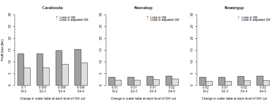
考虑调整默认为矩阵的名称属性的names.arg of barplot。具体来说,创建新的名称向量,反转空格分隔的原始colnames并用换行符替换空间:
条形标签
barsCarabooda <- gsub(" ", "\n",
                      lapply(strsplit(colnames(mxCarabooda), split=" "),
                             function(x) paste(rev(x), collapse=" "))
                     )

barsNeerabup <- gsub(" ", "\n",
                     lapply(strsplit(colnames(mxNeerabup), split=" "),
                            function(x) paste(rev(x), collapse=" "))
                    )

barsNowergup <- gsub(" ", "\n",
                     lapply(strsplit(colnames(mxNowergup), split=" "),
                            function(x) paste(rev(x), collapse=" "))
)用names.arg绘制图
par(mfrow=c(1,3), mar=c(5, 4, 4, 0.2))
colours <- c("gray63","gray87")

barplot(mxCarabooda, main='Carabooda', ylab='Profit loss ($m)',
        xlab='Change in water table at each level of GW cut', beside=TRUE,
        col=colours, ylim=c(0,30), names.arg=barsCarabooda)
legend('topright', bty="n", legend=c('Loss in GM','Loss in adjusted GM'),
       col=c("gray63","gray87"), pch=15)

barplot(mxNeerabup,main='Neerabup', ylab='',
        xlab='Change in water table at each level of GW cut', beside=TRUE,
        col=colours, ylim=c(0,30), names.arg=barsNeerabup)
legend('topright', bty="n", legend=c('Loss in GM','Loss in adjusted GM'),
       col=c("gray63","gray87"), pch=15)

barplot(mxNowergup,main='Nowergup', ylab='',
        xlab='Change in water table at each level of GW cut',beside=TRUE,
        col=colours, ylim=c(0,30), names.arg=barsNowergup)
legend('topright', bty="n", legend=c('Loss in GM','Loss in adjusted GM'),
       col=c("gray63","gray87"), pch=15)
页面原文内容由Stack Overflow提供。腾讯云小微IT领域专用引擎提供翻译支持
原文链接:
https://stackoverflow.com/questions/55401877
复制相关文章
相似问题
腾讯云开发者

Copyright © 2013 - 2026 Tencent Cloud. All Rights Reserved. 腾讯云 版权所有
深圳市腾讯计算机系统有限公司 ICP备案/许可证号:粤B2-20090059 ![]() 粤公网安备44030502008569号
粤公网安备44030502008569号
腾讯云计算(北京)有限责任公司 京ICP证150476号 | 京ICP备11018762号