
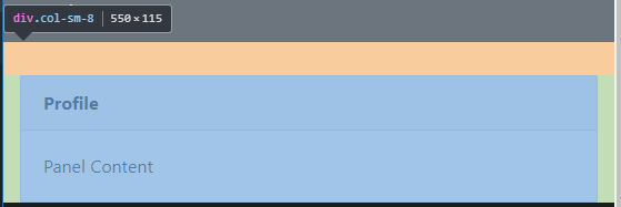
在小型设备中,使引导列之间的空间对齐。
- 在本例中,一行中有两列
col-sm-3,col-sm-8。 - 在最小化窗口(参见屏幕截图)后,两列相互粘合。-Also第二列(即column 8)在sm断点处没有获得完全宽度. 注意:要在sm断点处的列之间留出主空间,也要全尺寸的col 8. 链接到引导代码
回答 3
Stack Overflow用户
发布于 2019-03-07 08:13:32
您只需添加类,那么col-sm-8将是全宽度的,并且在sm断点的列之间也有空间。
在col-sm-8 div only上添加下面的calss
<div class="col-sm-8 mt-3 mt-md-0 p-0 px-md-3">
document.getElementsByTagName("h1")[0].style.fontSize = "80px";<!DOCTYPE html>
<html lang="en">
<head>
<meta charset="UTF-8">
<meta name="viewport" content="width=device-width, initial-scale=1.0">
<meta http-equiv="X-UA-Compatible" content="ie=edge">
<title>Document</title>
<link rel="stylesheet"
href="https://maxcdn.bootstrapcdn.com/bootstrap/4.0.0/css/bootstrap.min.css"
integrity="sha384-Gn5384xqQ1aoWXA+058RXPxPg6fy4IWvTNh0E263XmFcJlSAwiGgFAW/dAiS6JXm"
crossorigin="anonymous"
>
<!-- <script src="https://ajax.googleapis.com/ajax/libs/jquery/3.3.1/jquery.min.js"></script> -->
<style>
.nav-pills .nav-link.active{
color: rgb(12, 11, 11) !important;
background-color: rgb(233, 233, 233);
}
html {
position: relative;
min-height: 100%;
}
body {
/* Margin bottom by footer height */
margin-bottom: 60px;
}
.footer {
position: absolute;
bottom: 0;
width: 100%;
/* Set the fixed height of the footer here */
height: 60px;
line-height: 60px; /* Vertically center the text there */
background-color: #1d1c1c;
}
/* Custom page CSS
-------------------------------------------------- */
/* Not required for template or sticky footer method. */
body > .container {
padding: 60px 15px 0;
}
.footer > .container {
padding-right: 15px;
padding-left: 15px;
}
code {
font-size: 80%;
}
</style>
</head>
<body>
<header>
<nav class="navbar navbar-expand-lg navbar-dark bg-dark">
<a class="navbar-brand" href="#">Navbar</a>
<button class="navbar-toggler" type="button" data-toggle="collapse" data-target="#navbarSupportedContent" aria-controls="navbarSupportedContent" aria-expanded="false" aria-label="Toggle navigation">
<span class="navbar-toggler-icon"></span>
</button>
<div class="collapse navbar-collapse" id="navbarSupportedContent">
<ul class="navbar-nav mr-auto">
<li class="nav-item active">
<a class="nav-link" href="#">Home <span class="sr-only">(current)</span></a>
</li>
<li class="nav-item">
<a class="nav-link" href="#">Link</a>
</li>
<li class="nav-item dropdown">
<a class="nav-link dropdown-toggle" href="#" id="navbarDropdown" role="button" data-toggle="dropdown" aria-haspopup="true" aria-expanded="false">
Dropdown
</a>
<div class="dropdown-menu" aria-labelledby="navbarDropdown">
<a class="dropdown-item" href="#">Action</a>
<a class="dropdown-item" href="#">Another action</a>
<div class="dropdown-divider"></div>
<a class="dropdown-item" href="#">Something else here</a>
</div>
</li>
<li class="nav-item">
<a class="nav-link disabled" href="#">Disabled</a>
</li>
</ul>
<form class="form-inline my-2 my-lg-0">
<input class="form-control mr-sm-2" type="search" placeholder="Search" aria-label="Search">
<button class="btn btn-outline-success my-2 my-sm-0" type="submit">Search</button>
</form>
</div>
</nav>
</header>
<main role="main" class="container">
<div class="row">
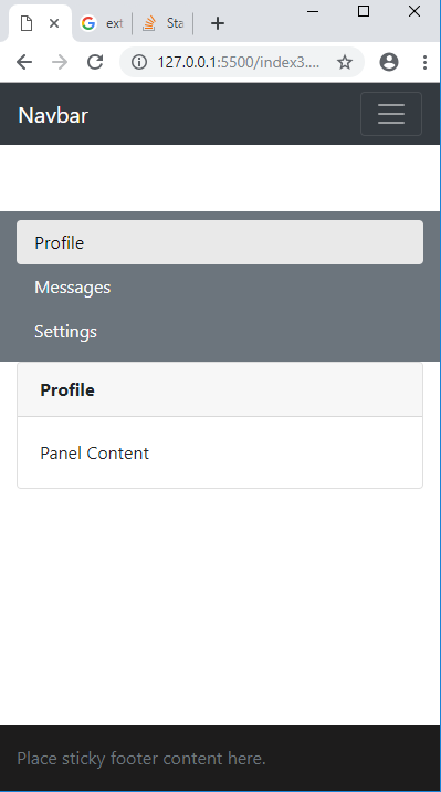
<div class="col-sm-3 text-white bg-secondary pt-2 pb-2" >
<div class="nav flex-column nav-pills" id="v-pills-tab" role="tablist" aria-orientation="vertical">
<a class="nav-link text-light active" id="v-pills-home-tab" data-toggle="pill" href="#v-pills-home" role="tab" aria-controls="v-pills-home" aria-selected="true">Profile</a>
<a class="nav-link text-light " id="v-pills-messages-tab" data-toggle="pill" href="#v-pills-messages" role="tab" aria-controls="v-pills-messages" aria-selected="false">Messages</a>
<a class="nav-link text-light " id="v-pills-settings-tab" data-toggle="pill" href="#v-pills-settings" role="tab" aria-controls="v-pills-settings" aria-selected="false">Settings</a>
</div>
</div>
<div class="col-sm-8 mt-3 mt-md-0 p-0 px-md-3">
<div class="tab-content" id="v-pills-tabContent">
<div class="tab-pane fade show active " id="v-pills-home" role="tabpanel" aria-labelledby="v-pills-home-tab">
<div class="card">
<div class="card-header card-title"><b>Profile</b></div>
<div class="card-body">Panel Content</div>
</div>
</div>
<div class="tab-pane fade" id="v-pills-messages" role="tabpanel" aria-labelledby="v-pills-messages-tab">
<div class="card">
<div class="card-header card-title"><b>Messages</b></div>
<div class="card-body">Panel Content</div>
</div>
</div>
<div class="tab-pane fade" id="v-pills-settings" role="tabpanel" aria-labelledby="v-pills-settings-tab">
<div class="card">
<div class="card-header card-title"><b>Settings</b></div>
<div class="card-body">Panel Content</div>
</div>
</div>
</div>
</div>
</div>
</main>
<footer class="footer">
<div class="container">
<span class="text-muted">Place sticky footer content here.</span>
</div>
</footer>
<script src="https://code.jquery.com/jquery-3.2.1.slim.min.js" integrity="sha384-KJ3o2DKtIkvYIK3UENzmM7KCkRr/rE9/Qpg6aAZGJwFDMVNA/GpGFF93hXpG5KkN" crossorigin="anonymous"></script>
<script src="https://cdnjs.cloudflare.com/ajax/libs/popper.js/1.12.9/umd/popper.min.js" integrity="sha384-ApNbgh9B+Y1QKtv3Rn7W3mgPxhU9K/ScQsAP7hUibX39j7fakFPskvXusvfa0b4Q" crossorigin="anonymous"></script>
<script src="https://maxcdn.bootstrapcdn.com/bootstrap/4.0.0/js/bootstrap.min.js" integrity="sha384-JZR6Spejh4U02d8jOt6vLEHfe/JQGiRRSQQxSfFWpi1MquVdAyjUar5+76PVCmYl" crossorigin="anonymous"></script>
</body>
</html>
Stack Overflow用户
发布于 2019-03-07 08:08:23
您可以在这样的margin上添加一些breakpoint:
@media screen and (max-width: 576px) {
  .col-sm-8 {
    margin-top: 30px;
  }
}
sm关键字在引导过程中意味着很小,它在576px处中断。
这个职位解释得很好
全宽度
为了使最后一个div在全宽度,您可以看到为什么它不是全宽度在开始检查它。
正如您所看到的,它在每一面都有填充- padding: 15px。我们可以在断点上删除它,以保持更高分辨率的空间。
@media screen and (max-width: 576px) {
  .col-sm-8 {
    padding-left: 0;
    padding-right: 0;
  }
}
这是你的代码,有新代码
Stack Overflow用户
发布于 2019-03-07 08:13:14
首先,您可以使用所有的引导边距属性。在这种情况下,我认为mb-3 (边距-底部-3)或mt-3 (边距-顶-3)应该是您正在寻找的。
请注意,对于纯CSS,如果宽度优于X,也可以添加页边距。
例如:
@media screen and (max-width: 640px) {
    .do_margin_bottom {
        margin-bottom:20px; /* Equivalent of mX-3 */
    }
}
然后将.do_margin_bottom应用于您的col 3。
关于第二点:您的col 8是正确的缩进,就像您的col 3.这是您的div.card,它正在添加边距-左:15 is和边距-右:15 is。您应该在您的卡元素上设置这些值,以得到您想要的。
我个人建议你不要这么做。一张没有边距的卡片是很奇怪的。
https://stackoverflow.com/questions/55038695
复制相似问题
腾讯云开发者

Copyright © 2013 - 2026 Tencent Cloud. All Rights Reserved. 腾讯云 版权所有
深圳市腾讯计算机系统有限公司 ICP备案/许可证号:粤B2-20090059  粤公网安备44030502008569号
腾讯云计算(北京)有限责任公司 京ICP证150476号 | 京ICP备11018762号