
引导3使用Django模板在每行显示3篇博客文章
引导3使用Django模板在每行显示3篇博客文章
提问于 2019-03-07 06:26:16
我正在使用Django(2.1.7)和Bootstrap (3.1)进行一个项目,我需要在每一行中显示3个博客文章:
注意:,我看过各种相关的问题,但是找不到任何解决我的问题的方法,所以请不要把这个问题标记为重复!
在这里,我已经尝试过:
<div class="container-fluid">
        <div class="row">
            <div class="col">
                <div class="col-lg-9">
                    <div class="row">
                        {% for post in posts %}
                            <div class="col-lg-4 col-sm-6 mb-4" style="margin-top: 2%">
                                <div class="card shadow border-0 h-100"><a href="post.html">
                                    <img src="{{ post.photo.url }}"
                                        alt="..." class="img-fluid card-img-top"></a>
                                    <div class="card-body"><a href="{% url 'blog-post' post.id %}"
                                                              class="text-uppercase text-muted text-sm letter-spacing-2">{{ post.category }} </a>
                                        <h5 class="my-2"><a href="post.html" class="text-dark">{{ post.title }}</a></h5>
                                        <p class="text-gray-500 text-sm my-3"><i class="far fa-clock mr-2"></i>{{ post.created_at }}</p>
                                        <p class="my-2 text-muted text-sm">{{ post.content }}</p><a
                                                href="{% url 'blog-post' post.id %}" class="btn btn-link pl-0">Read more<i
                                                class="fa fa-long-arrow-alt-right ml-2"></i></a>
                                    </div>
                                </div>
                            </div>
                        {% endfor %}
                    </div>
                </div>
                <div class="col-lg-3" style="background-color: darkgrey; height: 100%">
                    <div class="container">
                        <form class="form" style="margin-top: 3%">
                            <input type="search" name="search" />
                            <button type="submit">Search</button>
                        </form>
                    </div>
                </div>
            </div>
        </div>
    </div>
下面是一些元素的css:
.card-img-top {
    width: 100%;
    border-top-left-radius: calc(.4rem - 1px);
    border-top-right-radius: calc(.4rem - 1px);
}

img {
    vertical-align: middle;
    border-style: none;
}

.img-fluid {
    max-width: 100%;
    height: auto;
    max-height: 200px;
    min-height: 200px;
}

.card-body {
    -ms-flex: 1 1 auto;
    flex: 1 1 auto;
    padding: 1.25rem;
}

@media (min-width: 992px){
.col-lg-4 {
    -ms-flex: 0 0 33.33333%;
    flex: 0 0 33.33333%;
    max-width: 33.33333%;
    }
}
.h-100 {
    height: 100% !important;
}
.shadow {
    box-shadow: 0 0 1rem rgba(0,0,0,0.15) !important;
}
.border-0 {
    border: 0 !important;
}
.card {
    position: relative;
    display: -ms-flexbox;
    display: flex;
    -ms-flex-direction: column;
    flex-direction: column;
    min-width: 0;
    word-wrap: break-word;
    background-color: #fff;
    background-clip: border-box;
    border: 1px solid rgba(0,0,0,0.125);
    border-radius: .4rem;
}

.row {
    display: -ms-flexbox;
    display: flex;
    -ms-flex-wrap: wrap;
    flex-wrap: wrap;
    margin-right: -12px;
    margin-left: -15px;
}在第一行的safari中,它只显示了2篇博客文章,而在其他行中,它显示了3篇博客文章,参见下面的截图:
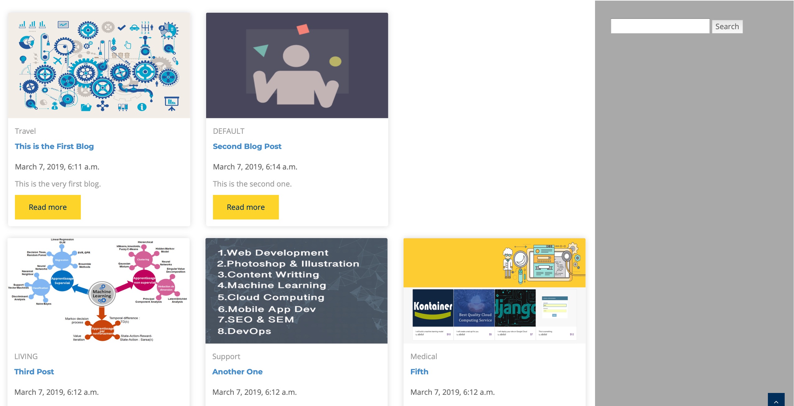
更新:下面的是从浏览器中生成的:
<div class="col-lg-9">
     <div class="row">
       <div class="col-lg-4 col-sm-6 mb-4" style="margin-top: 2%">
           <div class="card shadow border-0 h-100"><a href="post.html">
               <img src="/media/blog_images/automation_image.jpg" alt="..." class="img-fluid card-img-top"></a>
               <div class="card-body"><a href="/blog/post/1" class="text-uppercase text-muted text-sm letter-spacing-2">Travel </a>
                   <h5 class="my-2"><a href="post.html" class="text-dark">This is the First Blog</a></h5>
                   <p class="text-gray-500 text-sm my-3"><i class="far fa-clock mr-2"></i>March 7, 2019, 6:11 a.m.</p>
                   <p class="my-2 text-muted text-sm">This is the very first blog.</p><a href="/blog/post/1" class="btn btn-link pl-0">Read more<i class="fa fa-long-arrow-alt-right ml-2"></i></a>
               </div>
           </div>
       </div>


       <div class="col-lg-4 col-sm-6 mb-4" style="margin-top: 2%">
           <div class="card shadow border-0 h-100"><a href="post.html">
               <img src="/media/blog_images/freelance-dev-business.png" alt="..." class="img-fluid card-img-top"></a>
               <div class="card-body"><a href="/blog/post/2" class="text-uppercase text-muted text-sm letter-spacing-2">DEFAULT </a>
                   <h5 class="my-2"><a href="post.html" class="text-dark">Second Blog Post</a></h5>
                   <p class="text-gray-500 text-sm my-3"><i class="far fa-clock mr-2"></i>March 7, 2019, 6:14 a.m.</p>
                   <p class="my-2 text-muted text-sm">This is the second one.</p><a href="/blog/post/2" class="btn btn-link pl-0">Read more<i class="fa fa-long-arrow-alt-right ml-2"></i></a>
               </div>
           </div>
       </div>


       <div class="col-lg-4 col-sm-6 mb-4" style="margin-top: 2%">
           <div class="card shadow border-0 h-100"><a href="post.html">
               <img src="/media/blog_images/machine-learning-apprentissage-supervise-ou-non-et-par-renforcement-hli-lab.jpg" alt="..." class="img-fluid card-img-top"></a>
               <div class="card-body"><a href="/blog/post/3" class="text-uppercase text-muted text-sm letter-spacing-2">LIVING </a>
                   <h5 class="my-2"><a href="post.html" class="text-dark">Third Post</a></h5>
                   <p class="text-gray-500 text-sm my-3"><i class="far fa-clock mr-2"></i>March 7, 2019, 6:12 a.m.</p>
                   <p class="my-2 text-muted text-sm">This is the third blog post.</p><a href="/blog/post/3" class="btn btn-link pl-0">Read more<i class="fa fa-long-arrow-alt-right ml-2"></i></a>
               </div>
           </div>
       </div>


</div><!-- close existing row and open another one-->
<div class="row">


       <div class="col-lg-4 col-sm-6 mb-4" style="margin-top: 2%">
           <div class="card shadow border-0 h-100"><a href="post.html">
               <img src="/media/blog_images/skills.jpg" alt="..." class="img-fluid card-img-top"></a>
               <div class="card-body"><a href="/blog/post/4" class="text-uppercase text-muted text-sm letter-spacing-2">Support </a>
                   <h5 class="my-2"><a href="post.html" class="text-dark">Another One</a></h5>
                   <p class="text-gray-500 text-sm my-3"><i class="far fa-clock mr-2"></i>March 7, 2019, 6:12 a.m.</p>
                   <p class="my-2 text-muted text-sm">This is another one.</p><a href="/blog/post/4" class="btn btn-link pl-0">Read more<i class="fa fa-long-arrow-alt-right ml-2"></i></a>
               </div>
           </div>
       </div>


       <div class="col-lg-4 col-sm-6 mb-4" style="margin-top: 2%">
           <div class="card shadow border-0 h-100"><a href="post.html">
               <img src="/media/blog_images/JobExpert.jpg" alt="..." class="img-fluid card-img-top"></a>
               <div class="card-body"><a href="/blog/post/5" class="text-uppercase text-muted text-sm letter-spacing-2">Medical </a>
                   <h5 class="my-2"><a href="post.html" class="text-dark">Fifth</a></h5>
                   <p class="text-gray-500 text-sm my-3"><i class="far fa-clock mr-2"></i>March 7, 2019, 7:43 a.m.</p>
                   <p class="my-2 text-muted text-sm">This is the fifth post on this blog.This is the fifth post on this blog.This is the fifth post on this blog.This is the fifth post on this blog.This is the fifth post on this blog.This is the fifth post on this blog.This is the fifth post on this blog.This is the fifth post on this blog.This is the fifth post on this blog.This is the fifth post on this blog.This is the fifth post on this blog.This is the fifth post on this blog.This is the fifth post on this blog.This is the fifth post on this blog.This is the fifth post on this blog.This is the fifth post on this blog.This is the fifth post on this blog.This is the fifth post on this blog.This is the fifth post on this blog.This is the fifth post on this blog.</p><a href="/blog/post/5" class="btn btn-link pl-0">Read more<i class="fa fa-long-arrow-alt-right ml-2"></i></a>
               </div>
           </div>
       </div>


       <div class="col-lg-4 col-sm-6 mb-4" style="margin-top: 2%">
           <div class="card shadow border-0 h-100"><a href="post.html">
               <img src="/media/blog_images/IMG_1832.jpg" alt="..." class="img-fluid card-img-top"></a>
               <div class="card-body"><a href="/blog/post/6" class="text-uppercase text-muted text-sm letter-spacing-2">Support </a>
                   <h5 class="my-2"><a href="post.html" class="text-dark">Sixth</a></h5>
                   <p class="text-gray-500 text-sm my-3"><i class="far fa-clock mr-2"></i>March 7, 2019, 6:12 a.m.</p>
                   <p class="my-2 text-muted text-sm">This is the sixth blog post here at BRT site.</p><a href="/blog/post/6" class="btn btn-link pl-0">Read more<i class="fa fa-long-arrow-alt-right ml-2"></i></a>
               </div>
           </div>
       </div>


</div><!-- close existing row and open another one-->
<div class="row">


</div>
                    </div>
这里有什么问题吗?我是新来的。
提前感谢!
回答 1
Stack Overflow用户
发布于 2019-03-07 07:42:02
试试这个。
<div class="row">
   {% for post in posts %}

       <div class="col-lg-4 col-sm-6 mb-4" style="margin-top: 2%">
           <div class="card shadow border-0 h-100"><a href="post.html">
               <img src="{{ post.photo.url }}"
                   alt="..." class="img-fluid card-img-top"></a>
               <div class="card-body"><a href="{% url 'blog-post' post.id %}"
                                         class="text-uppercase text-muted text-sm letter-spacing-2">{{ post.category }} </a>
                   <h5 class="my-2"><a href="post.html" class="text-dark">{{ post.title }}</a></h5>
                   <p class="text-gray-500 text-sm my-3"><i class="far fa-clock mr-2"></i>{{ post.created_at }}</p>
                   <p class="my-2 text-muted text-sm">{{ post.content }}</p><a
                           href="{% url 'blog-post' post.id %}" class="btn btn-link pl-0">Read more<i
                           class="fa fa-long-arrow-alt-right ml-2"></i></a>
               </div>
           </div>
       </div>

{% if forloop.counter|divisibleby:3 %}

</div><!-- close existing row and open another one-->
<div class="row">
{% endif %}
   {% endfor %}
</div>页面原文内容由Stack Overflow提供。腾讯云小微IT领域专用引擎提供翻译支持
原文链接:
https://stackoverflow.com/questions/55037333
复制相关文章
相似问题
腾讯云开发者

Copyright © 2013 - 2026 Tencent Cloud. All Rights Reserved. 腾讯云 版权所有
深圳市腾讯计算机系统有限公司 ICP备案/许可证号:粤B2-20090059  粤公网安备44030502008569号
腾讯云计算(北京)有限责任公司 京ICP证150476号 | 京ICP备11018762号