
用带弹性容器的引导4设计
用带弹性容器的引导4设计
提问于 2019-02-24 12:27:22
我试着设计布局如下:
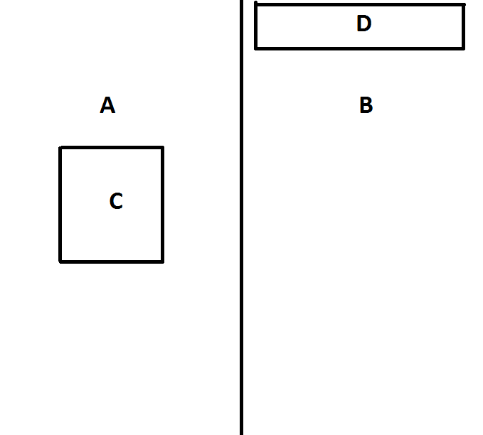
描述:
- A和B组件应该有一个50%的宽度和100%的高度,所有页面。
- C组件应该是水平和垂直中心。
- D组件应位于顶部。
- A含有C.
- B含有D.
<!DOCTYPE html>
<html lang="en">
<head>
  <title>Bootstrap Example</title>
  <meta charset="utf-8">
  <meta name="viewport" content="width=device-width, initial-scale=1">
  <link rel="stylesheet" href="https://maxcdn.bootstrapcdn.com/bootstrap/4.3.1/css/bootstrap.min.css">
  <script src="https://ajax.googleapis.com/ajax/libs/jquery/3.3.1/jquery.min.js"></script>
  <script src="https://cdnjs.cloudflare.com/ajax/libs/popper.js/1.14.7/umd/popper.min.js"></script>
  <script src="https://maxcdn.bootstrapcdn.com/bootstrap/4.3.1/js/bootstrap.min.js"></script>
<style>
html {
  height: 100%;
}
body {
  min-height: 100%;
  background-color: blue;
}

.row-height100
{
  min-height: 100%;
}

</style>

</head>
<body class="d-flex">

<div class="flex-fill flex-row row-height100 justify-content-center">
<div class="flex-fill p-2 bg-success d-flex justify-content-center row-height100">
        <div>Flex item 1</div>
</div>
<div class="flex-fill p-2 bg-success d-flex justify-content-start row-height100">Flex item 2</div>
</div>


</body>
</html>
回答 2
Stack Overflow用户
回答已采纳
发布于 2019-02-25 10:35:01
- 使用
d-flex更改您的身体或div元素,将这些元素包装到挠曲盒中,并使用h-100使柔性盒达到完全高度。 - 并
flex-fill到您的"A"和"B"元素,使它们共享并占用50%的全部宽度。 - 使用
"A"和"B"将您的d-flex.元素也更改为柔性盒 - 使用
"C"和"D"元素的内容水平中心justify-content-center. - 垂直中心-使用
"C"对齐"C"元素的内容 - 垂直顶对齐您的
"D"元素的内容使用align-items-start.
请检查并运行以下代码段,以了解我前面描述的实际示例:
/* CSS */

html, body {height: 100%;width: 100%;}
body {min-height: 100%;background-color: blue;}

/* ignore following two css properties. Added just for visual example's sake */
.flex-fill {border: 4px solid #000;}
.flex-fill div {border: 4px solid #000; background-color: #FFF; padding: 5px;}<!-- Scripts -->
<script src="https://cdnjs.cloudflare.com/ajax/libs/jquery/3.3.1/jquery.min.js"></script><script src="https://cdnjs.cloudflare.com/ajax/libs/popper.js/1.14.0/umd/popper.min.js"></script><script src="https://stackpath.bootstrapcdn.com/bootstrap/4.1.0/js/bootstrap.min.js"></script><link href="https://stackpath.bootstrapcdn.com/bootstrap/4.1.0/css/bootstrap.min.css" rel="stylesheet"/>
<!-- HTML -->
<div class="d-flex h-100">
<div class="flex-fill d-flex justify-content-center align-items-center bg-success">
<div>Flex item 1</div>
</div>
<div class="flex-fill d-flex justify-content-center align-items-start bg-success">
<div>Flex item 2</div>
</div>
</div>
Stack Overflow用户
发布于 2019-02-24 12:31:28
html {
  height:100%;
}

body {
  margin:0;
  height:100%;
  display: flex;
}

.a, .b {
  flex:1;
  position: relative;
}

.a {
  border-right:2px solid;
}

.c {
  border:2px solid;
  position: absolute;
  height: 200px;
  width: 200px;
  left: 50%;
  transform:translate(-50%,-50%);
  top:50%;
}

.d {
  position: absolute;
  left: 50%;
  transform:translateX(-50%);
  top:20px;
  width: 80%;
  height: 70px;
  border:2px solid;
}<div class="a">
<div class="c"></div>
</div>
<div class="b">
<div class="d"></div>
</div>
页面原文内容由Stack Overflow提供。腾讯云小微IT领域专用引擎提供翻译支持
原文链接:
https://stackoverflow.com/questions/54851868
复制相关文章
相似问题
腾讯云开发者

Copyright © 2013 - 2026 Tencent Cloud. All Rights Reserved. 腾讯云 版权所有
深圳市腾讯计算机系统有限公司 ICP备案/许可证号:粤B2-20090059  粤公网安备44030502008569号
腾讯云计算(北京)有限责任公司 京ICP证150476号 | 京ICP备11018762号