
对数图中的寄生虫x轴
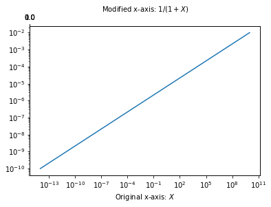
我有一个图,其中x轴是GeV中的温度,但我也需要在开尔文中给出温度的参考,所以我想把一个寄生虫轴和K中的温度放在一起,试图跟随这个答案,How to add a second x-axis in matplotlib,这是代码的例子。我得到第二个轴在我的图表顶部,但它不是我所需要的K的温度。
import numpy as np
import matplotlib.pyplot as plt

tt = np.logspace(-14,10,100)
yy = np.logspace(-10,-2,100)

fig = plt.figure()
ax1 = fig.add_subplot(111)
ax2 = ax1.twiny()

ax1.loglog(tt,yy)
ax1.set_xlabel('Temperature (GeV')

new_tick_locations = np.array([.2, .5, .9])

def tick_function(X):
    V = X*1.16e13
    return ["%.1f" % z for z in V]

ax2.set_xlim(ax1.get_xlim())
ax2.set_xticks(new_tick_locations)
ax2.set_xticklabels(tick_function(ax1Xs))
ax2.set_xlabel('Temp (Kelvin)')
plt.show()
这就是我运行代码时得到的。
对数图
我需要寄生虫轴和原来的x轴成比例。当任何人看到这张图时,可以很容易地读懂开尔文的温度。提前谢谢。
回答 2
Stack Overflow用户
发布于 2019-02-12 02:45:19
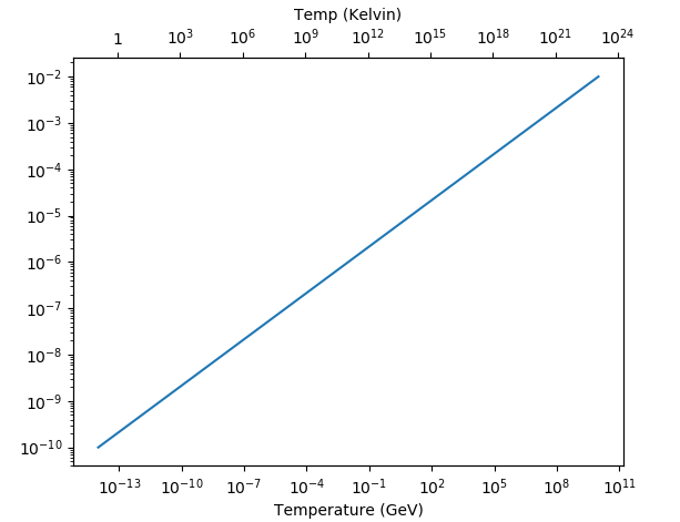
通用解决方案如下所示。因为你有一个非线性的尺度,我们的想法是在开尔文找到好的蜱的位置,转换成GeV,以GeV的单位来设置位置,但是用开尔文的单位来标记它们。这听起来很复杂,但优点是您不需要自己找到蜱,只需依靠matplotlib来找到它们。然而,这需要的是两个尺度之间的功能依赖,即GeV和Kelvin之间的转换及其逆。
import numpy as np
import matplotlib.pyplot as plt
import matplotlib.ticker as mticker

tt = np.logspace(-14,10,100)
yy = np.logspace(-10,-2,100)

fig = plt.figure()
ax1 = fig.add_subplot(111)
ax2 = ax1.twiny()

plt.setp([ax1,ax2], xscale="log", yscale="log")
ax1.get_shared_x_axes().join(ax1, ax2)

ax1.plot(tt,yy)

ax1.set_xlabel('Temperature (GeV)')
ax2.set_xlabel('Temp (Kelvin)')

fig.canvas.draw()

# 1 GeV == 1.16 × 10^13 Kelvin
Kelvin2GeV = lambda k:  k / 1.16e13
GeV2Kelvin = lambda gev: gev * 1.16e13

loc = mticker.LogLocator()
locs = loc.tick_values(*GeV2Kelvin(np.array(ax1.get_xlim())))

ax2.set_xticks(Kelvin2GeV(locs))
ax2.set_xlim(ax1.get_xlim())

f = mticker.ScalarFormatter(useOffset=False, useMathText=True)
g = lambda x,pos : "${}$".format(f._formatSciNotation('%1.10e' % GeV2Kelvin(x)))
fmt = mticker.FuncFormatter(g)
ax2.xaxis.set_major_formatter(mticker.FuncFormatter(fmt))

plt.show()
Stack Overflow用户
发布于 2019-02-12 00:20:08
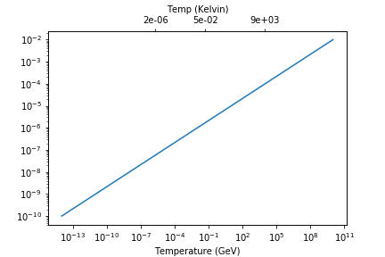
问题似乎如下:当您使用ax2.set_xlim(ax1.get_xlim())时,基本上是将上x轴的限制设置为与下x轴的限制相同。如果你这么做了
print(ax1.get_xlim())
print(ax2.get_xlim())
对于两个轴,得到的值与
(6.309573444801943e-16, 158489319246.11108)
(6.309573444801943e-16, 158489319246.11108) 但你的下x轴有一个对数标度。当您使用ax2.set_xlim()分配限制时,ax2的限制是相同的,但是的标度仍然是线性的。这就是为什么当您在[.2, .5, .9]设置滴答号时,这些值在x轴上的最左边显示为滴答,如图中所示。
解决办法是将上x轴也设为对数标度.这是必需的,因为您的new_tick_locations对应于较低x轴上的实际值。您只想重命名这些值,以便在开尔文中显示滴答标签。从变量名中可以清楚地看到,new_tick_locations对应于新的滴答位置。我使用一些修改过的new_tick_locations值来突出这个问题。
我使用科学的格式化'%.0e',因为1 GeV =1.16e13K,因此0.5 GeV是一个包含许多零的非常大的值。
以下是一个样本答案:
import numpy as np
import matplotlib.pyplot as plt
import matplotlib.ticker as mtick

tt = np.logspace(-14,10,100)
yy = np.logspace(-10,-2,100)

fig = plt.figure()
ax1 = fig.add_subplot(111)
ax2 = ax1.twiny()

ax1.loglog(tt,yy)
ax1.set_xlabel('Temperature (GeV)')

new_tick_locations = np.array([0.000002, 0.05, 9000])

def tick_function(X):
    V = X*1.16e13
    return ["%.1f" % z for z in V]

ax2.set_xscale('log') # Setting the logarithmic scale
ax2.set_xlim(ax1.get_xlim())

ax2.set_xticks(new_tick_locations)
ax2.set_xticklabels(tick_function(new_tick_locations))
ax2.xaxis.set_major_formatter(mtick.FormatStrFormatter('%.0e'))

ax2.set_xlabel('Temp (Kelvin)')
plt.show()
https://stackoverflow.com/questions/54640423
复制相似问题
腾讯云开发者

Copyright © 2013 - 2026 Tencent Cloud. All Rights Reserved. 腾讯云 版权所有
深圳市腾讯计算机系统有限公司 ICP备案/许可证号:粤B2-20090059 ![]() 粤公网安备44030502008569号
粤公网安备44030502008569号
腾讯云计算(北京)有限责任公司 京ICP证150476号 | 京ICP备11018762号