
如何创建uint16高斯噪声图像?
我想要创建一个高斯噪声的uint16图像,具有定义的均值和标准差。
为此,我尝试使用numpy的random.normal,但它返回一个float64数组:
mu = 10
sigma = 100
shape = (1024,1024)
gauss_img = np.random.normal(mu, sigma, shape)

print(gauss_img.dtype)

>>> dtype('float64')是否有方法将gauss_img转换为uint16数组,同时保留原始的均值和标准差?或者,是否有另一种方法完全创建uint16噪声图像?
编辑:正如注释中提到的那样,np.random.normal不可避免地会给出一个sd >平均值的负值样本,这是转换为uint16的一个问题。
所以我想我需要一种不同的方法来直接创建一个无符号的高斯图像。
回答 3
Stack Overflow用户
发布于 2019-02-08 21:29:12
所以我觉得这很接近你要找的东西。
导入库和欺骗一些扭曲的数据。在这里,由于输入来源不明,所以我使用np.expm1(np.random.normal())创建了倾斜数据。您也可以使用skewnorm().rvs(),但这是一种欺骗,因为这也是用来描述它的库。
我把原始样本压平,以便更容易地绘制直方图。
import numpy as np
from scipy.stats import skewnorm

# generate dummy raw starting data
# smaller shape just for simplicity
shape = (100, 100)
raw_skewed = np.maximum(0.0, np.expm1(np.random.normal(2, 0.75, shape))).astype('uint16')

# flatten to look at histograms and compare distributions
raw_skewed = raw_skewed.reshape((-1))
现在,找到描述您的倾斜数据的参数,并使用这些参数创建一个新的发行版,从中获取希望与原始数据很好匹配的样本。
这两行代码就是你想要的。
# find params
a, loc, scale = skewnorm.fit(raw_skewed)

# mimick orig distribution with skewnorm
new_samples = skewnorm(a, loc, scale).rvs(10000).astype('uint16')
现在,画出每一个的分布来进行比较。
plt.hist(raw_skewed, bins=np.linspace(0, 60, 30), hatch='\\', label='raw skewed')
plt.hist(new_samples, bins=np.linspace(0, 60, 30), alpha=0.65, color='green', label='mimic skewed dist')
plt.legend()
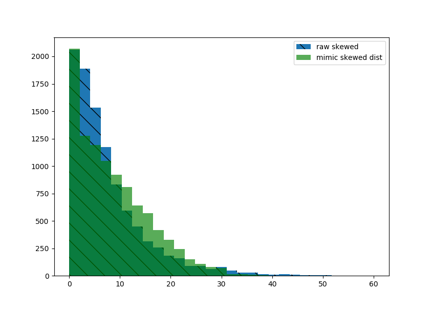
直方图非常接近。如果看起来足够好的话,将你的新数据重塑到所需的形状。
# final result
new_samples.reshape(shape)现在..。这是我认为可能不够的地方。看一看每个人的热图。最初的发行版在右边有一个更长的尾巴(更多的skewnorm()没有描述的离群点)。
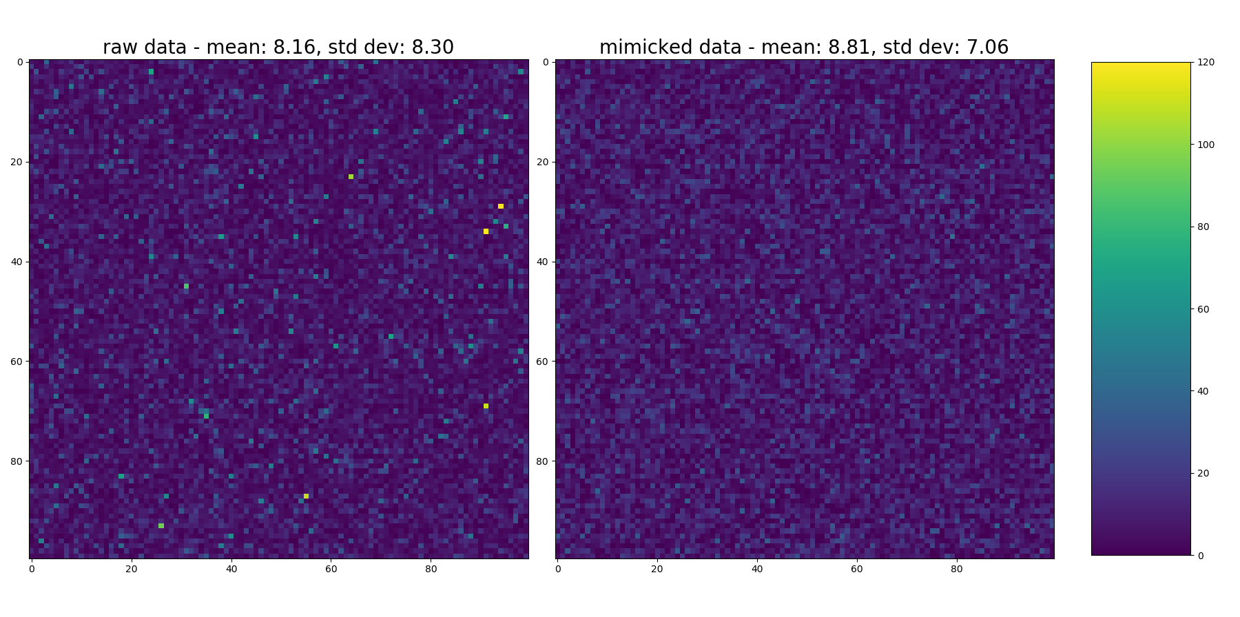
这画出了每一张的热图。
# plot heatmaps of each
fig = plt.figure(2, figsize=(18,9))
ax1 = fig.add_subplot(1, 2, 1)
ax2 = fig.add_subplot(1, 2, 2)

im1 = ax1.imshow(raw_skewed.reshape(shape), vmin=0, vmax=120)
ax1.set_title("raw data - mean: {:3.2f}, std dev: {:3.2f}".format(np.mean(raw_skewed), np.std(raw_skewed)), fontsize=20)

im2 = ax2.imshow(new_samples.reshape(shape), vmin=0, vmax=120)
ax2.set_title("mimicked data - mean: {:3.2f}, std dev: {:3.2f}".format(np.mean(new_samples), np.std(new_samples)), fontsize=20)

plt.tight_layout()

# add colorbar
fig.subplots_adjust(right=0.85)
cbar_ax = fig.add_axes([0.88, 0.1, 0.08, 0.8])  # [left, bottom, width, height]
fig.colorbar(im1, cax=cbar_ax)
看着它..。您可以看到偶尔出现的黄色斑点,表明原始发行版中的值很高,但没有进入输出。这也显示在输入数据的更高的std dev中(请参见每个热图中的标题,但同样,正如对原始问题的注释一样.因为它们不是正态分布,所以平均值和性病并不能真正描述它们的分布.但它们是相对比较的)。
但是..。这正是我为入门而创建的非常特定的倾斜示例的问题所在。希望这里有足够的空间来处理和调优,直到它适合您的需要和特定的数据集。祝好运!
Stack Overflow用户
发布于 2019-02-08 19:48:57
有了这个平均值和西格玛,你就一定会得到一些负值。所以我想这个选项可能是,在抽样之后,找到最负的值,然后把它的绝对值加到所有的样本中。之后,按照注释中的建议将其转换为uint。但你当然可以这么说。
Stack Overflow用户
发布于 2019-02-08 20:05:31
如果您有一系列的uint16数字可供取样,那么您应该查看这个职位。
这样,您可以使用scipy.stats.truncnorm生成一个高斯无符号整数。
https://stackoverflow.com/questions/54599018
复制相似问题
腾讯云开发者

Copyright © 2013 - 2026 Tencent Cloud. All Rights Reserved. 腾讯云 版权所有
深圳市腾讯计算机系统有限公司 ICP备案/许可证号:粤B2-20090059 ![]() 粤公网安备44030502008569号
粤公网安备44030502008569号
腾讯云计算(北京)有限责任公司 京ICP证150476号 | 京ICP备11018762号