
用不同尺寸对齐一列图像
用不同尺寸对齐一列图像
提问于 2019-02-05 20:14:16
我有一个固定宽度的容器和3幅不同宽度和高度的图像。我努力实现的目标是:
- 图像显示在一行中。
- 行图像正在以摘要宽度填充包装容器。
- 行高是自动计算的。
- 每幅图像的高度和宽度保持其比例。
- 排在一排的图像之间有固定的边距,但在左边和右边没有。
对预期结果的说明:
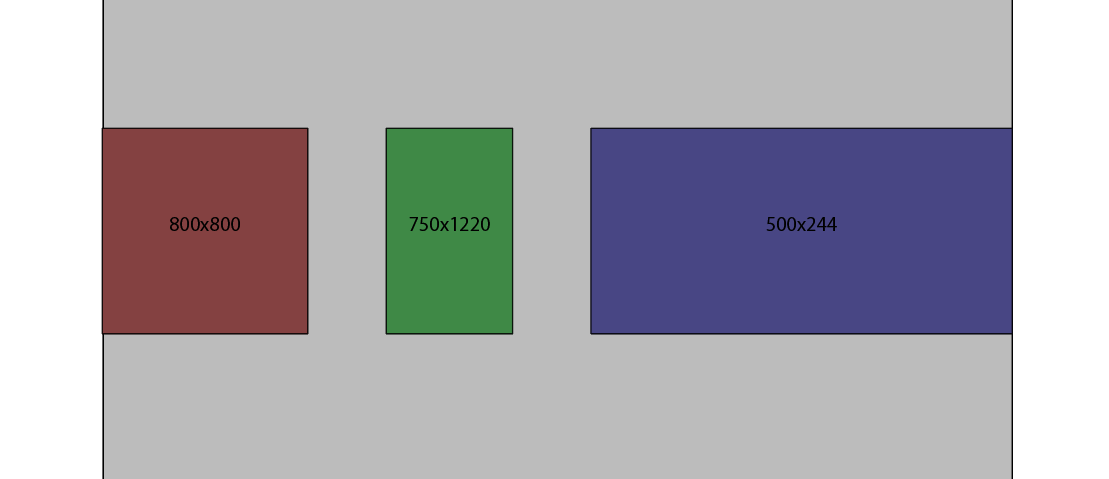
怎么做呢?
回答 2
Stack Overflow用户
回答已采纳
发布于 2019-02-05 20:45:51
您可以为图像定义通用的固定高度和自动宽度,并在容器上使用flex和justify-content: space-between。
html, body {
  margin: 0;
}

.container {
  display: flex;
  justify-content: space-between;
}

.container>img {
  height: 120px;
  width: auto;
}<div class="container">
<img src="https://placehold.it/300x200/fa0">
<img src="https://placehold.it/160x300/0fa">
<img src="https://placehold.it/500x180/f0a">
</div>
Stack Overflow用户
发布于 2019-02-05 20:25:01
为容器添加此样式:
.container {
  display: flex;
  justify-content: space-between;
  }
这不重要你的图像的宽度和高度
页面原文内容由Stack Overflow提供。腾讯云小微IT领域专用引擎提供翻译支持
原文链接:
https://stackoverflow.com/questions/54542331
复制相关文章
相似问题
腾讯云开发者

Copyright © 2013 - 2026 Tencent Cloud. All Rights Reserved. 腾讯云 版权所有
深圳市腾讯计算机系统有限公司 ICP备案/许可证号:粤B2-20090059  粤公网安备44030502008569号
腾讯云计算(北京)有限责任公司 京ICP证150476号 | 京ICP备11018762号