
溢出弹性容器的子容器超过容器
我已经在这个问题上做了一段时间了,并且尝试了很多我在不同的Stackoverflow问题/博客/.但老实说我不知道到底出了什么问题。
我有一个弯曲的div,里面有两个div。上面的div有一个固定的高度,另一个div使用flex: 1;填充其余的。如果屏幕的大小调整到小于A+B的高度,那么B就会开始溢出。我希望它滚动,但我也希望内容是完全可见的滚动。由于一些我无法理解的原因,内容呈现在div B的顶部,正如您在我的小提琴的屏幕截图中所看到的那样
以前问过的一些问题让我找到了某个地方。例如,将主体设置为height: auto;,但是当屏幕大于A+B时,它就不能再对齐中心。在这种情况下,min-height: 0;似乎也无济于事。
如何确保我的容器溢出,但将充分显示它的内容?
回答 1
Stack Overflow用户
发布于 2019-01-27 18:08:34
你可以通过给.second来解决这个问题
flex-basis: auto;
flex-shrink: 0;或者,用速记:flex: 1 0 auto;
工作实例:
html, body {
width: 100%;
height: 100%;
padding: 0;
margin: 0;
}
body {
display: flex;
flex-direction: column;
}
.second {
flex: 1 0 auto;
background: blue;
width: 100%;
display: flex;
justify-content: center;
align-items: center;
min-height: 0;
overflow: auto;
}
.container {
display: flex;
flex-direction: column;
width: 100%;
max-width: 500px;
min-height: 0;
/* added this to make it obvious. Obviously, not needed */
padding: 2rem 0;
}
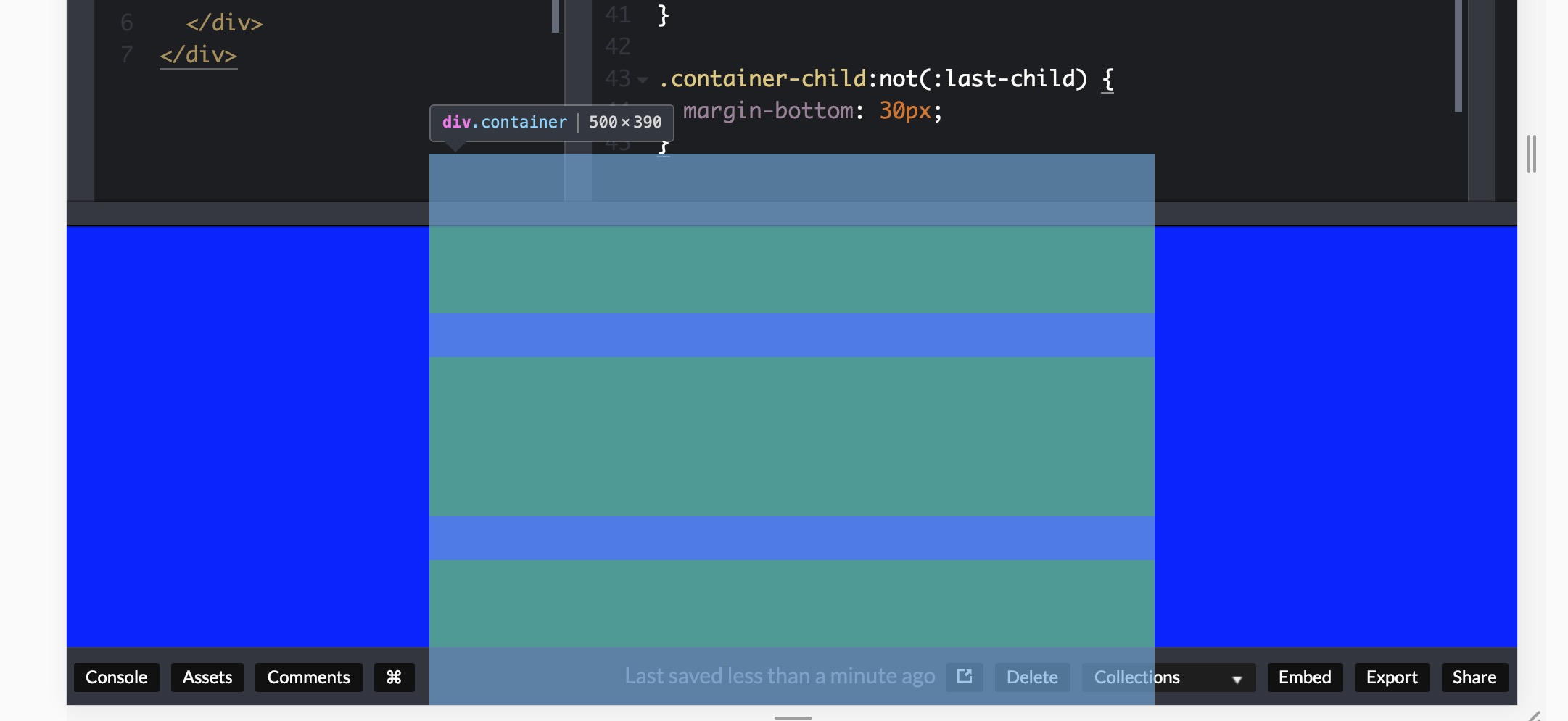
.container-child {
height: 110px;
background: green;
width: 100%;
}
.container-child:not(:last-child) {
margin-bottom: 30px;
}<div class="second">
<div class="container">
<div class="container-child"></div>
<div class="container-child"></div>
<div class="container-child"></div>
</div>
</div>
我在.container 中添加了一些顶部和底部填充,以清楚地表明它在工作--但它并不需要。
现在让我们来看看,为什么会发生这种情况。当您应用.second { flex:1; }时,它的意思是:
flex-grow: 1;
flex-shrink: 1;
flex-basis: 0%;
..。这使得它的体积比它的内容小。
每当您在一个较小的父节点中有一个更大的子中心时,浏览器就不会为top提供一个滚动条(或者在水平时为left提供滚动条),因为这样,如果父级和子级的顶部重合在一起,并且子节点比父级大,那么子节点就不再是居中的了,对吗?同样的情况也发生在使用其他对中技术时,您将较大的孩子集中在一个较小的父母身上。
要解决这个问题,您需要防止孩子的成长超过父级。
在本例中,它意味着根据其内容( .second ) (flex-basis: auto)对其进行调整,而不允许它收缩:(flex-shrink: 0;)。
为了更好地可视化问题,请考虑下面的示例:
.left, .right {
  position: relative;
  border: 1px solid red;
  padding: 1rem 5rem;
}
.left {
  left: -5rem;
}
.right {
  right: -5rem;
}<div class="left">
I'm taken left
</div>
<div class="right">
I'm taken right
</div>
如果浏览器提供滚动条以允许您滚动到.left的开头,这将意味着left: -5rem没有应用。我希望这是合理的,我不能解释得更好。
https://stackoverflow.com/questions/54391073
复制相似问题
腾讯云开发者

Copyright © 2013 - 2026 Tencent Cloud. All Rights Reserved. 腾讯云 版权所有
深圳市腾讯计算机系统有限公司 ICP备案/许可证号:粤B2-20090059  粤公网安备44030502008569号
腾讯云计算(北京)有限责任公司 京ICP证150476号 | 京ICP备11018762号