
使组件在列中显示
使组件在列中显示
提问于 2019-01-02 21:56:24
我对React非常陌生,我正在使用material(ui)制作我的第一个应用程序,我已经成功地呈现了我想要的组件,但我还无法打印它们,它们按行显示:
我尝试用div和p包装它们,得到了相同的结果。
这是我的组件的代码:
import React, { Component } from 'react';
import Button from '@material-ui/core/Button';
import classNames from 'classnames';
import PropTypes from 'prop-types';
import { withStyles } from '@material-ui/core/styles';
import Input from '@material-ui/core/Input';
import InputLabel from '@material-ui/core/InputLabel';
import InputAdornment from '@material-ui/core/InputAdornment';
import FormControl from '@material-ui/core/FormControl';
import Visibility from '@material-ui/icons/Visibility';
import VisibilityOff from '@material-ui/icons/VisibilityOff';
import IconButton from '@material-ui/core/IconButton';
const styles = theme => ({
root: {
display: 'flex',
flexWrap: 'wrap',
},
margin: {
margin: theme.spacing.unit,
},
withoutLabel: {
marginTop: theme.spacing.unit * 3,
},
textField: {
flexBasis: 200,
},
button: {
margin: theme.spacing.unit,
},
input: {
display: 'none',
},
});
class LoginModal extends Component {
state = {
password: '',
showPassword: false,
};
render() {
const { classes } = this.props
return (
<div className={classes.root}>
<h1>Welcome to My App...</h1>
<FormControl className={classNames(classes.margin, classes.textField)}>
<InputLabel htmlFor="adornment-email">eMail</InputLabel>
<Input i
d="adornment-email"
variant="filled"
/>
</FormControl>
<FormControl className={classNames(classes.margin, classes.textField)}>
<InputLabel htmlFor="adornment-password">Password</InputLabel>
<Input
id="adornment-password"
variant="filled"
type={this.state.showPassword ? 'text' : 'password'}
value={this.state.password}
endAdornment={
<InputAdornment position="end">
<IconButton
aria-label="Toggle password visibility"
onClick={this.handleClickShowPassword}
>
{this.state.showPassword ? <Visibility /> : <VisibilityOff />}
</IconButton>
</InputAdornment>
}
/>
<p><a href="#">Did you forget your password?</a></p>
<Button color="primary" variant="contained">Login</Button>
</FormControl>
</div>
);
};
}
LoginModal.propTypes = {
classes: PropTypes.object.isRequired,
};
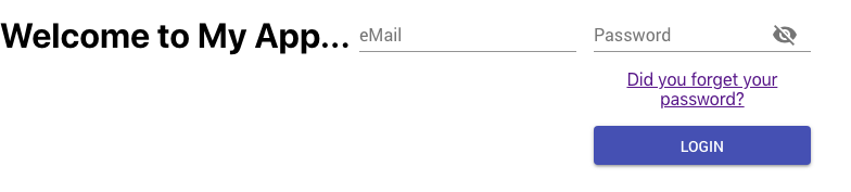
export default withStyles(styles)(LoginModal);只有两个最新的组件显示堆叠,而其余的显示成一行。
如何指示React以堆叠方式显示组件?
回答 2
Stack Overflow用户
回答已采纳
发布于 2019-01-03 04:47:04
我发现Material UI使用网格组件来管理响应性,您可以使用它来排列显示中的对象。
这就是我使用Grid以我想要的方式显示对象的方式:
class LoginModal extends Component {
state = {
password: '',
showPassword: false,
};
render() {
const { classes } = this.props
return (
<div className={classes.root}>
<Grid container spacing={24}>
<Grid item xs={12}>
<h1>Welcome to My App...</h1>
</Grid>
<Grid item xs={12}>
<FormControl className={classNames(classes.margin, classes.textField)}>
<InputLabel htmlFor="adornment-email">eMail</InputLabel>
<Input
id="adornment-email"
variant="filled"
/>
</FormControl>
</Grid>
<Grid item xs={12}>
<FormControl className={classNames(classes.margin, classes.textField)}>
<InputLabel htmlFor="adornment-password">Password</InputLabel>
<Input
id="adornment-password"
variant="filled"
type={this.state.showPassword ? 'text' : 'password'}
value={this.state.password}
endAdornment={
<InputAdornment position="end">
<IconButton
aria-label="Toggle password visibility"
onClick={this.handleClickShowPassword}
>
{this.state.showPassword ? <Visibility /> : <VisibilityOff />}
</IconButton>
</InputAdornment>
}
/>
<p><a href="#">Did you forget your password?</a></p>
<Button color="primary" variant="contained">Login</Button>
</FormControl>
</Grid>
</Grid>
</div>
);
};
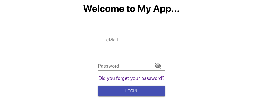
}这就是结果:
Stack Overflow用户
发布于 2019-01-02 23:04:09
将root样式更新为:
root: {
  display: 'flex',
  flex-direction: column;
},
您可能需要调整其他flex属性以获得所需的对齐方式。
页面原文内容由Stack Overflow提供。腾讯云小微IT领域专用引擎提供翻译支持
原文链接:
https://stackoverflow.com/questions/54013686
复制相关文章
相似问题
腾讯云开发者

Copyright © 2013 - 2026 Tencent Cloud. All Rights Reserved. 腾讯云 版权所有
深圳市腾讯计算机系统有限公司 ICP备案/许可证号:粤B2-20090059  粤公网安备44030502008569号
腾讯云计算(北京)有限责任公司 京ICP证150476号 | 京ICP备11018762号