
如何使用CSS3生成曲线边框?
如何使用CSS3生成曲线边框?
提问于 2018-12-31 06:49:58
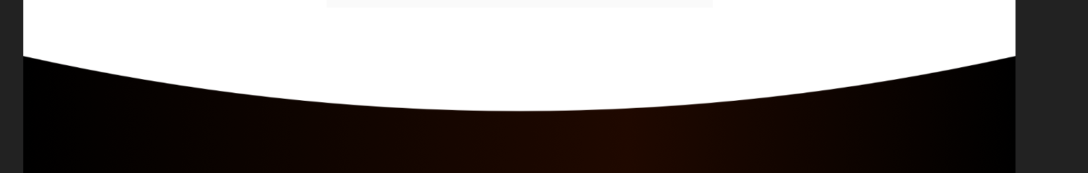
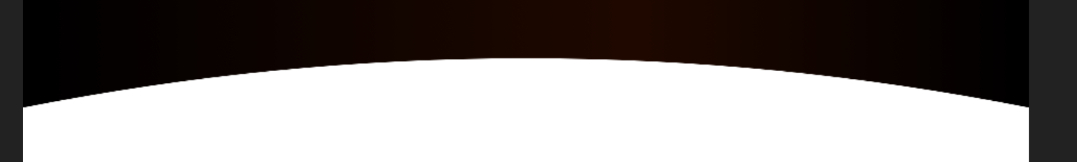
我在这里加了两张照片。你可以看到,第一条曲线是向下曲线,第二条是向上曲线。
现在,我有一个使用CSS的矩形框。我想做的上下边框应该像图片一样。
我可以使用CSS border-radius属性来绘制边框曲线。但我不明白如何使用CSS3制作这种边界曲线?
更新:
以下是我想要的全部输出:
回答 3
Stack Overflow用户
回答已采纳
发布于 2018-12-31 07:22:52
我使用before after实现了这一目标。
div{
  width: 400px;
  height: 200px;
  background-color: #333;
  position: relative;
  overflow: hidden;
}
div:before {
    content: "";
    position: absolute;
    top: -10%;
    width: 100%;
    height: 50%;
    background-color: white;
    border-bottom-left-radius: 50%;
    border-bottom-right-radius: 50%;
}
div:after {
    content: "";
    position: absolute;
    width: 100%;
    bottom: -10%;
    height: 50%;
    background-color: white;
    border-top-left-radius: 50%;
    border-top-right-radius: 50%;
}<div></div>
在OP最近的评论之后,更新,在这里您可以在content-main div中添加内容
.content{
  background-color: #333;
  width: 400px;
}
.content-top, .content-bottom{
  width: 400px;
  height: 100px;
  background-color: #333;
  position: relative;
  overflow: hidden;
}
.content-top:before {
    content: "";
    position: absolute;
    top: -10%;
    width: 100%;
    height: 50%;
    background-color: white;
    border-bottom-left-radius: 50%;
    border-bottom-right-radius: 50%;
}
.content-bottom:after {
    content: "";
    position: absolute;
    width: 100%;
    bottom: -10%;
    height: 50%;
    background-color: white;
    border-top-left-radius: 50%;
    border-top-right-radius: 50%;
}
.content-main{
  padding: 10px;
}<div class="content">
<div class="content-top"></div>
<div class="content-main">
<h1>Cat</h1>
<img src="https://encrypted-tbn0.gstatic.com/images?q=tbn:ANd9GcS11TbGOYA0EmL-usNpArFE8o17OSRSilYYohX1lgyxaP43M2Pt">
</div>
<div class="content-bottom"></div>
</div>
Stack Overflow用户
发布于 2018-12-31 07:00:58
您可以使用两个Divs,一个是黑色背景,另一个是白色背景和圆形边框来实现这一点。包装应该有一个填充来模拟边框的厚度:
#wrapper{
background:#000000;
width:600px;
height:200px;
padding:10px;
}
#roundCurve{
background:#ffffff;
width:600px;
height:200px;
border-bottom-left-radius:50% 50px;
border-bottom-right-radius:50% 50px;
border-top-left-radius:50% 50px;
border-top-right-radius:50% 50px;
}<div id="wrapper">
<div id="roundCurve"></div>
</div>
Stack Overflow用户
发布于 2018-12-31 07:27:48
下面是一个您可以遵循的示例:
body {
  background: black;
}
.roundCorner {
  width: 150px;
  height: 100px;
  padding: 2em;
  border-bottom: 0;
  position: relative;
  background: white;
  border-radius: 1em 1em 0 0;
}
.roundCorner:before {
  position: absolute;
  left: -1px;
  right: -1px;
  top: 0;
  height: 1.5em;
  border: 1px solid black;
  border-top: 0;
  border-radius: 0 0 3em 3em;
  content:'';
  background: black;
}
.roundCorner:after {
  position: absolute;
  left: -1px;
  right: -1px;
  bottom: 0;
  height: 1.5em;
  border: 1px solid black;
  border-bottom: 0;
  border-radius: 3em 3em 0 0;
  content: '';
  background: black;
}<div class="roundCorner"></div>
您可以更改body、.roundCorner、.roundCorner:before、.roundCorner:after的背景,看看它是如何工作的。
页面原文内容由Stack Overflow提供。腾讯云小微IT领域专用引擎提供翻译支持
原文链接:
https://stackoverflow.com/questions/53984470
复制相关文章
相似问题
腾讯云开发者

Copyright © 2013 - 2026 Tencent Cloud. All Rights Reserved. 腾讯云 版权所有
深圳市腾讯计算机系统有限公司 ICP备案/许可证号:粤B2-20090059  粤公网安备44030502008569号
腾讯云计算(北京)有限责任公司 京ICP证150476号 | 京ICP备11018762号