
整理图片图
整理图片图
提问于 2018-12-29 17:35:52
给定一个地块构造的两个向量,一个边和一个重:
edg <- c("ES1-3", "ES4-6", "ES4-6", "ES6-8", "ES6-8", "ES7-9", "ES7-9",
"ES10-12", "ES10-12", "ES13-15", "ES13-15", "ES16-18", "ES16-18",
"ES19-21", "ES19-21", "ES22-24", "ES22-24", "ES25-27", "ES25-27",
"ES28-30", "ES28-30", "ES31-33", "ES31-33", "ES34-36", "ES34-36",
"ES37-38", "ES13-15", "SA1-3", "SA1-3", "SA4-6", "SA4-6", "SA7-9",
"SA7-9", "SA10-12", "SA10-12", "SA13-15", "SA13-15", "SA16-18",
"SA16-18", "SA19-21", "SA19-21", "SA22-25")
用上述向量绘制代码:
g1 <- make_graph(edges=edg)以及权向量:
E(g1)$weight = c(0.0051, 0.0022, 0.0152, 0.0257, 0.0039, 0.0109, 0.012,
0.0275, 0.0108, 0.029, 0.0061, 0.0134, 0.0205, 0.0129, 0.0081, 0.0035,
0.02, 0.0094, 0.0095, 0.0161, 0.0199)
现在,请看一看下面代码的结果:
 plot(g1,
 edge.label = E(g1)$weight,
 edge.arrow.size=.4,
 vertex.color='orange',
 vertex.size=7,
 vertex.frame.color="orange",
 vertex.label.color="black",
 vertex.label.cex=0.8,
 vertex.label.dist=1.1,
 margin=-.2,
 vertex.shape='circle')
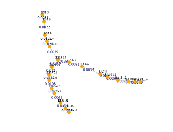
我在这个情节上有几个问题,我不能正确地解决:
- 尽管给
edge.arrow.size=.4一个常数,边缘箭头大小有不同的大小,也就是说,一些箭头比另一些箭头大,我希望它们都具有相同的大小。 - 我想用不同的颜色来表示代码,也就是‘SA’的右分支,即'SA1-3‘SA4-6’等等。我读到它与创建一个属性有关,就像我创建的权重向量一样,但无法正确地计算出来。
- 我想要一个更整洁的图形,也就是说,不重叠的边缘标签与数字应该在箭头之上。正如您在
plot(g1,...)代码上看到的那样,我试着调整了几个参数,但是没有一个参数给出了一个好看的、整洁的图表。 - 每次我在R上运行下面描述的
plot(g1,...)代码时,都会得到不同形状的图。这就是分支大小的变化,例如,左边的分支在右边,反之亦然。那是为什么?为什么每次我不修改代码就运行代码时,igraph总是为相同的代码提供不同的形状?
回答 1
Stack Overflow用户
回答已采纳
发布于 2018-12-29 21:26:44
正如@RuiBaradas所评论的,默认布局有一个随机元素。为了使布局可重复,您必须显式地指定布局,或者使用类似于set.seed(123)的内容设置种子。但是,图上有许多相互竞争的标签。你随意做的几乎任何事情都会有问题,所以我建议你做一个明确的布局。我将在下面展示这一点。要更改顶点颜色,只需指定颜色向量,而不是单个常量。以下也显示了这一点。我还调整了vertex.label.dist和vertex.label.degree以控制标签相对于节点的位置。我没有看到你的问题与不同的箭头大小。
使用您的数据:
## First make a color map
ColMap = rep("orange", vcount(g1))
ColMap[grep("^SA", V(g1)$name)] = "red"

## Create an explicit layout of the vertices
## that will separate the labels
LO = matrix(0, nrow=22, ncol=2)
LO[1:5,1]   = 5:1
LO[7:14,1]  = (1:8)/1.7
LO[15:22,1] = (1:8)/1.7
LO[7:14,2]  = -(1:8)
LO[15:22,2] = 2:9


plot(g1, layout=LO,
  edge.label = E(g1)$weight,
  edge.label.cex = 0.8,
  edge.arrow.size=.4,
  vertex.color=ColMap,
  vertex.size=7,
  vertex.frame.color="orange",
  vertex.label.color="black",
  vertex.label.cex=0.8,
  vertex.label.dist=c(rep(1.2,5), rep(2.2,17)),
  vertex.label.degree = c(rep(-pi/2, 5), pi, rep(-0.1,8), rep(0.1,8)),
  margin=-.2,
  vertex.shape='circle')
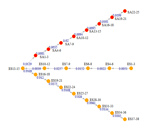
考虑到您想要在这个图中打包多少,这看起来不算太糟。至少你能读懂所有的东西。如果你不喜欢这个形状,你可以调整布局来定位你想要的东西。
页面原文内容由Stack Overflow提供。腾讯云小微IT领域专用引擎提供翻译支持
原文链接:
https://stackoverflow.com/questions/53971847
复制相关文章
相似问题
腾讯云开发者

Copyright © 2013 - 2026 Tencent Cloud. All Rights Reserved. 腾讯云 版权所有
深圳市腾讯计算机系统有限公司 ICP备案/许可证号:粤B2-20090059 ![]() 粤公网安备44030502008569号
粤公网安备44030502008569号
腾讯云计算(北京)有限责任公司 京ICP证150476号 | 京ICP备11018762号