
geom_dotplot的正确用途是什么?
我的目的是复制这个数字(道格拉斯A.林德,威廉G马尔查尔,塞缪尔A.瓦西,统计技术在商业和经济,麦格劳-希尔,第17版)与ggplot2 (作者:哈德利韦翰)。
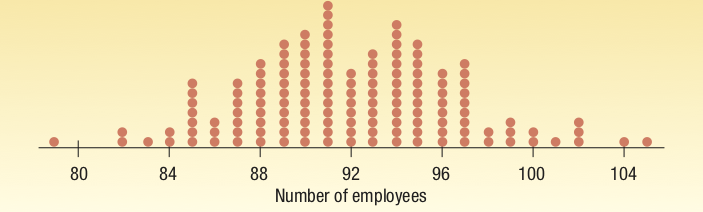
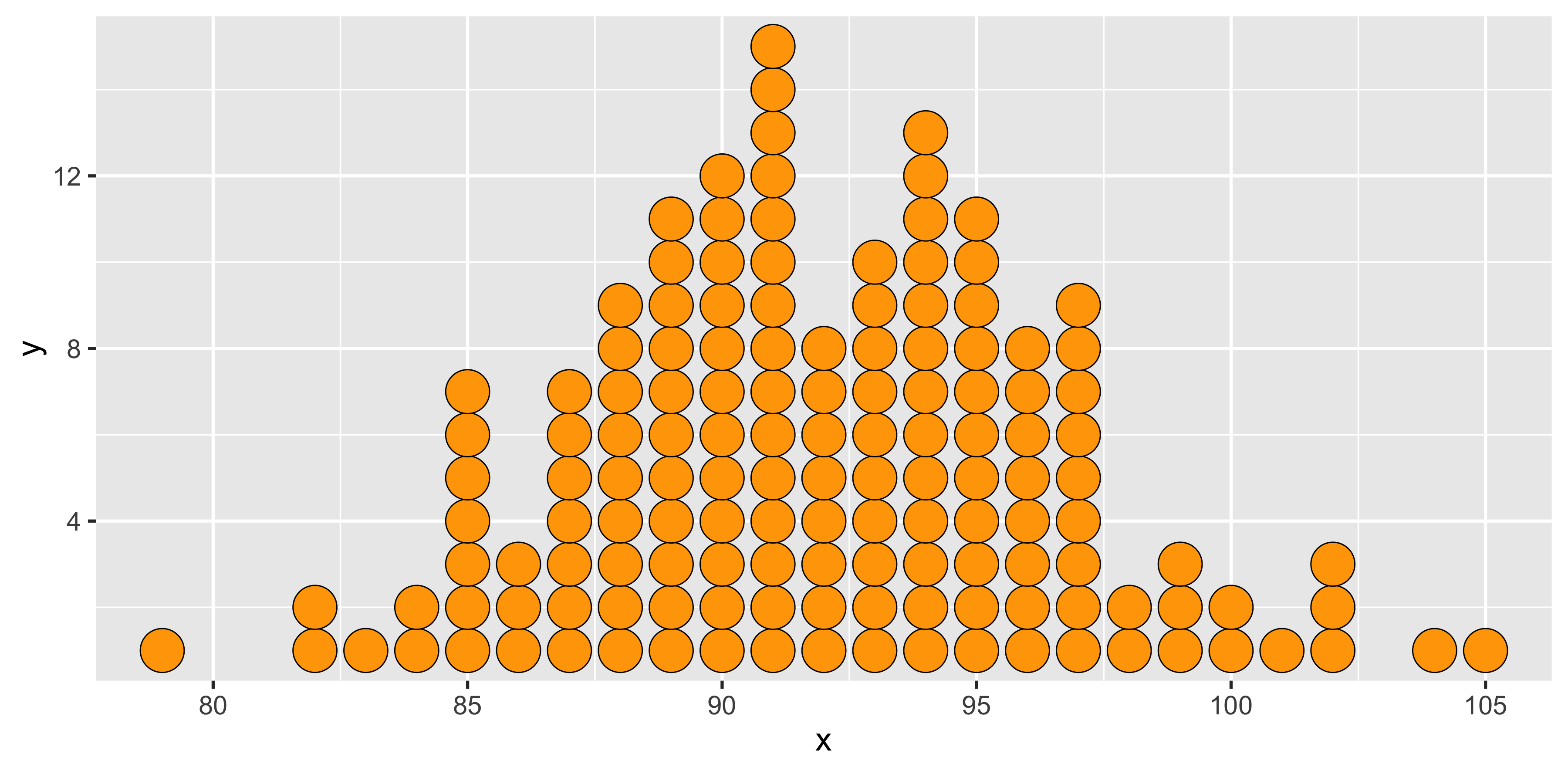
下面是我基于geom_point和一些丑陋的数据准备所做的工作(请参阅下面的代码):
我怎么能用geom_dotplot()**?** 这么做?
在我的尝试中,我遇到了几个问题:(1)将geom_dotplot生成的默认密度映射到一个计数,(2)切断轴,(3)没有意外的漏洞。我放弃了,转而黑了geom_point()。
我期望(而且仍然希望)事情会像这样简单
ggplot(data, aes(x,y)) + geom_dotplot(stat = "identity")但是没有。下面是我尝试过的结果和输出:
# Data
df <- structure(list(x = c(79, 80, 81, 82, 83, 84, 85, 86, 87, 88, 89, 90, 91, 92, 93, 94, 95, 96, 97, 98, 99, 100, 101, 102, 103, 104, 105), y = c(1, 0, 0, 2, 1, 2, 7, 3, 7, 9, 11, 12, 15, 8, 10, 13, 11, 8, 9, 2, 3, 2, 1, 3, 0, 1, 1)), class = "data.frame", row.names = c(NA, -27L))

# dotplot based on geom_dotplot
geom_dots <- function(x, count, round = 10, breaks = NULL, ...) {
    require(ggplot2)
    n = sum(count) # total number of dots to be drawn
    b = round*round(n/round) # prettify breaks
    x = rep(x, count) # make x coordinates for dots
    if (is.null(breaks))  breaks = seq(0, 1, b/4/n)
    ggplot(data.frame(x = x), aes(x = x)) +
        geom_dotplot(method = "histodot", ...) +
        scale_y_continuous(breaks = breaks,
                        #limits = c(0, max(count)+1), # doesn't work
                        labels = breaks * n)
}

geom_dots(x = df$x, count = df$y)

# dotplot based on geom_point
ggplot_dot <- function(x, count, ...) {
    require(ggplot2)
    message("The count variable must be an integer")
    count = as.integer(count) # make sure these are counts
    n = sum(count) # total number of dots to be drawn
    x = rep(x, count) # make x coordinates for dots
    count = count[count > 0]  # drop zero cases
    y = integer(0)  # initialize y coordinates for dots
    for (i in seq_along(count))
        y <- c(y, 1:(count[i]))  # compute y coordinates
    ggplot(data.frame(x = x, y = y), aes(x = x, y = y)) +
        geom_point(...)  # draw one dot per positive count
}

ggplot_dot(x = df$x, count = df$y,
    size = 11, shape = 21, fill = "orange", color = "black") + theme_gray(base_size = 18)
# ggsave("dotplot.png")
ggsave("dotplot.png", width = 12, height = 5.9)简单随机注释:使用geom_point()解决方案,保存绘图需要调整大小,以确保点的大小(点大小和图的高度/宽度)。使用geom_dotplot()解决方案,我对标签进行了舍入,使其更加美观。不幸的是,我无法在大约100的时候切断轴:使用limits()或coord_cartesian()会导致重新缩放整个地块,而不是裁剪。还请注意,为了使用geom_dotplot(),我创建了一个基于计数的数据向量,因为我无法直接使用count变量(我希望stat="identity"能够这样做,但我无法使它工作)。
回答 2
Stack Overflow用户
发布于 2018-12-11 18:01:12
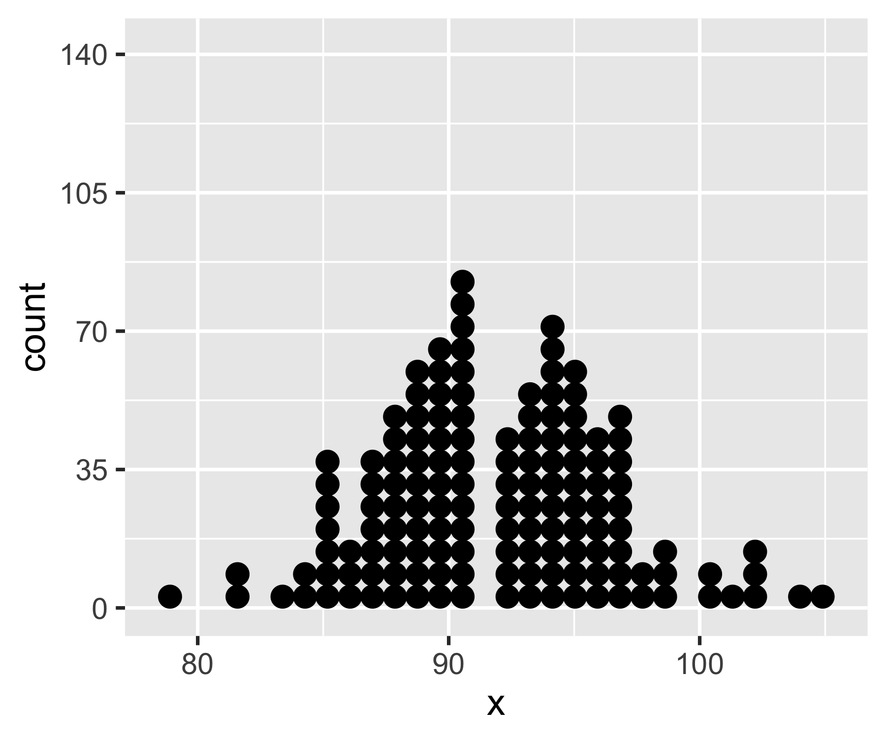
巧合的是,在过去的一天里,我还和geom_dotplot()打过架,并试图让它显示出它的重要性。我还没有找到让y轴显示实际数字的方法,但是我找到了一种截断y轴的方法。正如您所提到的,coord_cartesian()和limits不工作,但coord_fixed()工作,因为它强制执行x:y单位的比率:
library(tidyverse)
df <- structure(list(x = c(79, 80, 81, 82, 83, 84, 85, 86, 87, 88, 89, 90, 91, 92, 93, 94, 95, 96, 97, 98, 99, 100, 101, 102, 103, 104, 105), y = c(1, 0, 0, 2, 1, 2, 7, 3, 7, 9, 11, 12, 15, 8, 10, 13, 11, 8, 9, 2, 3, 2, 1, 3, 0, 1, 1)), class = "data.frame", row.names = c(NA, -27L))
df <- tidyr::uncount(df, y)

ggplot(df, aes(x)) +
  geom_dotplot(method = 'histodot', binwidth = 1) +
  scale_y_continuous(NULL, breaks = NULL) +
  # Make this as high as the tallest column
  coord_fixed(ratio = 15)
使用15作为这里的比率是可行的,因为x轴也是在相同的单位(即单个整数)。如果x轴是一个百分比或对数美元或日期或其他,你必须修补的比率,直到y轴被截断足够。
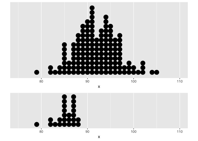
编辑与地块结合法
正如我在下面的评论中所提到的,使用拼凑法将情节与coord_fixed()结合起来并不是很好。但是,如果手动将合并的地块的高度(或宽度)设置为与coord_fixed()中的比率相同的值,并确保每个地块具有相同的x轴,则可以得到psuedo面图。
# Make a subset of df
df2 <- df %>% slice(1:25)

plot1 <- ggplot(df, aes(x)) +
  geom_dotplot(method = 'histodot', binwidth = 1) +
  scale_y_continuous(NULL, breaks = NULL) +
  # Make this as high as the tallest column
  # Make xlim the same on both plots
  coord_fixed(ratio = 15, xlim = c(75, 110))

plot2 <- ggplot(df2, aes(x)) +
  geom_dotplot(method = 'histodot', binwidth = 1) +
  scale_y_continuous(NULL, breaks = NULL) +
  coord_fixed(ratio = 7, xlim = c(75, 110))

# Combine both plots in a single column, with each sized incorrectly
library(patchwork)
plot1 + plot2 +
  plot_layout(ncol = 1)
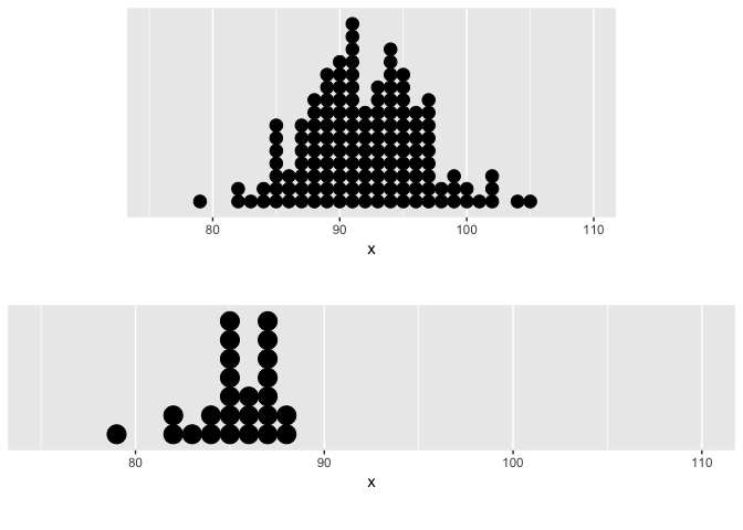
# Combine both plots in a single column, with each sized appropriately
library(patchwork)
plot1 + plot2 +
  plot_layout(ncol = 1, heights = c(15, 7) / (15 + 7))
Stack Overflow用户
发布于 2018-12-10 00:26:53
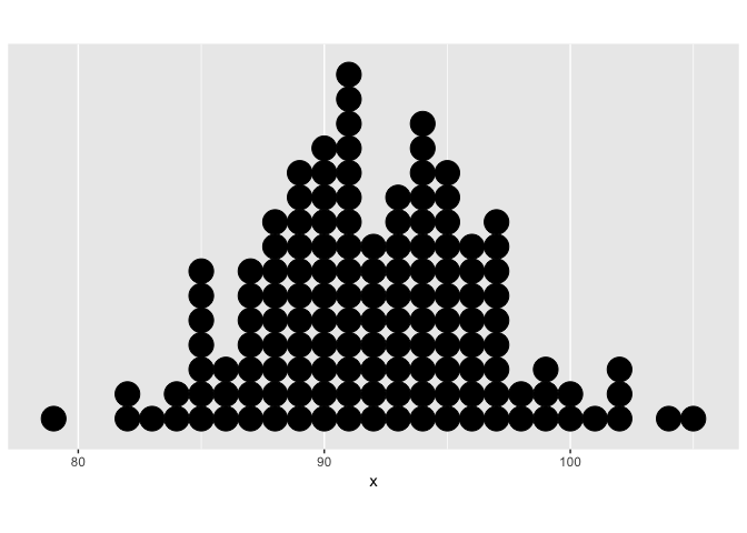
这对复制来说够近吗?
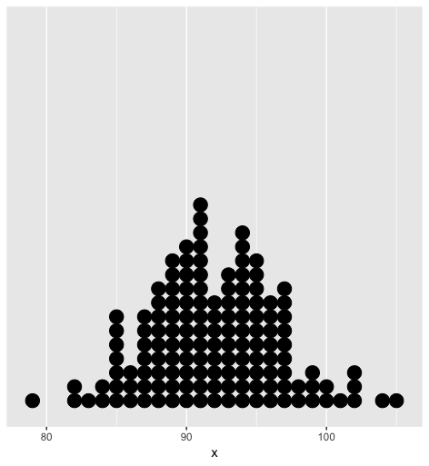
为了达到这个目的,因为第一幅图实际上是一个直方图,所以从计数摘要中,将示例数据展开到每个观察表单中的一行。
df <- tidyr::uncount(df, y) 然后利用method = 'histodot'和bindwidth=1将geom_dotplot()转换成直方图-y形式.
为了美学起见,移除y轴,因为它是小数的胡言乱语,甚至连医生都说它“没有意义,所以把它藏起来”。
ggplot(df, aes(x)) +
  geom_dotplot(method = 'histodot', binwidth = 1) +
scale_y_continuous(NULL, breaks = NULL)https://stackoverflow.com/questions/53697235
复制相似问题
腾讯云开发者

Copyright © 2013 - 2026 Tencent Cloud. All Rights Reserved. 腾讯云 版权所有
深圳市腾讯计算机系统有限公司 ICP备案/许可证号:粤B2-20090059 ![]() 粤公网安备44030502008569号
粤公网安备44030502008569号
腾讯云计算(北京)有限责任公司 京ICP证150476号 | 京ICP备11018762号