
如何将新材料BottomAppBar实现为BottomNavigationView
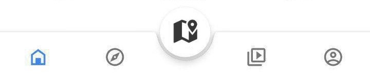
我试图实现新的BottomAppBar,它通常看起来像这样:材料BottomAppBar作为一个BottomNavigationView,就像在Google应用程序中看起来像这一样。
我的问题是,由于我只能用菜单资源填充BottomAppBar,所以我无法理解如何使我的按钮看起来像BottomNavigationView (但是使用Fab按钮的“剪切”),而不是将所有内容对齐到BottomAppBar的一侧。
如何在这个新材料BottomAppBar中添加自定义布局?
或者,是否有任何方法来实现BottomNavigationView的“剪切”为Fab按钮(保持凉爽的默认动画,如新的BottomAppBar)?
回答 5
Stack Overflow用户
发布于 2018-12-08 17:27:51
解决了
基本上,我没有试图将菜单资源强制配置到我所需要的布局中,而是使用这个解决方案,而是使用@dglozano建议的“空”元素在BottomAppBar中放置一个BottomAppBar。
使用?attr/selectableItemBackgroundBorderless,我还能够实现一个与BottomNavigationView非常相似的效果。
<com.google.android.material.bottomappbar.BottomAppBar
    android:id="@+id/bar"
    android:layout_width="match_parent"
    android:layout_height="wrap_content"
    android:layout_gravity="bottom"
    android:gravity="center"
    app:layout_anchorGravity="start"
    app:hideOnScroll="true"
    app:fabAnimationMode="scale"
    app:fabAlignmentMode="center"
    app:contentInsetEnd="16dp"
    app:contentInsetStart="16dp"
    app:backgroundTint="@color/colorPrimary">

    <LinearLayout
        android:layout_width="match_parent"
        android:layout_height="wrap_content"
        android:weightSum="5">
        <ImageButton
            android:layout_width="0dp"
            android:layout_height="wrap_content"
            android:layout_weight="1"
            app:srcCompat="@drawable/ic_home_white_24dp"
            android:background="?attr/selectableItemBackgroundBorderless"
            android:tint="@color/secondary_text"/>
        <ImageButton
            android:layout_width="0dp"
            android:layout_height="wrap_content"
            android:layout_weight="1"
            app:srcCompat="@drawable/ic_map_black_24dp"
            android:background="?attr/selectableItemBackgroundBorderless"/>
        <ImageButton
            android:layout_width="0dp"
            android:layout_height="wrap_content"
            android:layout_weight="1"
            android:background="@android:color/transparent"/>
        <ImageButton
            android:layout_width="0dp"
            android:layout_height="wrap_content"
            android:layout_weight="1"
            app:srcCompat="@drawable/ic_people_white_24dp"
            android:background="?attr/selectableItemBackgroundBorderless"/>
        <ImageButton
            android:layout_width="0dp"
            android:layout_height="wrap_content"
            android:layout_weight="1"
            app:srcCompat="@drawable/ic_account_circle_24dp"
            android:background="?attr/selectableItemBackgroundBorderless"/>
    </LinearLayout>
</com.google.android.material.bottomappbar.BottomAppBar>Stack Overflow用户
发布于 2019-09-20 17:43:57
为android实现材料组件的团队说,这个设计不是规范的一部分,但是他们慷慨地提供了一个简单的解决方案,可以在下面的链接中看到。
有可能让菜单均匀分布的BottomAppBar & FloatingActionButton吗?#72
基本上,需要更改菜单按钮的容器的布局参数:
if(bottomAppBar.childCount > 0) {
     val actionMenuView = bottomAppBar.getChildAt(0) as androidx.appcompat.widget.ActionMenuView
     actionMenuView.layoutParams.width = androidx.appcompat.widget.ActionMenuView.LayoutParams.MATCH_PARENT
}
这与您的无效菜单项的结合将发挥作用,避免使用另一个android组件。
Stack Overflow用户
发布于 2018-12-08 13:56:49
1 -在build.gradle存储库中包含Maven
allprojects {
    repositories {
        jcenter()
        maven {
            url "https://maven.google.com"
        }
    }
}
2 -在build.gradle.中放置材料组件依赖项,请记住材料版本定期更新。
implementation 'com.google.android.material:material:1.0.0-alpha1'3 -将compileSdkVersion和targetSdkVersion设置为最新的API版本,使Android达到28。
4 -确保您的应用程序继承了Theme.MaterialComponents主题,以便使BottomAppBar使用最新的样式。或者,您可以在布局xml文件中的小部件声明中声明BottomAppBar的样式,如下所示。
style=”@style/Widget.MaterialComponents.BottomAppBar”5 -,您可以在布局中包括BottomAppBar,如下所示。BottomAppBar一定是CoordinatorLayout的孩子。
<com.google.android.material.bottomappbar.BottomAppBar
android:id="@+id/bottom_app_bar"
android:layout_width="match_parent"
android:layout_height="wrap_content"
android:layout_gravity="bottom"
app:backgroundTint="@color/colorPrimary"
app:fabAlignmentMode="center"
app:fabAttached="true"
app:navigationIcon="@drawable/baseline_menu_white_24"/>
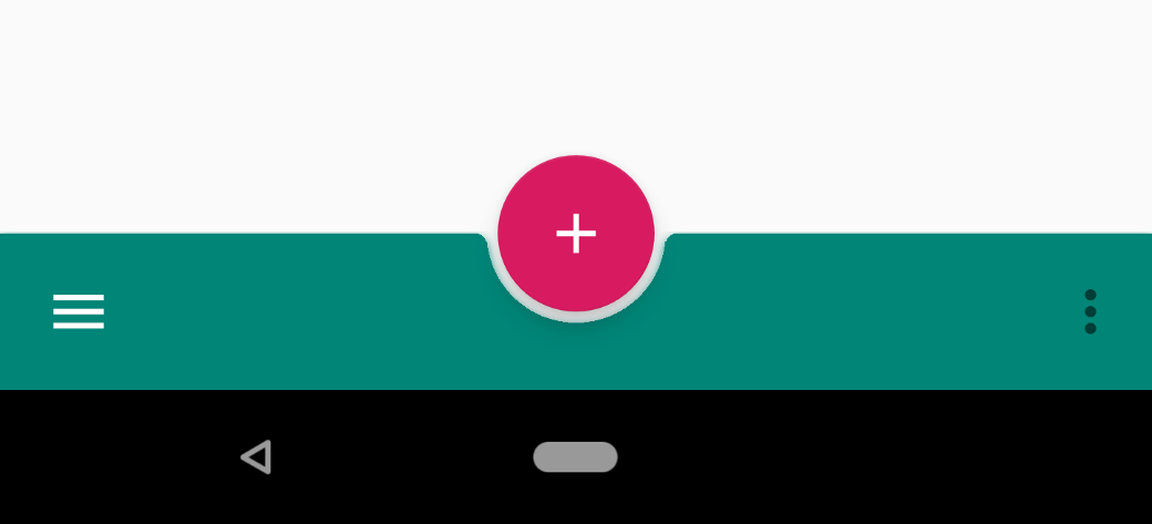
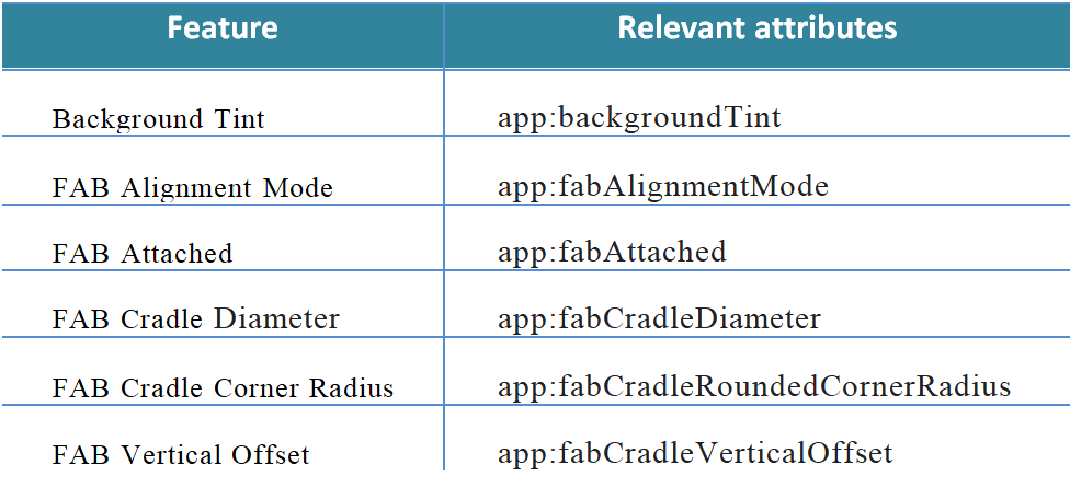
6 -您可以通过在FAB的app:layout_anchor属性中指定BottomAppBar的id来将浮动动作按钮(FAB)锚定到BottomAppBar。BottomAppBar可以用一个形状的背景来支撑FAB,或者FAB可以重叠BottomAppBar。
<com.google.android.material.floatingactionbutton.FloatingActionButton
android:id="@+id/fab"
android:layout_width="wrap_content"
android:layout_height="wrap_content"
android:src="@drawable/baseline_add_white_24"
app:layout_anchor="@id/bottom_app_bar" />
7 -有很多属性可以用来配置底层Nav和Fab图标。
更新: Check 这是对他的问题的最终解决办法的回答。
https://stackoverflow.com/questions/53682200
复制相似问题
腾讯云开发者

Copyright © 2013 - 2026 Tencent Cloud. All Rights Reserved. 腾讯云 版权所有
深圳市腾讯计算机系统有限公司 ICP备案/许可证号:粤B2-20090059  粤公网安备44030502008569号
腾讯云计算(北京)有限责任公司 京ICP证150476号 | 京ICP备11018762号