
R中的数据汇总
我相信这真的很容易,但作为一个R新手,我正在撕扯我的头发。
我有一个数据框架:
df <- data.frame("Factor_1" = c(1,2,1,1,2,1,1,2,1,2,1,2),
                 "Factor_2" = c("M", "F", "M", "F","M", "F","M", "F","M", "F","M", "F"),
                 "Denominator" = c(1,1,1,1,1,1,1,1,1,1,1,1),
                 "Numerator" = c(0,0,1,0,0,0,1,0,0,0,1,1))
我想要创建一些图表:
(1) Sum(Denominator) - split by Factor_1
(2) Sum(Numerator)/Sum(Denominator) - split by Factor_1

(so Factor_1 appears on the horizontal axis)

(and then repeat for Factor_2)
理想情况下,(1)和(2)具有不同的垂直轴线和(1)作为列和(2)作为线。
看起来有点像附加的图片(来自Excel枢轴表/图表):
回答 2
Stack Overflow用户
发布于 2018-11-29 18:20:39
不要把这个问题看作是Excel中的一个支点,而要把它看作是使用tidyverse的最佳机会!
让我们建立我们的环境:
library(tidyverse)   # This will load dplyr and tidyverse to make visualization easier!

df <- data.frame("Factor_1" = c(1,2,1,1,2,1,1,2,1,2,1,2),
             "Factor_2" = c("M", "F", "M", "F","M", "F","M", "F","M", "F","M", "F"),
             "Denominator" = c(1,1,1,1,1,1,1,1,1,1,1,1),
"Numerator" = c(0,0,1,0,0,0,1,0,0,0,1,1)) 首先,让我们使用Factor_1。首先,我们要得到每个Factor_1群的分子和分母和分子/分母比。我们需要告诉R,我们想要按Factor_1分组,然后我们可以使用dplyr包中的summarize()函数来完成大部分的繁重工作。
summaryFactor1 <- df %>%                     # Save as new object: summaryFactor1
group_by(Factor_1) %>%                       # Group data by Factor_1, and for each:
summarize(sum_num = sum(Numerator),          # sum Numerator
        sum_den = sum(Denominator)) %>%      # sum Denominator
mutate(ratio = sum_num/sum_den)              # and create new column for num/den
这将使我们:
summaryFactor1
#  A tibble: 2 x 4
  Factor_1 sum_num sum_den ratio
     <dbl>   <dbl>   <dbl> <dbl>
1        1       3       7 0.429
2 2 1 5 0.2 为了再现您要寻找的图形,我们使用我们的summaryFactor1 tibble并使用ggplot:
summaryFactor1 %>%                        # Use our summary table
ggplot(aes(x = Factor_1)) +               # plot Factor_1 on x-axis,
geom_col(aes(y = sum_den)) +              # sum_den as columns,
geom_line(aes(y = ratio))                 # and ratio as a line
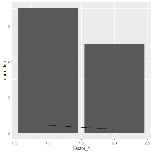
请注意,这里只有一个y轴,因此绘制该比率的直线很难解释。虽然您希望从Excel中共享的地块看起来更好,但是要小心对该比率的误解。
我们可以对Factor_2使用与上面相同的逻辑:
summaryFactor2 <- df %>%                     # Save as new object: summaryFactor1
group_by(Factor_2) %>%                       # Group data by Factor2, and for each:
summarize(sum_num = sum(Numerator),          # sum Numerator
        sum_den = sum(Denominator)) %>%      # sum Denominator
mutate(ratio = sum_num/sum_den)              # and create new column for num/den

# Let's view the result
summaryFactor2
# A tibble: 2 x 4
 Factor_2 sum_num sum_den ratio
  <fct>      <dbl>   <dbl> <dbl>
1 F              1       6 0.167
2 M              3       6 0.5
在我们继续之前,请注意,每个组的分母之和是相同的。当我们比较因子1组中的比率时,注意这两个组有一个不同的分母和,所以这是一个更容易的1:1比较。
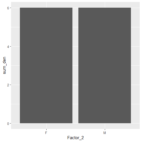
因为在两组之间策划sum_den并不是很有见地.
summaryFactor2
ggplot(aes(x = Factor_2)) +
geom_col(aes(y = sum_den))
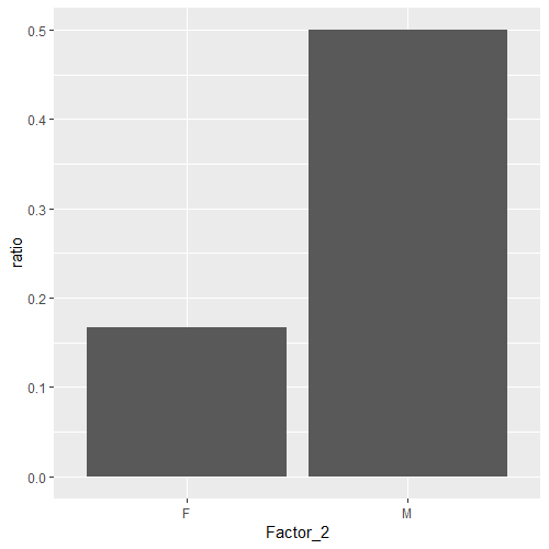
相反,让我们画出这个比率:
summaryFactor2 %>%
ggplot(aes(x = Factor_2)) +
geom_col(aes(y = ratio))
Stack Overflow用户
发布于 2018-11-29 16:42:58
library(tidyverse)

df <- data.frame("Factor_1" = c(1,2,1,1,2,1,1,2,1,2,1,2),
             "Factor_2" = c("M", "F", "M", "F","M", "F","M", "F","M", "F","M", "F"),
             "Denominator" = c(1,1,1,1,1,1,1,1,1,1,1,1),
             "Numerator" = c(0,0,1,0,0,0,1,0,0,0,1,1))


df %>% group_by(Factor_1) %>% summarize(sum_num=sum(Numerator),sum_dem=sum(Denominator)) %>% mutate(ratio=sum_num/sum_dem)

A tibble: 2 x 4
Factor_1 sum_num sum_dem ratio
   <dbl>   <dbl>   <dbl> <dbl>
       1       3       7 0.429
       2       1       5 0.2
这个有用吗?
https://stackoverflow.com/questions/53543193
复制相似问题
腾讯云开发者

Copyright © 2013 - 2026 Tencent Cloud. All Rights Reserved. 腾讯云 版权所有
深圳市腾讯计算机系统有限公司 ICP备案/许可证号:粤B2-20090059 ![]() 粤公网安备44030502008569号
粤公网安备44030502008569号
腾讯云计算(北京)有限责任公司 京ICP证150476号 | 京ICP备11018762号