
全息图的二次轴
全息图的二次轴
提问于 2018-11-26 21:14:25
我正在试图绘制一组图,上面覆盖着一幅显示它们之间的%差异的图表。
我的密谋代码是:
%%output size = 200
%%opts Curve[height=200, width=400,show_grid=True,tools=['hover','box_select'], xrotation=90]
%%opts Curve(line_width=1)


from bokeh.models import Range1d, LinearAxis

new_df = new_df.astype('float')
percent_diff_df = percent_diff_df.astype('float')

def twinx(plot, element):
    # Setting the second y axis range name and range
    start, end = (element.range(1))
    label = element.dimensions()[1].pprint_label
    plot.state.extra_y_ranges = {"foo": Range1d(start=0, end=150)}
    # Adding the second axis to the plot.
    linaxis = LinearAxis(axis_label='% Difference', y_range_name='foo')
    plot.state.add_layout(linaxis, 'right')

wavelength = hv.Dimension('wavelength', label = 'Wavelength', unit = 'nm')
radiance = hv.Dimension('radiance', label = 'Radiance', unit = 'W/m^2/sr/nm')
curve = hv.Curve((new_df['Wave'], new_df['Level_9']), wavelength, radiance,label = 'Level_9', group = 'Requirements')*\
    hv.Curve((new_df['gcal_wave'],new_df['gcal_9']),wavelength, radiance,label = 'GCAL_9', group = 'Requirements')
curve2 = hv.Curve((percent_diff_df['pdiff_wave'],percent_diff_df['pdiff_9']), label = '% Difference', group = 'Percentage Difference').opts(plot=dict(finalize_hooks=[twinx]), style=dict(color='purple'))
curve * curve2
结果如下:
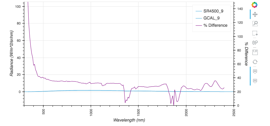
平面图实际上应该是这样的:
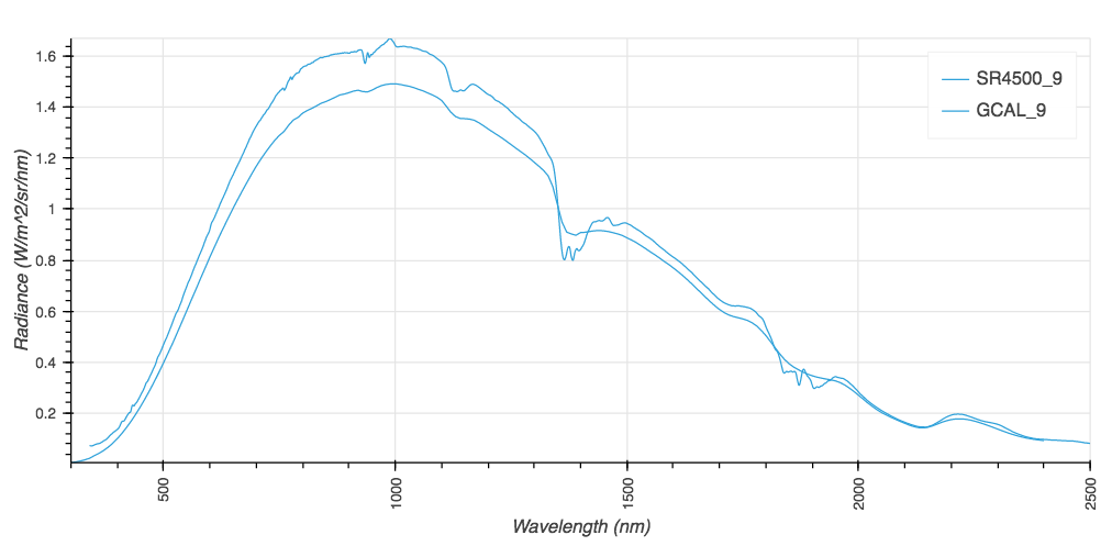
我需要在两个尺度上绘制这两幅图。我似乎能够增加一个刻度,但没有附加任何情节的天平。
回答 1
Stack Overflow用户
发布于 2019-06-30 20:38:41
你的解决方案快完成了。要实际使用钩子中创建的范围和轴,您需要访问底层bokeh字形并设置其y_range_name。
一个一般的例子如下所示:
import pandas as pd
import holoviews as hv
from bokeh.models.renderers import GlyphRenderer

hv.extension('bokeh')

def apply_formatter(plot, element):

    p = plot.state

    # create secondary range and axis
    p.extra_y_ranges = {"twiny": Range1d(start=0, end=35)}
    p.add_layout(LinearAxis(y_range_name="twiny"), 'right')

    # set glyph y_range_name to the one we've just created
    glyph = p.select(dict(type=GlyphRenderer))[0]
    glyph.y_range_name = 'twiny'

dts = pd.date_range('2015-01-01', end='2015-01-10').values

c_def = hv.Curve((dts, np.arange(10)), name='default_axis').options(color='red', width=300)
c_sec = hv.Curve((dts, np.arange(10)), name='secondary_axis').options(color='blue',width=300, hooks=[apply_formatter])
c_def + c_def * c_sec + c_sec欲了解更多详情,请参阅github原版:https://github.com/pyviz/holoviews/issues/396
编辑-高级示例
从最初的问题被回答到现在已经有一段时间了,随着github的线程的发展,我想跨越一个更高级的例子来处理原始答案中显示的一些不一致之处。我仍然鼓励您通过github的线程来挖掘细节,因为全息视图中的多轴图目前需要了解bokeh如何处理多轴。
import pandas as pd
import streamz
import streamz.dataframe
import holoviews as hv
from holoviews import opts
from holoviews.streams import Buffer
from bokeh.models import Range1d, LinearAxis

hv.extension('bokeh')

def plot_secondary(plot, element):
    '''
    A hook to put data on secondary axis
    '''
    p = plot.state

    # create secondary range and axis
    if 'twiny' not in [t for t in p.extra_y_ranges]:
        # you need to manually recreate primary axis to avoid weird behavior if you are going to
        # use secondary_axis in your plots. From what i know this also relates to the way axis
        # behave in bokeh and unfortunately cannot be modified from hv unless you are
        # willing to rewrite quite a bit of code
        p.y_range = Range1d(start=0, end=10)
        p.y_range.name = 'default'
        p.extra_y_ranges = {"twiny": Range1d(start=0, end=10)}
        p.add_layout(LinearAxis(y_range_name="twiny"), 'right')

    # set glyph y_range_name to the one we've just created
    glyph = p.renderers[-1]
    glyph.y_range_name = 'twiny'

    # set proper range
    glyph = p.renderers[-1]
    vals = glyph.data_source.data['y'] # ugly hardcoded solution, see notes below
    p.extra_y_ranges["twiny"].start = vals.min()* 0.99
    p.extra_y_ranges["twiny"].end = vals.max()* 1.01

# define two streamz random dfs to sim data for primary and secondary plots
simple_sdf = streamz.dataframe.Random(freq='10ms', interval='100ms')
secondary_sdf = streamz.dataframe.Random(freq='10ms', interval='100ms')

# do some transformation
pdf = (simple_sdf-0.5).cumsum()
sdf = (secondary_sdf-0.5).cumsum()

# create streams for holoviews from these dfs
prim_stream = Buffer(pdf.y)
sec_stream = Buffer(sdf.y)

# create dynamic maps to plot streaming data
primary = hv.DynamicMap(hv.Curve, streams=[prim_stream]).opts(width=400, show_grid=True, framewise=True)
secondary = hv.DynamicMap(hv.Curve, streams=[sec_stream]).opts(width=400, color='red', show_grid=True, framewise=True, hooks=[plot_secondary])
secondary_2 = hv.DynamicMap(hv.Curve, streams=[prim_stream]).opts(width=400, color='yellow', show_grid=True, framewise=True, hooks=[plot_secondary])

# plot these maps on the same figure
primary * secondary * secondary_2页面原文内容由Stack Overflow提供。腾讯云小微IT领域专用引擎提供翻译支持
原文链接:
https://stackoverflow.com/questions/53489164
复制相关文章
相似问题
腾讯云开发者

Copyright © 2013 - 2026 Tencent Cloud. All Rights Reserved. 腾讯云 版权所有
深圳市腾讯计算机系统有限公司 ICP备案/许可证号:粤B2-20090059 ![]() 粤公网安备44030502008569号
粤公网安备44030502008569号
腾讯云计算(北京)有限责任公司 京ICP证150476号 | 京ICP备11018762号