
将剖面转换为divs
将剖面转换为divs
提问于 2018-11-25 03:29:53
我最近创建了一个网站,它使用的是部分而不是div,因为我希望div在同一个div中相互浮动,这对我来说已经变得相当混乱了。
想必,我希望这是在网页的头,但每次我试图删除容器,div折叠在一起,导致他们共享CSS属性,我不想明显发生。
我的头看起来像

我的页面应该看起来像
一个示例,说明如果删除容器会发生什么
我希望我的div在同一个div中并排叠加,我找到的唯一有效的方法是使用节,但它不是HTML5标准。
请告诉我如何修复我的代码,以便我可以满足HTML5标准,谢谢。
header, nav, footer, section, clipper, SliderFrame, Picture {
	display: block;
	margin-bottom: 20px;
}
* {
	margin: 0px;
	padding: 0px;
}
#clipper
{
	float:left;
	margin-bottom: 20px;
}
#SliderFrame
{
	margin-left: auto;
	margin-right: auto;
	border: 1px solid;
	width: 830px;
	height: 450px;
}

#Prices1of3
{
	width: 175px;
	border: 1px solid;
	margin-left: 330px;
	float: left;

}

#Prices2of3
{
	width: 175px;
	border: 1px solid;
	margin-left: 175px;
	float: left;
}

#Prices3of3
{
	width: 175px;
	border: 1px solid;
	margin-left: 175px;
	float: left;
}

#Picture
{
	margin-left: 620px;
	margin-right: auto;
	width: 449px;
	height: 226px;
}

#Content
{
	margin-left: auto;
	margin-right: auto;
	max-width: 1260px;
	min-width: 780px;
	width: 780px;
}

#container
{
	margin:0 auto;
	background-color:#66B034;
	max-width: 1260px;
	min-width: 780px;
	width: 90%;
	color: #000;
	font-family: "Trebuchet MS", Arial, Heletica, sans-serif;
}
#logo {
	float: left;
	width: 302px;
	height: 72px;
	background-image:url(../images/Logo/Logofin.gif);
	background-repeat:no-repeat;
	border: 1px solid;
	margin-right: 143px;
}
header h1{
	visibility: hidden;
}
nav ul li{
	list-style: none;
	border: 1px solid Gray;
	display: inline;
}
nav ul li a{
	text-align: center;
	padding: 1px;
	display: inline-block;
}
nav {
	border: solid medium Black;
	float: left;
	width: 70%;
	margin: 1px;
	display: inline-block;

}
nav.nav_item1 {

}
nav.nav_item2 {

}
nav.nav_item3 {

}
nav.nav_item4 {

}
section{
	border: solid medium Black;
}
footer{
	border: solid medium Black;
	clear: both;
	margin: 10px;
	padding: 5px;
}
section ul, ol{
	margin: 15px;
}
.mySlides
{
	width: 830px;
	height: 330px;
	display:none
}
.w3-left, .w3-right, .w3-badge
{
	cursor:pointer
}
.w3-badge
{
	height:13px;
	width:13px;
	padding:0
}<!DOCTYPE html>
<html lang = "en">
<head>
<meta charset="utf-8">
<title>Bog Snorkelling</title>
<link rel="stylesheet" href="../assets/css/webber_1.css" >
<div id="clipper">
<section>
<div id="logo">
</div>
<div id="Navigation">
<nav>
<ul>
<li class="nav_item1"><a href= "../index.html">Home</a></li>
<li class="nav_item2"><a href= "../bogsnorkeling/bog.html">Bog Snorkelling</a></li>
<li class="nav_item3"><a href= "../football/foot.html">Football</a></li>
<li class="nav_item4"><a href= "../golf/golf.html">Golf</a></li>
<li class="nav_item4"><a href= "../racketsports/racket.html">Racket Sports</a></li>
<li class="nav_item5"><a href= "../bookingsfailure/bookingfail.html">Bookings Failure</a></li>
<li class="nav_item6"><a href= "../bookingssuccess/bookingsuccess.html">Bookings Success</a></li>
<li class="nav_item7"><a href= "../bookings/bookings.html">Bookings</a></li>
<li class="nav_item8"><a href= "../community/community.html">Community</a></li>
<li class="nav_item9"><a href= "../induction/induction.html">Induction</a></li>
<li class="nav_item10"><a href= "../inductionsuccess/inductionsuccess.html">Induction Success</a></li>
<li class="nav_item11"><a href= "../inductionfailure/inductionfail.html">Induction Failure</a></li>
<li class="nav_item12"><a href= "../facilities/facilities.html">Facilities</a></li>
<li class="nav_item13"><a href= "../contactus/contactus.html">Contact Us</a></li>
<li class="nav_item14"><a href= "../contactsuccess/contactsuccess.html">Contact Success</a></li>
<li class="nav_item15"><a href= "../contactfailure/contactfail.html">Contact Failure</a></li>
<li class="nav_item16"><a href= "../aboutus/aboutus.html">About Us</a></li>
</ul>
</nav>
</div>
</section>
</div>
</section>
<section>
<h1>Nothing</h1>
</section>
<section>
<div id="Picture">
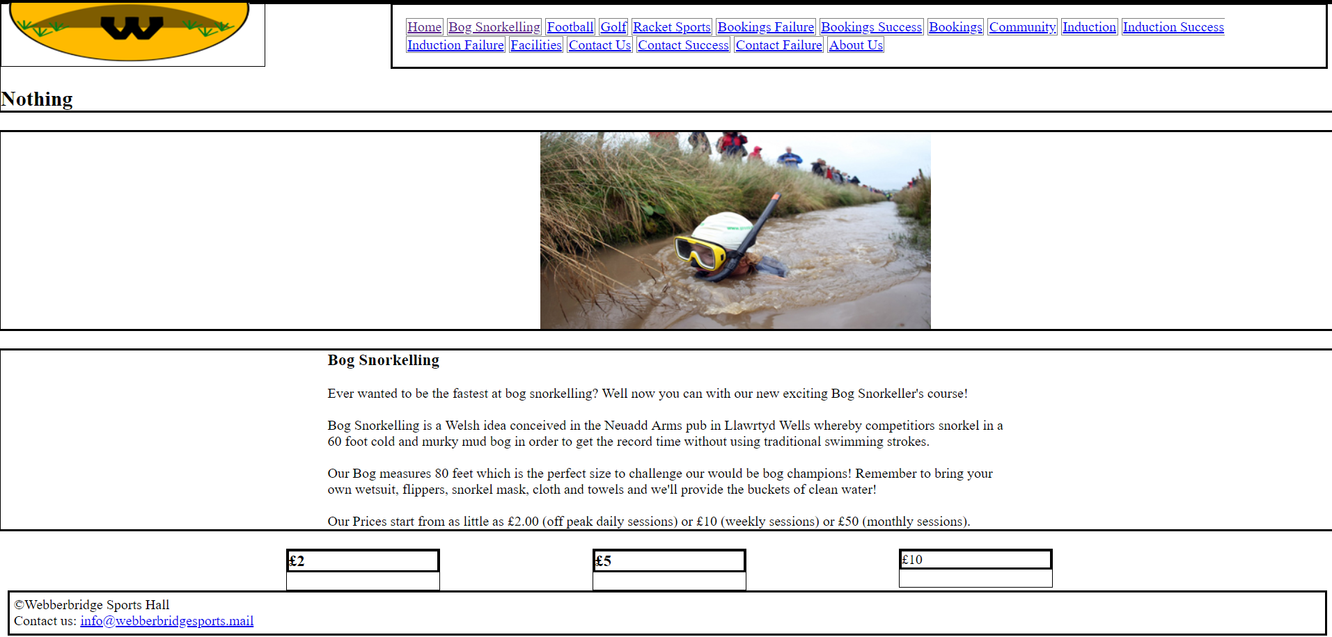
<img src = "../assets/images/Bog/BogSnork.jpg" alt = "nice pic!" class = center>
</div>
</section>
<section>
<div id="Content">
<h3> Bog Snorkelling </h3>
<br>
<p>Ever wanted to be the fastest at bog snorkelling? Well now you can with our new exciting Bog Snorkeller's course!</p>
<br>
<p>Bog Snorkelling is a Welsh idea conceived in the Neuadd Arms pub in Llawrtyd Wells whereby competitiors snorkel in a 60 foot cold and murky mud bog in order to get the record time without using traditional swimming strokes. </p>
<br>
<p>Our Bog measures 80 feet which is the perfect size to challenge our would be bog champions! Remember to bring your own wetsuit, flippers, snorkel mask, cloth and towels and we'll provide the buckets of clean water! </p>
<br>
<p>Our Prices start from as little as £2.00 (off peak daily sessions) or £10 (weekly sessions) or £50 (monthly sessions).</p>
</div>
</section>
<div id = "Prices1of3">
<section>
<h3>£2</h3>
</section>
</div>
<div id = "Prices2of3">
<section>
<h3>£5</h3>
</div>
</section>
<div id = "Prices3of3">
<section>
</h3>£10</h3>
</div>
</section>
<p></p>
<div id="footer">
<footer>
<p>©Webberbridge Sports Hall</p> <p>Contact us: <a href = "mailto:info@webberbridgesports.mail"> info@webberbridgesports.mail</a></p>
</footer>
</div>
</body>
</html>
回答 1
Stack Overflow用户
发布于 2018-11-25 05:11:09
如果希望它们并排出现,而不是出现在新行上,则需要对这些元素使用display: inline-block。
Div默认显示为块元素(并在css中声明),这意味着它们将在新行上呈现。
将类添加到您希望内联显示的元素中,并添加css规则display: inline-block,或将规则添加到每个id的样式中。
如果您想要使类应用于某些元素,则如下所示:
.inline {
    display: inline-block;
}然后将属性class="inline"添加到每个元素中,在这些元素中,您希望以内联方式而不是在新行上呈现这种行为。
页面原文内容由Stack Overflow提供。腾讯云小微IT领域专用引擎提供翻译支持
原文链接:
https://stackoverflow.com/questions/53464409
复制相关文章
相似问题
腾讯云开发者

Copyright © 2013 - 2026 Tencent Cloud. All Rights Reserved. 腾讯云 版权所有
深圳市腾讯计算机系统有限公司 ICP备案/许可证号:粤B2-20090059  粤公网安备44030502008569号
腾讯云计算(北京)有限责任公司 京ICP证150476号 | 京ICP备11018762号