
ggplot2:添加geom_smooth()会破坏点图例
ggplot2:添加geom_smooth()会破坏点图例
提问于 2018-11-24 14:20:16
我有一个奇怪的问题,我似乎找不到任何以前的问题与类似的问题。
我有数据:
> econ3
# A tibble: 6 x 6
# Groups: decade [6]
decade mean.pce mean.pop mean.uempmed mean.unemploy mean.psavert
<dbl> <dbl> <dbl> <dbl> <dbl> <dbl>
1 1960 568. 201165. 4.52 2854. 11.2
2 1970 1038. 214969. 6.29 5818. 11.8
3 1980 2620. 237423. 7.2 8308. 9.30
4 1990 4924. 264777. 7.58 7566. 6.71
5 2000 8501. 294869. 9.26 8269. 4.26
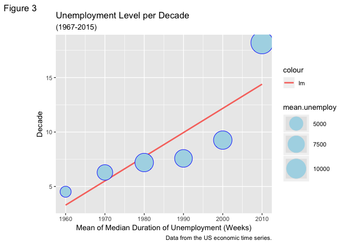
6 2010 11143. 314800. 18.2 12186. 5.7当我用这个来制作一个情节时,一切看起来都很棒:
ggplot(econ3, aes(x=decade, y=mean.uempmed, size=mean.unemploy),guide=FALSE)+
  geom_point(colour="blue", fill="lightblue", shape=21)+
  scale_size_area(max_size = 15)+
  theme_gray()+
  labs(title = "Unemployment Level per Decade",
       subtitle = "(1967-2015)",
       caption = "Data from the US economic time series.",
       tag = "Figure 3",
       x = "Mean of Median Duration of Unemployment (Weeks)",
       y = "Decade")
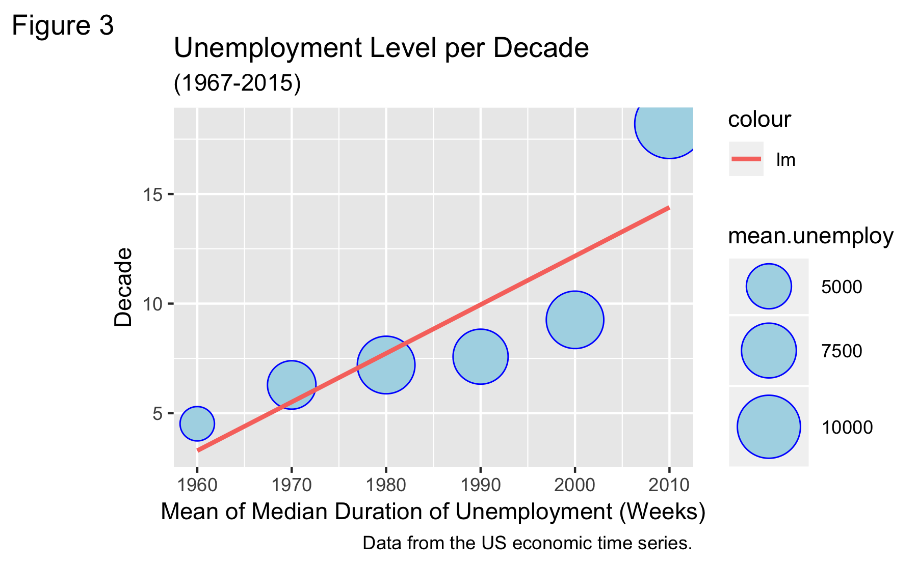
但是,一旦我使用geom_smooth添加了一个趋势线,这个图例就会被完全销毁。
ggplot(econ3, aes(x=decade, y=mean.uempmed, size=mean.unemploy),guide=FALSE)+
  geom_point(colour="blue", fill="lightblue", shape=21)+
  scale_size_area(max_size = 15)+
  geom_smooth(method=lm, se=FALSE, formula = y~x, aes(color="lm"))+
  theme_gray()+
  labs(title = "Unemployment Level per Decade",
       subtitle = "(1967-2015)",
       caption = "Data from the US economic time series.",
       tag = "Figure 3",
       x = "Mean of Median Duration of Unemployment (Weeks)",
       y = "Decade")
我不太清楚是什么导致了这件事,也不知道如何解决它。我相信一定是很简单的事情。
回答 2
Stack Overflow用户
回答已采纳
发布于 2018-11-25 09:43:47
我认为这是因为size=mean.unemploy是全球定位的。如果你把它放在aes of ggplot中,它会影响整个geom。这意味着新的geom_smooth也将读取size参数。
因为size只需要geom_point,所以可以把它放在mapping of _point中。你可能只会改变那部分。
library(tidyverse)
# your dataset
ggplot(econ3, aes(x=decade, y=mean.uempmed),guide=FALSE) + # remove size aesthetic
  geom_point(aes(size=mean.unemploy), colour="blue", fill="lightblue", shape=21) + # size aesthetic in geom_point
  scale_size_area(max_size = 15)+
  geom_smooth(method=lm, se=FALSE, formula = y~x, aes(color="lm"))+
  theme_gray()+
  labs(title = "Unemployment Level per Decade",
       subtitle = "(1967-2015)",
       caption = "Data from the US economic time series.",
       tag = "Figure 3",
       x = "Mean of Median Duration of Unemployment (Weeks)",
       y = "Decade")
如果修改前两行,则不会触及点的图例。
Stack Overflow用户
发布于 2018-11-24 17:06:33
你可以试试这个。它看起来像size参数与您选择的形状相结合,使整个图例背景成为您选择的颜色。您可以重新排列和更改图例,以反映您选择的灰色颜色。这里唯一的问题是,你失去了蓝色边界周围的点在传说,但我觉得你不会失去任何信息,没有它。
library(tidyverse)

df <- read_table2("decade mean.pce mean.pop mean.uempmed mean.unemploy mean.psavert
   1960     568.  201165.         4.52         2854.        11.2
   1970    1038.  214969.         6.29         5818.        11.8
   1980    2620.  237423.         7.2          8308.         9.30
   1990    4924.  264777.         7.58         7566.         6.71
   2000    8501.  294869.         9.26         8269.         4.26
   2010   11143.  314800.        18.2         12186.         5.7")


df %>%
  ggplot(aes(x=decade, y=mean.uempmed, size=mean.unemploy))+
  geom_smooth(method=lm, se=FALSE, aes(colour = "lm"))+
  geom_point(colour="blue", fill="lightblue", shape=21)+
  scale_size_area(max_size = 15)+
  theme_gray()+
  labs(title = "Unemployment Level per Decade",
       subtitle = "(1967-2015)",
       caption = "Data from the US economic time series.",
       tag = "Figure 3",
       x = "Mean of Median Duration of Unemployment (Weeks)",
       y = "Decade")+
  guides(size = guide_legend(override.aes = list(color = "grey90")))
页面原文内容由Stack Overflow提供。腾讯云小微IT领域专用引擎提供翻译支持
原文链接:
https://stackoverflow.com/questions/53459094
复制相关文章
相似问题
腾讯云开发者

Copyright © 2013 - 2026 Tencent Cloud. All Rights Reserved. 腾讯云 版权所有
深圳市腾讯计算机系统有限公司 ICP备案/许可证号:粤B2-20090059 ![]() 粤公网安备44030502008569号
粤公网安备44030502008569号
腾讯云计算(北京)有限责任公司 京ICP证150476号 | 京ICP备11018762号