
R:如何将图例添加到具有5个统计量差异的散点图中
R:如何将图例添加到具有5个统计量差异的散点图中
提问于 2018-11-14 21:05:09
我是R的新手,我试着用ggplot2制作一个图形,在那里你可以得到5个不同的统计数据。所以,我想在右边有一个传奇人物的颜色和名字,但我不知道怎么做。
我制作图形的代码是:
  ggplot(object@data, aes(x=data[,1])) +
    geom_point(aes(y=data[,2]), color="blue") +
    geom_point(aes(y=data[,3]), color = "red") +
    geom_point(aes(y=data[,4]), color = "olivedrab4") +
    geom_point(aes(y=data[,5]), color = "hotpink4") +
    geom_point(aes(y=data[,6]), color = "limegreen") +
    labs(title = "Liga DIA: Comparativas (Liga Regular) - www.basketmetrics.com",
         x = "Equipos", y = "Total") +
    #Pone las etiquetas del eje de las X en vertical
    theme(axis.text.x = element_text(angle = 90, hjust = 1, color = "white"),
          axis.text.y = element_text(color = "white"),
          legend.position = "top", legend.title = element_blank()) +
    #Modificamos el fondo del panel
    theme(panel.background = element_rect(fill = 'peachpuff', colour = 'white')) +
    theme(plot.background = element_rect(fill = 'navyblue', colour = 'white'),
          plot.title = element_text(size = 20, face = "bold", color = "white"),
          axis.title.x = element_text(face = "bold", color = "white"),
          axis.title.y = element_text(face = "bold", color = "white")) +
    scale_color_manual(name="Estadísticas", labels = c("ORTG", "DRTG", "Pace", "eFG%", "3P%"),
                       values = c("blue", "red", "olivedrab4", "hotpink4", "limegreen"))
我以为有了这段代码,我就有了这个传奇,但它对我来说不管用:
scale_color_manual(name="Estadísticas", labels = c("ORTG", "DRTG", "Pace", "eFG%", "3P%"),
                   values = c("blue", "red", "olivedrab4", "hotpink4", "limegreen"))
现在,我得到的是这个图形:
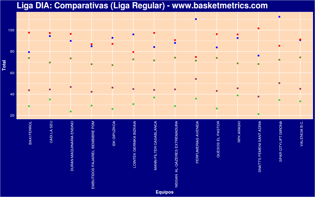
我如何在右边设置一个图例,每种颜色和统计数据的名称?
回答 1
Stack Overflow用户
回答已采纳
发布于 2018-11-14 21:45:24
您可以从这些步骤开始。
正如@Jon所述,ggplot2更喜欢long format而不是宽格式的数据,因此首先您应该转换数据,而不是应用ggplot2函数。
# you can use this package, to melt the data. You have not given any data, so
# at the bottom of this question, you can see some fake data similar to your:
library(reshape2)
long <- melt(data, id.vars = c("name"))
long
   name variable value
1     a     col2     2
2     b     col2     2
3     c     col2     2
4     a     col3     3
5     b     col3     3
6     c     col3     3
7     a     col4     4
8     b     col4     4
9     c     col4     4
10    a     col5     5
11    b     col5     5
12    c     col5     5
13    a     col6     6
14    b     col6     6
15    c     col6     6
现在情节:
ggplot(long, aes(x=long[,1],y =long[,3], color = long[,2])) +
# here only one geom_point, using the long format
geom_point() +
labs(title = "Liga DIA: Comparativas (Liga Regular) - www.basketmetrics.com", x = "Equipos", y = "Total") +
# you can manage the theme features in only one theme
theme(axis.text.x = element_text(angle = 90, hjust = 1, color = "white"),
      axis.text.y = element_text(color = "white"),
      legend.position = "top", legend.title = element_blank(),
      panel.background = element_rect(fill = 'peachpuff', colour = 'white'),
      plot.background = element_rect(fill = 'navyblue', colour = 'white'),
      plot.title = element_text(size = 20, face = "bold", color = "white"),
      axis.title.x = element_text(face = "bold", color = "white"),
      axis.title.y = element_text(face = "bold", color = "white"),
      legend.key = element_rect(fill = "transparent", colour = "transparent")) +
      scale_color_manual(name="Estadísticas", labels = c("ORTG", "DRTG", "Pace", "eFG%", "3P%"),values = c("blue", "red", "olivedrab4", "hotpink4", "limegreen"))
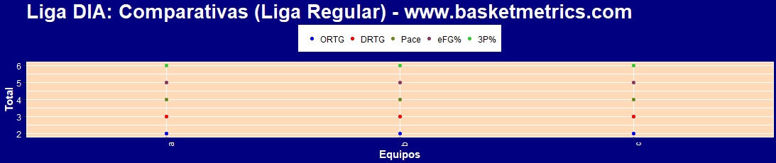
有数据:
data <- data.frame(name = c('a','b','c'),
                   col2 = c(2,2,2),
                   col3 = c(3,3,3),
                   col4 = c(4,4,4),
                   col5 = c(5,5,5),
                   col6 = c(6,6,6)
)页面原文内容由Stack Overflow提供。腾讯云小微IT领域专用引擎提供翻译支持
原文链接:
https://stackoverflow.com/questions/53308702
复制相关文章
相似问题
腾讯云开发者

Copyright © 2013 - 2026 Tencent Cloud. All Rights Reserved. 腾讯云 版权所有
深圳市腾讯计算机系统有限公司 ICP备案/许可证号:粤B2-20090059 ![]() 粤公网安备44030502008569号
粤公网安备44030502008569号
腾讯云计算(北京)有限责任公司 京ICP证150476号 | 京ICP备11018762号