
如何将三个文本表达式垂直对齐并以一行居中
如何将三个文本表达式垂直对齐并以一行居中
提问于 2018-11-10 11:54:04
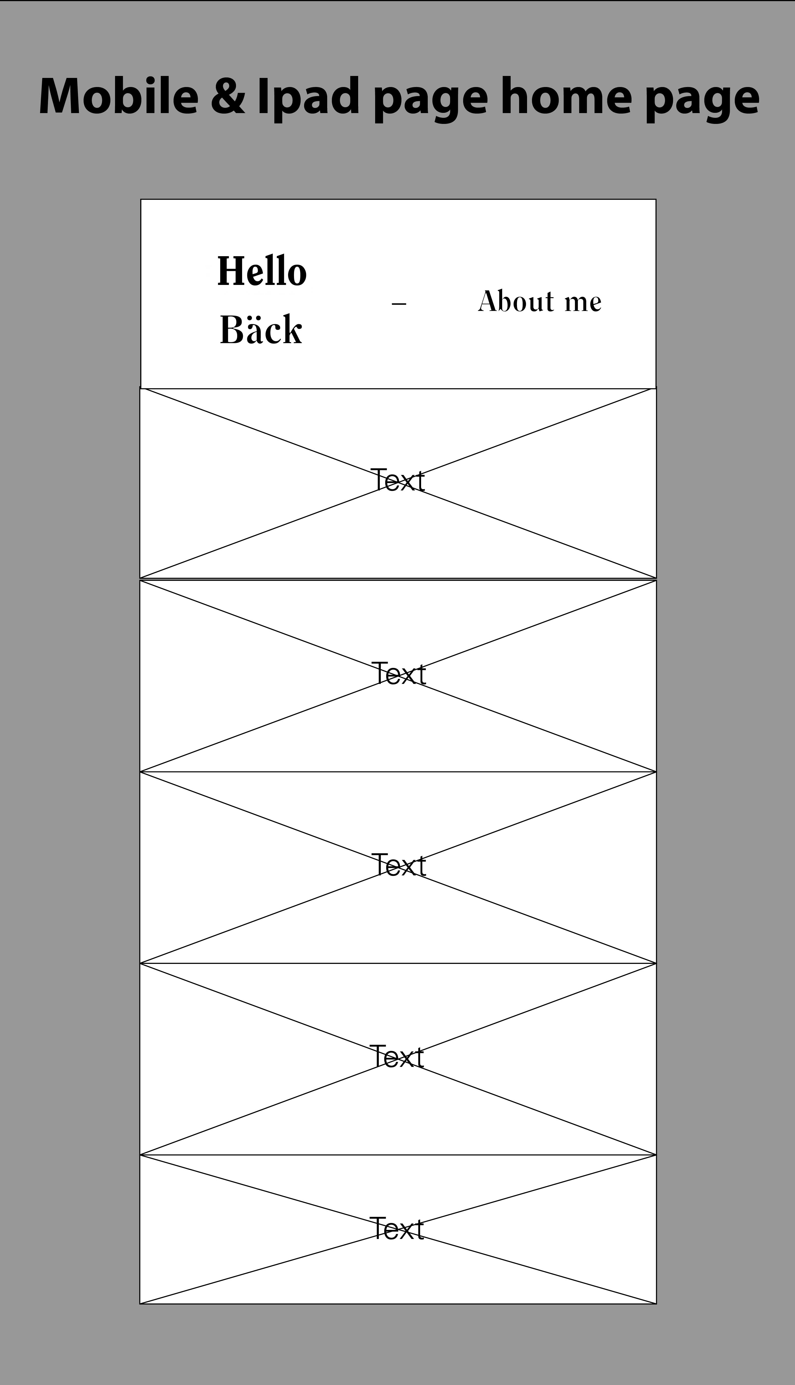
我有一个单一的HTML页面,我希望它在移动/平板电脑中的标题内容类似于所附的照片。我试过几种方法,但没有运气:
以下是预期的结果:
下面是我用过的密码:
body {
            margin: 0;
            background-color: black;
        }

        .title {
            text-align: center;
            background-color : white;
            color : black;
            height: 100px;
            padding: 35px 0;
            margin: 0;
            width: 100%;
            z-index: 1;
            position: fixed;
            font-family: Clearface, sans-serif;
            font-size: 40px;
        }

        .header #accordion-0 {
            font-size: 25px;
        }

        #about {
            background-color: black;
            color : white;
            float : left;
            width : 50%;
            height : 100vh;
            font-family: Clearface, sans-serif;
            margin-top: 170px;
            position: fixed;
        }

        #about h2 {
            font-size: 80px;
            padding: 30px 70px 0 70px;
        }

        #about p {
            font-size: 30px;
            padding : 70px;
            padding-top: 0;
        }

        #projects .accordion {
            background-color: #333648;
            color: white;
            cursor: pointer;
            padding: 20px;
            width: 100%;
            border: none;
            text-align: center;
            outline: none;
            font-size: 17px;
            transition: 0.5s;
            height: 20%;
            font-family: 'Univers LT Std', sans-serif;
            font-size: 20px;
            opacity: 0.7;
        }

        #projects .active, #projects .accordion:hover {
            background-color: #ccc;
            color: black;
            opacity: 1;
        }

        .panel {
            padding:0 18px;
            background-color: white;
            max-height: 0;
            overflow-y: hidden;
            transition: max-height 0.3s ease-out;

        }

        .post {
            padding: 0 20%;
            font-family: 'Univers LT Std', sans-serif;
            font-size: 20px;
        }

        .img-responsive {
            display: block;
            max-width: 100%;
            height: auto;
            margin: 50px auto;
        }

        #projects {
            float : right;
            width: 50%;
            height: 100vh;
            font-family: 'Univers LT Std', sans-serif;
            font-size : 20px;
            margin-top: 170px;
        }

        #about-accordion h2, #about-accordion p{
            font-family: Clearface, sans-serif;
        }

        #about-accordion .panel{
            background-color: black;
            color : white;
        }

        #about-accordion {
            font-size: 30px;
        }

        /* Smartphones (portrait and landscape) ----------- */
        @media only screen
        and (min-device-width : 320px)
        and (max-device-width : 480px) {
            #about {
                display : none;
            }

            #projects {
                width: 100%;
            }

        }

        /* iPads (portrait and landscape) ----------- */
        @media only screen
        and (min-device-width : 768px)
        and (max-device-width : 1024px) {
            #about {
                display : none;
            }

            #projects {
                width: 100%;
            }

        }

        /* Desktops and laptops ----------- */
        @media only screen
        and (min-width : 1224px) {
            #about-accordion {
                display : none;
            }

            .header #accordion-0 {
                display : none;
            }

            #dash {
                display : none;
            }
        }

        /* Large screens ----------- */
        @media only screen
        and (min-width : 1824px) {
            #about-accordion {
                display : none;
            }

            .header #accordion-0 {
                display : none;
            }

            #dash {
                display : none;
            }
}<!DOCTYPE html>
<html>
<head>
<meta name="viewport" content="width=device-width, initial-scale=1, minimum-scale=1, maximum-scale=1"/>
<meta charset="UTF-8">
<link rel="stylesheet" type="text/css" href="style.css">
</head>
<body>
<h1 class="header title">
<span id="hello-back"> Hello <br> Back </span>
<span id="dash"> - </span>
<span id="accordion-0" class="accordion">About Me</span>
</h1>
<div id="about">
<h2>
Hello!
</h2>
<p>
Lorem Ipsum är en utfyllnadstext från tryck- och förlagsindustrin. Lorem ipsum har varit standard ända sedan 1500-talet, när en okänd boksättare tog att antal bokstäver och blandade dem för att göra ett provexemplar av en bok. Lorem ipsum har inte bara överlevt fem århundraden, utan även övergången till elektronisk typografi utan större förändringar. Det blev allmänt känt på 1960-talet i samband med lanseringen av Letraset-ark med avsnitt av Lorem Ipsum, och senare med mjukvaror som Aldus PageMaker.
</p>
</div>
<div id="projects">
<div id="about-accordion">
<div id="panel-0" class="panel">
<div class="post">
<h2>
Hello!
</h2>
<p>
Lorem Ipsum är en utfyllnadstext från tryck- och förlagsindustrin. Lorem ipsum har varit standard ända sedan 1500-talet, när en okänd boksättare tog att antal bokstäver och blandade dem för att göra ett provexemplar av en bok. Lorem ipsum har inte bara överlevt fem århundraden, utan även övergången till elektronisk typografi utan större förändringar. Det blev allmänt känt på 1960-talet i samband med lanseringen av Letraset-ark med avsnitt av Lorem Ipsum, och senare med mjukvaror som Aldus PageMaker.
</p>
</div>
</div>
</div>
<button id="accordion-1" class="accordion">Project 1</button>
<div id="panel-1" class="panel">
<div class="post">
<h2>TITLE HEADING</h2>
<p>
Lorem Ipsum is simply dummy text of the printing and typesetting industry. Lorem Ipsum has been the industry's standard dummy text ever since the 1500s, when an unknown printer took a galley of type and scrambled it to make a type specimen book. It has survived not only five centuries, but also the leap into electronic typesetting, remaining essentially unchanged. It was popularised in the 1960s with the release of Letraset sheets containing Lorem Ipsum passages, and more recently with desktop publishing software like Aldus PageMaker including versions of Lorem Ipsum.
</p>
<div>
<img src="images/placeholder.jpg" class="img-responsive">
<img src="images/placeholder.jpg" class="img-responsive">
<img src="images/placeholder.jpg" class="img-responsive">
</div>
</div>
</div>
<button id="accordion-2" class="accordion">Project 2</button>
<div id="panel-2" class="panel">
<div class="post">
<h2>TITLE HEADING</h2>
<p>
Lorem Ipsum is simply dummy text of the printing and typesetting industry. Lorem Ipsum has been the industry's standard dummy text ever since the 1500s, when an unknown printer took a galley of type and scrambled it to make a type specimen book. It has survived not only five centuries, but also the leap into electronic typesetting, remaining essentially unchanged. It was popularised in the 1960s with the release of Letraset sheets containing Lorem Ipsum passages, and more recently with desktop publishing software like Aldus PageMaker including versions of Lorem Ipsum.
</p>
<div>
<img src="images/placeholder.jpg" class="img-responsive">
<img src="images/placeholder.jpg" class="img-responsive">
<img src="images/placeholder.jpg" class="img-responsive">
</div>
</div>
</div>
<button id="accordion-3" class="accordion">Project 3</button>
<div id="panel-3" class="panel">
<div class="post">
<h2>TITLE HEADING</h2>
<p>
Lorem Ipsum is simply dummy text of the printing and typesetting industry. Lorem Ipsum has been the industry's standard dummy text ever since the 1500s, when an unknown printer took a galley of type and scrambled it to make a type specimen book. It has survived not only five centuries, but also the leap into electronic typesetting, remaining essentially unchanged. It was popularised in the 1960s with the release of Letraset sheets containing Lorem Ipsum passages, and more recently with desktop publishing software like Aldus PageMaker including versions of Lorem Ipsum.
</p>
<div>
<img src="images/placeholder.jpg" class="img-responsive">
<img src="images/placeholder.jpg" class="img-responsive">
<img src="images/placeholder.jpg" class="img-responsive">
</div>
</div>
</div>
<button id="accordion-4" class="accordion">Project 4</button>
<div id="panel-4" class="panel">
<div class="post">
<h2>TITLE HEADING</h2>
<p>
Lorem Ipsum is simply dummy text of the printing and typesetting industry. Lorem Ipsum has been the industry's standard dummy text ever since the 1500s, when an unknown printer took a galley of type and scrambled it to make a type specimen book. It has survived not only five centuries, but also the leap into electronic typesetting, remaining essentially unchanged. It was popularised in the 1960s with the release of Letraset sheets containing Lorem Ipsum passages, and more recently with desktop publishing software like Aldus PageMaker including versions of Lorem Ipsum.
</p>
<div>
<img src="images/placeholder.jpg" class="img-responsive">
<img src="images/placeholder.jpg" class="img-responsive">
<img src="images/placeholder.jpg" class="img-responsive">
</div>
</div>
</div>
<button id="accordion-5" class="accordion">Project 5</button>
<div id="panel-5" class="panel">
<div class="post">
<h2>TITLE HEADING</h2>
<p>
Lorem Ipsum is simply dummy text of the printing and typesetting industry. Lorem Ipsum has been the industry's standard dummy text ever since the 1500s, when an unknown printer took a galley of type and scrambled it to make a type specimen book. It has survived not only five centuries, but also the leap into electronic typesetting, remaining essentially unchanged. It was popularised in the 1960s with the release of Letraset sheets containing Lorem Ipsum passages, and more recently with desktop publishing software like Aldus PageMaker including versions of Lorem Ipsum.
</p>
<div>
<img src="images/placeholder.jpg" class="img-responsive">
<img src="images/placeholder.jpg" class="img-responsive">
<img src="images/placeholder.jpg" class="img-responsive">
</div>
</div>
</div>
</div>
<script>
var accordion = document.getElementsByClassName("accordion");
var i;
for (i = 0; i < accordion.length; i++) {
accordion[i].addEventListener("click", function() {
var patt = /(accordion-)(\d)/gm;
var match = patt.exec(this.id);
panel = document.getElementById("panel-" + match[2]);
if (panel.style.maxHeight){
panel.style.maxHeight = null;
} else {
panels = document.getElementsByClassName('panel');
for(j = 0; j < panels.length; j++) {
if(panels[j].id != panel.id) {
panels[j].style.maxHeight = null;
panels[j].classList.remove('active');
}
}
panel.style.maxHeight = panel.scrollHeight + "px";
}
this.classList.toggle("active");
});
}
function hscrollbar() {
/* First, we need the horizontal scroll position of the viewer's display,
but there are different ways to call it in JS depending on browser.
I'm using the if/else shorthand notation to detect if a call is legit:
somevar = (statement) ? statement_true_value : statement_false_value */
var left =
/* window.pageXOffset should work for most recent browsers: */
window.pageXOffset ? window.pageXOffset :
/* If it DOESN'T, let's try this: */
document.documentElement.scrollLeft ? document.documentElement.scrollLeft :
/* And if THAT didn't work: */
document.body.scrollLeft;
/* Now that we have the horizontal scroll position, set #footpanel's left
position to NEGATIVE the value, so it APPEARS to follow the scroll: */
document.getElementById('about').style.left = -left;
}
window.onscroll = hscrollbar; /* Call the function when the user scrolls */
window.onresize = hscrollbar; /* Call the function when the window resizes */
</script>
</body>
</html>
回答 1
Stack Overflow用户
回答已采纳
发布于 2018-11-10 12:04:54
可以使用flex-box,将以下内容添加到.title类中:
.title {
  display: flex;
  justify-content: space-between;
  align-items: center;
}页面原文内容由Stack Overflow提供。腾讯云小微IT领域专用引擎提供翻译支持
原文链接:
https://stackoverflow.com/questions/53238672
复制相关文章
相似问题
腾讯云开发者

Copyright © 2013 - 2026 Tencent Cloud. All Rights Reserved. 腾讯云 版权所有
深圳市腾讯计算机系统有限公司 ICP备案/许可证号:粤B2-20090059  粤公网安备44030502008569号
腾讯云计算(北京)有限责任公司 京ICP证150476号 | 京ICP备11018762号