
使图表中的某些滴答变暗
使图表中的某些滴答变暗
提问于 2018-10-22 18:20:11
目前为止的图表:
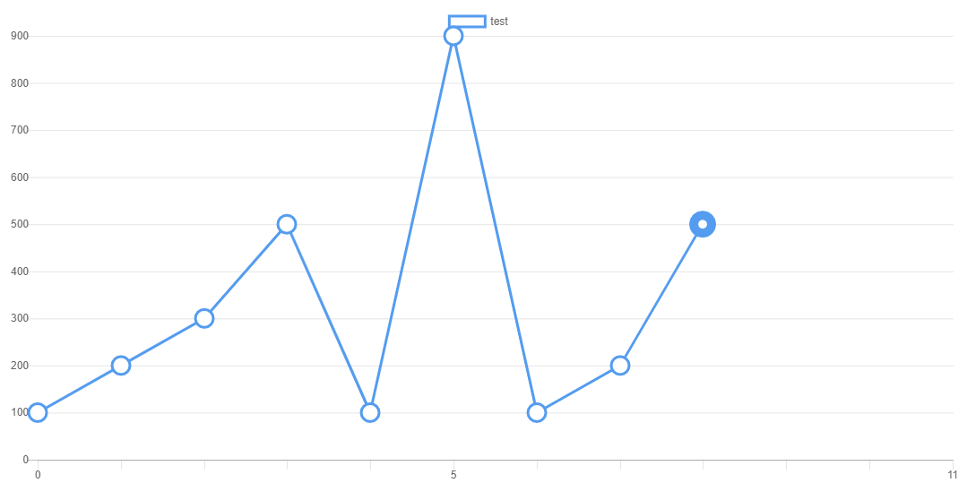
我试图使0,5和11的滴答变暗,但我似乎在chart.js网站上找不到任何信息。我使用chart.js2和角5。我隐藏其他标签,所以我只显示特定的标签取决于数据的长度。
  ngOnInit() {
    this.chart = new Chart('canvas', {
      type: 'line',
      data: {
        labels: ['0', '1', '2', '3', '4', '5', '6', '7', '8', '9','10', '11'],
        datasets: [
          {
            label: 'test',
            data: [
              100, 200, 300, 500, 100, 900, 100, 200, 500
            ],
            borderColor: '#549cef',
            backgroundColor: 'rgba(0,0,0,0.0)',
            pointBackgroundColor: 'white',
            pointRadius: 10,
            pointBorderWidth: this.getThick(),
            pointHoverBackgroundColor: '#549cef',
            borderWidth: 3
          }
        ]
      },
      options: {
        responsive: true,
        scales: {
          xAxes:[{
            gridLines: {
              drawBorder: true,
              drawOnChartArea: false,
            },
            ticks: {
              callback: function(dataLabel, index,data){
                return  data.length < 5? '':
                 data.length<12 && (index==0 || index==(data.length-1)) ? '':
                  (index==0 || index == 5 || index == 11)? dataLabel: '';
              }
            }
}],},回答 1
Stack Overflow用户
回答已采纳
发布于 2018-10-23 11:37:47
使x轴标签变暗,
您可以在ticks下使用以下选项
ticks: {
  fontColor: '#000000',
  fontStyle: 'bold',
看下面的工作片段..。
$(document).ready(function() {
  new Chart(document.getElementById('myChart').getContext('2d'), {
    type: 'line',
    data: {
      labels: ['0', '1', '2', '3', '4', '5', '6', '7', '8', '9','10', '11'],
      datasets: [
        {
          label: 'test',
          data: [
            100, 200, 300, 500, 100, 900, 100, 200, 500
          ],
          borderColor: '#549cef',
          backgroundColor: 'rgba(0,0,0,0.0)',
          pointBackgroundColor: 'white',
          pointRadius: 10,
          //pointBorderWidth: this.getThick(),
          pointHoverBackgroundColor: '#549cef',
          borderWidth: 3
        }
      ]
    },
    options: {
      responsive: true,
      scales: {
        xAxes:[{
          gridLines: {
            drawBorder: true,
            drawOnChartArea: false,
          },
          ticks: {
            fontColor: '#000000',
            fontStyle: 'bold',
            callback: function(dataLabel, index,data){
              return  data.length < 5? '':
               data.length<12 && (index==0 || index==(data.length-1)) ? '':
                (index==0 || index == 5 || index == 11)? dataLabel: '';
            }
          }
        }],
      }
    }
  });
});<script src="https://ajax.googleapis.com/ajax/libs/jquery/2.1.1/jquery.min.js"></script>
<script src="https://cdnjs.cloudflare.com/ajax/libs/Chart.js/2.7.2/Chart.bundle.min.js"></script>
<canvas id="myChart"></canvas>
编辑
不确定你能不能在轴标签上标上仪表符,
但是您可以使用一系列的颜色来分别对每个网格线进行样式设置。
参见下面的工作片段.
$(document).ready(function() {
  new Chart(document.getElementById('myChart').getContext('2d'), {
    type: 'line',
    data: {
      labels: ['0', '1', '2', '3', '4', '5', '6', '7', '8', '9','10', '11'],
      datasets: [
        {
          label: 'test',
          data: [
            100, 200, 300, 500, 100, 900, 100, 200, 500
          ],
          borderColor: '#549cef',
          backgroundColor: 'rgba(0,0,0,0.0)',
          pointBackgroundColor: 'white',
          pointRadius: 10,
          //pointBorderWidth: this.getThick(),
          pointHoverBackgroundColor: '#549cef',
          borderWidth: 3
        }
      ]
    },
    options: {
      responsive: true,
      scales: {
        xAxes:[{
          gridLines: {
            drawBorder: true,
            drawOnChartArea: false,
          },
          gridLines: {
            color: ['#000000', 'rgba(0, 0, 0, 0.1)', 'rgba(0, 0, 0, 0.1)', 'rgba(0, 0, 0, 0.1)', 'rgba(0, 0, 0, 0.1)', '#000000', 'rgba(0, 0, 0, 0.1)', 'rgba(0, 0, 0, 0.1)', 'rgba(0, 0, 0, 0.1)', 'rgba(0, 0, 0, 0.1)', 'rgba(0, 0, 0, 0.1)', '#000000'],
            drawBorder: false
          },
          ticks: {
            fontColor: '#000000',
            fontStyle: 'bold',
            callback: function(dataLabel, index,data){
              return  data.length < 5? '':
               data.length<12 && (index==0 || index==(data.length-1)) ? '':
                (index==0 || index == 5 || index == 11)? dataLabel: '';
            }
          }
        }],
      }
    }
  });
});<script src="https://ajax.googleapis.com/ajax/libs/jquery/2.1.1/jquery.min.js"></script>
<script src="https://cdnjs.cloudflare.com/ajax/libs/Chart.js/2.7.2/Chart.bundle.min.js"></script>
<canvas id="myChart"></canvas>
页面原文内容由Stack Overflow提供。腾讯云小微IT领域专用引擎提供翻译支持
原文链接:
https://stackoverflow.com/questions/52935473
复制相关文章
相似问题
腾讯云开发者

Copyright © 2013 - 2026 Tencent Cloud. All Rights Reserved. 腾讯云 版权所有
深圳市腾讯计算机系统有限公司 ICP备案/许可证号:粤B2-20090059 ![]() 粤公网安备44030502008569号
粤公网安备44030502008569号
腾讯云计算(北京)有限责任公司 京ICP证150476号 | 京ICP备11018762号