
ggplot图中的雷达图
ggplot图中的雷达图
提问于 2018-10-12 09:06:38
我知道这个问题以前有人问过,但在使用过去的一些答案时,我仍然无法制作我想要的雷达图表。我用过这个,作为雷达图的一个例子,我正在试图复制。,但我似乎找不出最后的部分。
到目前为止,这就是我所拥有的:

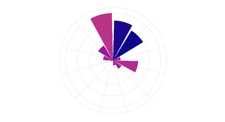
我对以下几点感到不满意: 1.极地网格的背景。我如何创建这样的一个,它确实贯穿每一个酒吧的中心?一开始看起来是这样的,但后来停了下来,我不知道为什么。如果我不能让它穿过中间,那么我希望它在每个酒吧的外面。如果这样做不起作用,那么也许只需将雷达图分割成8个等截面? 2.为什么有些条形图之间有宽度,而另一些条形图则不那么宽。
代码:
t<-12
angle_bucket<-seq(0,2*pi-2*pi/t,2*pi/t)
angle_group<-seq(1,length(angle_bucket),1)
meanL<-c(17.289,20.7857,18.675,10.4,0,0,22.1,19.5,18.02,19.5,30.35,29.83)
normized<-c(1,0.368,0.2105,0.05263,0,0,0.10526,0.21056,0.5263,0.157894,0.7368,0.8421)
ang_dfp<-data.frame(angle_bucket,angle_group,meanL,normized)
ang_dfp$angle_group<-as.factor(ang_dfp$angle_group)
ang_dfp$angle_bucket<-ang_dfp$angle_bucket+2*pi/t/2
p<-ggplot()+
  geom_bar(data=ang_dfp,aes(x=angle_bucket,y=normized, fill=meanL), stat = "identity")+
  scale_fill_viridis_c(alpha=1,begin=0,end=1,direction=-1,option='plasma',aesthetics ='fill')+
  scale_x_continuous(breaks = 0:nlevels(ang_dfp$angle_group))+
  #Theme
  theme_minimal()+
  theme(
    panel.background = element_rect(fill = "transparent", colour = NA),
    axis.title = element_blank(),
    axis.ticks = element_blank(),
    axis.text=element_blank(),
    axis.line=element_blank(),
    plot.margin = unit(c(0.1,0.1,0.1,0.1), "cm"),
    plot.background = element_rect(fill = "transparent", colour = NA),
    legend.position = 'none'
  )+
  coord_polar(theta='x',start=0,direction=-1)
p回答 1
Stack Overflow用户
回答已采纳
发布于 2018-10-12 09:14:40
如果你仔细看一下你链接到的例子,他们就会用一个因素来创建这个情节。您使用的是数字(连续)变量。我强迫angle_bucket考虑因素。
ggplot() +
  geom_bar(data=ang_dfp,aes(x=as.factor(angle_bucket),y=normized, fill=meanL), stat = "identity")+
  scale_fill_viridis_c(alpha=1,begin=0,end=1,direction=-1,option='plasma',aesthetics ='fill')+
  # scale_x_continuous(breaks = 0:nlevels(ang_dfp$angle_group))+
  #Theme
  theme_minimal()+
  theme(
    panel.background = element_rect(fill = "transparent", colour = NA),
    axis.title = element_blank(),
    axis.ticks = element_blank(),
    axis.text=element_blank(),
    axis.line=element_blank(),
    plot.margin = unit(c(0.1,0.1,0.1,0.1), "cm"),
    plot.background = element_rect(fill = "transparent", colour = NA),
    legend.position = 'none') +
  coord_polar(theta='x',start=0,direction=-1)
页面原文内容由Stack Overflow提供。腾讯云小微IT领域专用引擎提供翻译支持
原文链接:
https://stackoverflow.com/questions/52776048
复制相关文章
相似问题
腾讯云开发者

Copyright © 2013 - 2026 Tencent Cloud. All Rights Reserved. 腾讯云 版权所有
深圳市腾讯计算机系统有限公司 ICP备案/许可证号:粤B2-20090059 ![]() 粤公网安备44030502008569号
粤公网安备44030502008569号
腾讯云计算(北京)有限责任公司 京ICP证150476号 | 京ICP备11018762号