
引导4网格,在一行中放置4个元素,并使用自定义的水平沟槽
我试图用自定义的水平槽将4个元素排在一行中,我尝试将每个元素与col-md-2类放在一个具有一定屏幕大小的目录中,并根据需要修改每个元素的边距。但是它看起来不太好,当应用col-md-3时
[class^="col"]:not(:last-child){
    margin-right: 60px;
}<div class="container">
<div class="row">
<div class="col col-md-2.5">1</div>
<div class="col col-md-2.5">2</div>
<div class="col col-md-2.5">3</div>
<div class="col col-md-2.5">4</div>
</div>
</div>
<!--I know it may look weird but this above HTML along with the CSS
achieved my goal on the big screens -->
<!-- things get messy again when i do the following to adjust the
view of elements on smaller screens -->
<div class="container">
<div class="row">
<div class="col-10 offset-1 col-md-2.5">1</div>
<div class="col-10 offset-1 col-md-2.5">2</div>
<div class="col-10 offset-1 col-md-2.5">3</div>
<div class="col-10 offset-1 col-md-2.5">4</div>
</div>
</div>
<!-- it works fine in small screen, but when I back to big
screens with this set up, it doesn't give me the initial
behavior and spans every element to columns !!
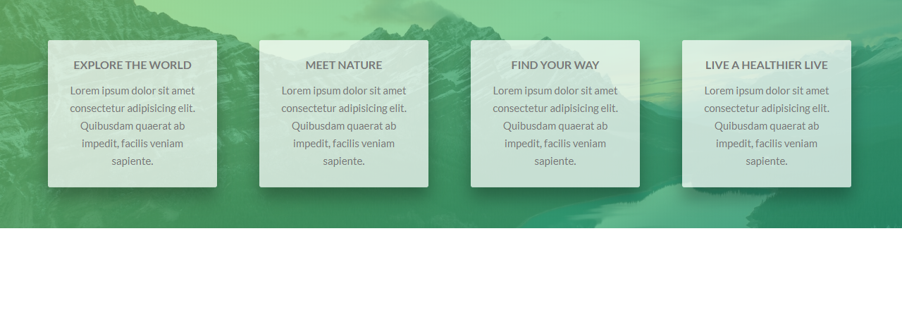
这里是所需行为的屏幕截图
提前谢谢!
回答 2
Stack Overflow用户
发布于 2018-10-02 23:48:16
我不太明白你的问题。您是否刚刚尝试过使用{property}{sides}-{breakpoint}-{size}符号简单地将填充应用到4列的左和右?
https://getbootstrap.com/docs/4.1/utilities/spacing/#notation
这样,您就不必在列中使用offset。相反,您可以只使用col。
例如,如果您只想在大型scrren上使用大的左、右垫子,可以在col类上应用col。
<div class="container">
    <div class="row">
        <div class="col px-lg-5">
            ...
        </div>
        <div class="col px-lg-5">
            ...
        </div>
        <div class="col px-lg-5">
            ...
        </div>
        <div class="col px-lg-5">
            ...
        </div>
    </div>
</div>
jsfiddle: http://jsfiddle.net/aq9Laaew/241204/
Stack Overflow用户
发布于 2018-10-02 22:03:01
你错过了目标屏幕:
<div class="container">
    <div class="row">
        <div class="col-10 offset-1 col-md-2.5">1</div>
        <div class="col-10 offset-1 col-md-2.5">2</div>
        <div class="col-10 offset-1 col-md-2.5">3</div>
        <div class="col-10 offset-1 col-md-2.5">4</div>
    </div>
</div>
添加您想要的任何大小: xs、sm、md、lg到col,偏移量如下:
<div class="container">
    <div class="row">
        <div class="col-10 col-sm-offset-1 col-md-2.5">1</div>
        <div class="col-10 col-sm-offset-1 col-md-2.5">2</div>
        <div class="col-10 col-sm-offset-1 col-md-2.5">3</div>
        <div class="col-10 col-sm-offset-1 col-md-2.5">4</div>
    </div>
</div>这里有一个参考资料:https://getbootstrap.com/docs/4.0/layout/grid/#offsetting-columns
编辑:在使用偏移类时,您可能需要指定目标屏幕。但是,你不需要另一个选择是对的。
https://stackoverflow.com/questions/52616545
复制相似问题
腾讯云开发者

Copyright © 2013 - 2026 Tencent Cloud. All Rights Reserved. 腾讯云 版权所有
深圳市腾讯计算机系统有限公司 ICP备案/许可证号:粤B2-20090059  粤公网安备44030502008569号
腾讯云计算(北京)有限责任公司 京ICP证150476号 | 京ICP备11018762号