
D3线图显示正负数
我正在与D3合作创建一个线条图。此图可在这里获得,小提琴。
我试图手动绘制线来表示某些数据点值。我尝试在代码中的大多数行中添加注释,因此希望您能够遵循。
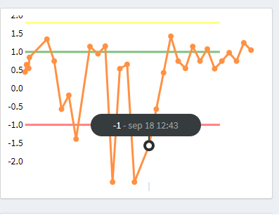
我的问题是,我似乎无法很好地绘制负数,如果我画了,那么图形-数据线就错对齐了。所以我的问题是:我怎样才能缩放我的图表,这样我就可以同时显示负数和正数?在这种情况下,图形应该根据我设置的最大/分钟值从2 to -2生成。
目前。我在像这样缩放我的图表
  //
  // Setup y scale
  //
  var y = d3.scale.linear()
    .domain([0, max])
    .range([height, 0]);

  //
  // Setup x scale
  //
  var x = d3.time.scale()
    .domain(d3.extent(data, dateFn))
.range([0, width]);在我看来,做.domain([-2,max])就足够了,但这似乎会让事情变得更糟。
而且,我的行文似乎与数据线的意思不符。在jsfiddle中,绿线设置在1。但是值为1的数据线并不在这条绿线上。
所以,我想这是个很大的问题。
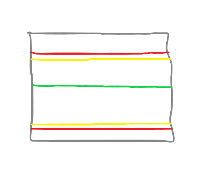
图形的可视化(Picasso)表示,如果它工作的话,它应该是什么样的。
回答 1
Stack Overflow用户
发布于 2018-09-26 13:59:09
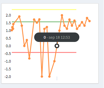
由于您希望您的y域是-2,而不是由数据驱动,您可以从您的drawGraph函数中删除许多安装和辅助函数。
在绘制图形之后,您可以简单地循环遍历yLines数组,并根据您的color在指定的val上为每个yScale绘制一条线。
Update: feed :由于您将从您的端点获得nominal, upperTolerance, lowerTolerance, innerUpperTolerance, innerLowerTolerance值(它们不需要从客户端的数据中计算),只需将这些值输入到数据驱动的yScale中以绘制彩色线即可。
下面我使用了1, 1.8, -1.8值,但是您将收到更有意义地绑定到数据的值。
// Setup
const yLines = [{
    val: 1,
    color: 'green'
  },
  {
    val: 1.8,
    color: 'yellow'
  },
  {
    val: -1.8,
    color: 'red'
  }
]

const margin = {
  top: 10,
  right: 80,
  bottom: 60,
  left: 20
};

const strokeWidth = 3;
const pointRadius = 4;
const svgWidth = 600;
const svgHeight = 600;
const width = svgWidth - margin.left - margin.right;
const height = svgHeight - margin.top - margin.bottom;
const stroke = '#2990ea'; // blue
const areaFill = 'rgba(41,144,234,0.1)'; // lighter blue
const format = d3.time.format("%b %e %Y");

const valueFn = function(d) {
  return d.value
};
const dateFn = function(d) {
  return format.parse(d.name)
};

// select the div and append svg to it
const graph = d3.select('#chart').append('svg')
  .attr('width', width + margin.left + margin.right)
  .attr('height', height + margin.top + margin.bottom)
  .style('overflow', 'visible');

const transformGroup = graph.append('g')
  .attr('tranform', `translate(${margin.left}, ${margin.right})`)


// Make a group for yLines
const extraLines = transformGroup.append('g')
  .attr('class', 'extra-lines')


// Generate some dummy data
const getData = function() {
  let JSONData = [];
  for (var i = 0; i < 30; i++) {
    JSONData.push({
      "name": moment().add(i, 'days').format('MMM D YYYY'),
      "value": Math.floor(Math.random() * (Math.floor(Math.random() * 20))) - 10
    })
  }
  return JSONData.slice()
}

const drawGraph = function(data) {

  console.log(data)

  // Setup y scale
  const y = d3.scale.linear()
    .domain(d3.extent(data.map((d) => d.value)))
    .range([height, 0]);

  // Setup y axis
  const yAxis = d3.svg.axis()
    .scale(y)
    .orient("left")
    .ticks(10)
    .tickSize(0, 0, 0)

  // append group & call yAxis
  transformGroup.append("g")
    .attr("class", "y axis")
    .attr("transform", "translate(" + margin.left + ",0)")
    .call(yAxis);

  // Draw extra coloured lines from yLines array
  extraLines.selectAll('.extra-line')
    .data(yLines)
    .enter()
    .append('line')
    .attr('class', 'extra-line')
    .attr('x1', margin.left)
    .attr('x2', svgWidth - margin.right)
    .attr('stroke', d => d.color)
    .attr('y1', d => y(+d.val))
    .attr('y2', d => y(+d.val))
    .attr('stroke-width', strokeWidth)
    .attr('opacity', 0.5)


  // Setup x scale
  const x = d3.time.scale()
    .domain(d3.extent(data, dateFn))
    .range([0, width])

  // function for filling area under chart
  const area = d3.svg.area()
    .x(d => x(format.parse(d.name)))
    .y0(height)
    .y1(d => y(d.value))

  // function for drawing line
  const line = d3.svg.line()
    .x(d => x(format.parse(d.name)))
    .y(d => y(d.value))

  const lineStart = d3.svg.line()
    .x(d => x(format.parse(d.name)))
    .y(d => y(0))

  // make the line
  transformGroup.append('path')
    .attr('stroke', stroke)
    .attr('stroke-width', strokeWidth)
    .attr('fill', 'none')
    .attr('transform', `translate(${margin.left}, ${margin.top})`)
    .attr('d', lineStart(data))
    .attr('d', line(data))

  // fill area under the graph
  transformGroup.append("path")
    .datum(data)
    .attr("class", "area")
    .attr('fill', areaFill)
    .attr('transform', `translate(${margin.left}, ${margin.top})`)
    .attr('d', lineStart(data))
    .attr("d", area)
}

drawGraph(getData())<script src="https://cdnjs.cloudflare.com/ajax/libs/d3/3.4.11/d3.min.js"></script>
<script src="https://cdnjs.cloudflare.com/ajax/libs/moment.js/2.10.6/moment.min.js"></script>
<div id="chart" style="margin: 0 auto;"></div>
https://stackoverflow.com/questions/52515318
复制相似问题
腾讯云开发者

Copyright © 2013 - 2026 Tencent Cloud. All Rights Reserved. 腾讯云 版权所有
深圳市腾讯计算机系统有限公司 ICP备案/许可证号:粤B2-20090059 ![]() 粤公网安备44030502008569号
粤公网安备44030502008569号
腾讯云计算(北京)有限责任公司 京ICP证150476号 | 京ICP备11018762号