
PDF绘图关注
PDF绘图关注
提问于 2018-08-02 18:42:59
我尝试了以下手动方法:
dict = {'id': ['a','b','c','d'], 'testers_time': [10, 30, 15, None], 'stage_1_to_2_time': [30, None, 30, None], 'activated_time' : [40, None, 45, None],'stage_2_to_3_time' : [30, None, None, None],'engaged_time' : [70, None, None, None]}
df = pd.DataFrame(dict, columns=['id', 'testers_time', 'stage_1_to_2_time', 'activated_time', 'stage_2_to_3_time', 'engaged_time'])

df= df.dropna(subset=['testers_time']).sort_values('testers_time')

prob = df['testers_time'].value_counts(normalize=True)
print(prob)
#0.333333,  0.333333,  0.333333
plt.plot(df['testers_time'], prob, marker='.', linestyle='-')

plt.show()
我尝试了以下在堆栈溢出中找到的方法:
dict = {'id': ['a','b','c','d'], 'testers_time': [10, 30, 15, None], 'stage_1_to_2_time': [30, None, 30, None], 'activated_time' : [40, None, 45, None],'stage_2_to_3_time' : [30, None, None, None],'engaged_time' : [70, None, None, None]}
df = pd.DataFrame(dict, columns=['id', 'testers_time', 'stage_1_to_2_time', 'activated_time', 'stage_2_to_3_time', 'engaged_time'])

df= df.dropna(subset=['testers_time']).sort_values('testers_time')

fit = stats.norm.pdf(df['testers_time'], np.mean(df['testers_time']), np.std(df['testers_time']))
print(fit)
#0.02902547,  0.04346777,  0.01829513]
plt.plot(df['testers_time'], fit, marker='.', linestyle='-')
plt.hist(df['testers_time'], normed='true')

plt.show()
正如您所看到的,我得到了完全不同的值--对于#1的概率是正确的,但是对于#2的概率是不正确的(它们的加起来也没有达到100%),并且直方图的y轴(%)是基于6个回收箱而不是3个。
你能解释一下我怎么才能得到第二题的正确概率吗?
回答 1
Stack Overflow用户
回答已采纳
发布于 2018-08-02 19:25:40
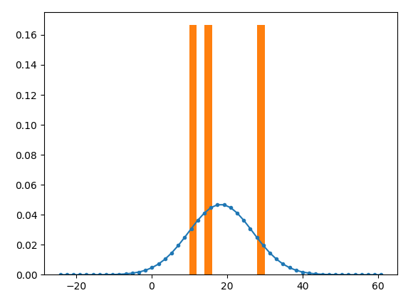
第一种方法给出了概率质量函数。第二部分给出了概率密度函数()--因此命名为概率密度函数(pdf)。因此两者都是正确的,它们只是展示了一些不同的东西。
如果你在一个更大的范围内评估pdf (例如10倍的标准偏差),它将看起来很像一个预期的高斯曲线。
import pandas as pd
import scipy.stats as stats
import numpy as np
import matplotlib.pyplot as plt

dict = {'id': ['a','b','c','d'], 'testers_time': [10, 30, 15, None], 'stage_1_to_2_time': [30, None, 30, None], 'activated_time' : [40, None, 45, None],'stage_2_to_3_time' : [30, None, None, None],'engaged_time' : [70, None, None, None]}
df = pd.DataFrame(dict, columns=['id', 'testers_time', 'stage_1_to_2_time', 'activated_time', 'stage_2_to_3_time', 'engaged_time'])

df= df.dropna(subset=['testers_time']).sort_values('testers_time')

mean = np.mean(df['testers_time'])
std = np.std(df['testers_time'])
x = np.linspace(mean - 5*std, mean + 5*std)

fit = stats.norm.pdf(x, mean, std)
print(fit)

plt.plot(x, fit, marker='.', linestyle='-')
plt.hist(df['testers_time'], normed='true')

plt.show()
页面原文内容由Stack Overflow提供。腾讯云小微IT领域专用引擎提供翻译支持
原文链接:
https://stackoverflow.com/questions/51660271
复制相关文章
相似问题
腾讯云开发者

Copyright © 2013 - 2026 Tencent Cloud. All Rights Reserved. 腾讯云 版权所有
深圳市腾讯计算机系统有限公司 ICP备案/许可证号:粤B2-20090059 ![]() 粤公网安备44030502008569号
粤公网安备44030502008569号
腾讯云计算(北京)有限责任公司 京ICP证150476号 | 京ICP备11018762号