
基于geojson和ggplot2的氯普烈地图
基于geojson和ggplot2的氯普烈地图
提问于 2018-06-14 14:23:21
我试图用Human Poverty Index和ggplot2在R中为尼泊尔各地区绘制choropleth地图。
我看到了一些例子,这里,这里。
我就是这样做的:
# Read geojson data for nepal with districts
library(tidyverse)
library(geojsonio)
#>
#> Attaching package: 'geojsonio'
#> The following object is masked from 'package:base':
#>
#>     pretty
spdf <- geojson_read("nepal-districts.geojson",  what = "sp")
##https://github.com/mesaugat/geoJSON-Nepal/blob/master/nepal-districts.geojson


#tidy data for ggplot2
library(broom)
spdf_fortified <- tidy(spdf)
#> Regions defined for each Polygons

# plot
ggplot() +
    geom_polygon(data = spdf_fortified, aes( x = long, y = lat, group = group)) +
    theme_void() +
    coord_map()
names(spdf_fortified)
#> [1] "long"  "lat"   "order" "hole"  "piece" "group" "id"


#Now read the data to map to districts
data=read.csv("data.csv")
#data from here
#https://github.com/opennepal/odp-poverty/blob/master/Human%20Poverty%20Index%20Value%20by%20Districts%20(2011)/data.csv

#filter and select data to reflect Value of HPI in various districts
data <- data %>% filter(Sub.Group=="HPI") %>% select(District,Value)


head(data)
#>       District Value
#> 1       Achham 46.68
#> 2 Arghakhanchi 27.37
#> 3        Banke 32.10
#> 4      Baglung 27.33
#> 5      Baitadi 39.58
#> 6      Bajhang 45.32

# Value represents HPI value for each district.

#Now how to merge and fill Value for various districts
#
#
#
#由reprex封装创建于2018-06-14 (v0.2.0)。
如果我可以将spdf_fortified和data合并到merged_df中,我想我可以用下面的代码得到叶绿体地图:
ggplot(data = merged_df, aes(x = long, y = lat, group = group)) + geom_polygon(aes(fill = Value), color = 'gray', size = 0.1)在合并两个数据方面有帮助吗?
回答 1
Stack Overflow用户
回答已采纳
发布于 2018-06-14 15:00:33
不是为了颠覆整个系统,但我最近一直在使用sf,并且发现使用它比sp容易得多。ggplot也有很好的支持,所以您可以用geom_sf绘图,通过将变量映射到fill而变成一个合唱团。
library(sf)
library(tidyverse)

nepal_shp <- read_sf('https://raw.githubusercontent.com/mesaugat/geoJSON-Nepal/master/nepal-districts.geojson')
nepal_data <- read_csv('https://raw.githubusercontent.com/opennepal/odp-poverty/master/Human%20Poverty%20Index%20Value%20by%20Districts%20(2011)/data.csv')

# calculate points at which to plot labels
centroids <- nepal_shp %>%
    st_centroid() %>%
    bind_cols(as_data_frame(st_coordinates(.)))    # unpack points to lat/lon columns

nepal_data %>%
    filter(`Sub Group` == "HPI") %>%
    mutate(District = toupper(District)) %>%
    left_join(nepal_shp, ., by = c('DISTRICT' = 'District')) %>%
    ggplot() +
    geom_sf(aes(fill = Value)) +
    geom_text(aes(X, Y, label = DISTRICT), data = centroids, size = 1, color = 'white')
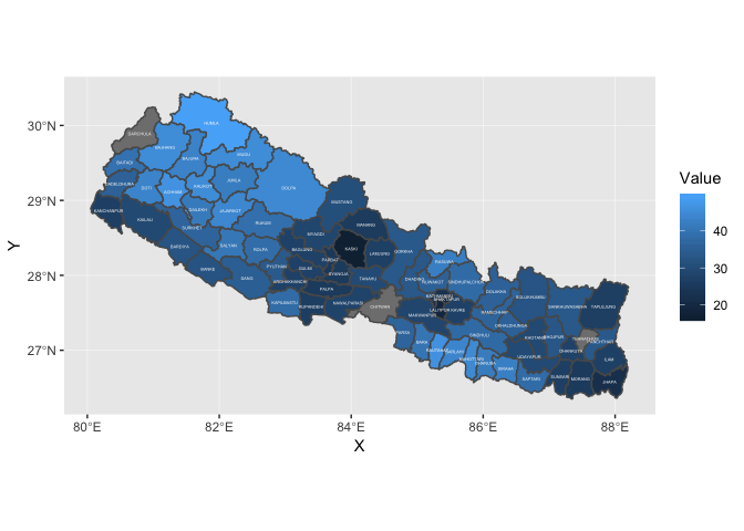
在这两个数据框架中,有三个地区的名称是不同的,必须进行清理,但这是一个很好的起点,不需要做大量的工作。
ggrepel::geom_text_repel是避免重叠标签的一种可能性。
页面原文内容由Stack Overflow提供。腾讯云小微IT领域专用引擎提供翻译支持
原文链接:
https://stackoverflow.com/questions/50859765
复制相关文章
相似问题
腾讯云开发者

Copyright © 2013 - 2026 Tencent Cloud. All Rights Reserved. 腾讯云 版权所有
深圳市腾讯计算机系统有限公司 ICP备案/许可证号:粤B2-20090059 ![]() 粤公网安备44030502008569号
粤公网安备44030502008569号
腾讯云计算(北京)有限责任公司 京ICP证150476号 | 京ICP备11018762号