
用ggplot2作例说明R中正态分布直方图
用ggplot2作例说明R中正态分布直方图
提问于 2018-06-14 07:57:32
我正试图用ggplot2绘制一个直方图。
我用R写了一个简单的代码
dnorm.count <- function(x, mean = 0, sd = 1, log = FALSE, n = 1, binwidth = 1){
  n * binwidth * dnorm(x = x, mean = mean, sd = sd, log = log)
}
mtcars %>%
  ggplot(aes(x =  mpg)) +
  geom_histogram(bins =60,color = "white", fill = "#9FE367",boundary = 0.5) +
  geom_vline(aes(xintercept = mean(mpg)),
             linetype="dashed",
             size = 1.6,
             color = "#FF0000")+
  geom_text(aes(label = ..count..), stat= "count",vjust = -0.6)+
  stat_function(fun = dnorm.count, color = "#6D67E3",
                args = list(mean= mean(mtcars$mpg),
                            sd = sd(mtcars$mpg),
                            n = nrow(mtcars)),
                lwd = 1.2) +
  scale_y_continuous(labels = comma, name = "Frequency") +
  scale_x_continuous(breaks=seq(0,max(mtcars$mpg)))+
  geom_text(aes(label = paste0("mean = ", round(mean(mtcars$mpg), 2)),
                x = mean(mtcars$mpg)*1.2,
                y  = mean(mtcars$mpg)/5))+
  geom_vline(aes(xintercept = sd(mpg)), linetype="dashed",size = 1.6, color = "#FF0000")
我得到的就是这个!
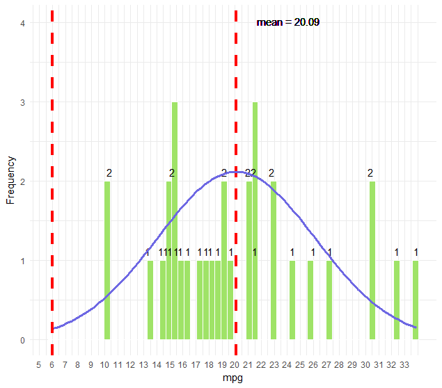
问题是如何绘制类似于此的直方图。
使用ggplot2,是否可以将代码转换为R函数?
编辑:为了更好地解释我想做的事情:
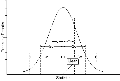
我想用ggplot2创建一个与附加的直方图完全相同的直方图,然后为它创建一个函数来减少编码。使用任何你喜欢的package+ggplot2。直方图应该有描述标准偏差的线条&均值,就像参考的一样。如果可能的话,把图中的标准差描述为参考图像,这就是我想要实现的。
回答 1
Stack Overflow用户
回答已采纳
发布于 2018-06-14 18:28:37
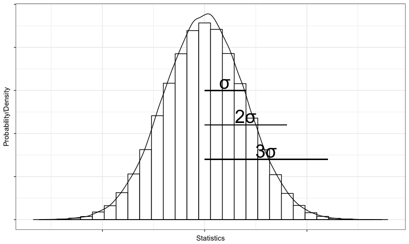
如果您的问题是如何像您在上一个图形中附加的柱状图那样绘制直方图,那么这9行代码将产生非常相似的结果。
library(magrittr) ; library(ggplot2)
set.seed(42)
data <- rnorm(1e5)
p <- data %>%
  as.data.frame() %>%
  ggplot(., aes(x = data)) +
  geom_histogram(fill = "white", col = "black", bins = 30 ) +
  geom_density(aes( y = 0.3 *..count..)) +
  labs(x = "Statistics", y = "Probability/Density") +
theme_bw() + theme(axis.text = element_blank())您可以使用annotate()添加符号或文本,使用geom_segment显示情节上的间隔,如下所示:
p + annotate(x = sd(data)/2 , y = 8000, geom = "text", label = "σ", size = 10) +
    annotate(x = sd(data) , y = 6000, geom = "text", label = "2σ", size = 10) +
    annotate(x = sd(data)*1.5 , y = 4000, geom = "text", label = "3σ", size = 10) +
    geom_segment(x = 0, xend = sd(data), y = 7500, yend = 7500) +
    geom_segment(x = 0, xend = sd(data)*2, y = 5500, yend = 5500) +
    geom_segment(x = 0, xend = sd(data)*3, y = 3500, yend = 3500)
这段代码将给您提供如下内容:
页面原文内容由Stack Overflow提供。腾讯云小微IT领域专用引擎提供翻译支持
原文链接:
https://stackoverflow.com/questions/50852408
复制相关文章
相似问题
腾讯云开发者

Copyright © 2013 - 2026 Tencent Cloud. All Rights Reserved. 腾讯云 版权所有
深圳市腾讯计算机系统有限公司 ICP备案/许可证号:粤B2-20090059 ![]() 粤公网安备44030502008569号
粤公网安备44030502008569号
腾讯云计算(北京)有限责任公司 京ICP证150476号 | 京ICP备11018762号