
更改TextInputLayout轮廓颜色
我正在尝试定制一个具有材质风格的TextInputLayout。我设法将焦点状态设置为我想要的颜色:
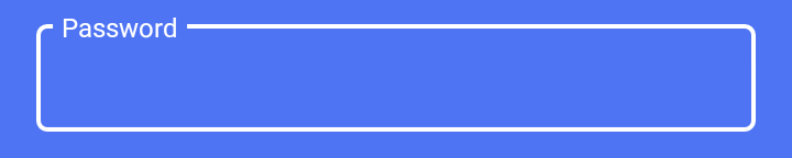
使用
<com.google.android.material.textfield.TextInputLayout
     style="@style/LoginTextInputLayoutStyle"
     android:theme="@style/LoginTextInputLayoutStyle"
     android:textColorHint="#fff"
     app:boxStrokeColor="#fff"
     .....>
          <EditText ...
这里的风格是:
<style name="LoginTextInputLayoutStyle" parent="Widget.MaterialComponents.TextInputLayout.OutlinedBox.Dense">
    <item name="colorAccent">#fff</item>
</style>
但是,当文本输入不集中时,我会看到这样的外观:
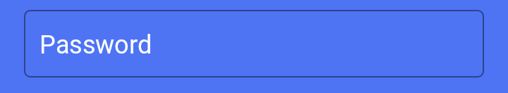
我怎样才能把黑线的颜色也改成白色呢?
回答 16
Stack Overflow用户
发布于 2018-06-12 13:25:43
使用此样式可应用边框颜色和边框宽度,如:
<style name="LoginTextInputLayoutStyle" parent="Widget.MaterialComponents.TextInputLayout.OutlinedBox.Dense">
    <item name="boxStrokeColor">#fff</item>
    <item name="boxStrokeWidth">2dp</item>
</style>从此链接获取有关样式设置的其他详细信息
在colors.xml文件中添加以下行,重写TextInputLayout的默认颜色
<color name="mtrl_textinput_default_box_stroke_color" tools:override="true">#fff</color>Stack Overflow用户
发布于 2018-12-14 05:21:18
作为安卓材料组件的1.1.0-alpha02版本,它的工作原理是为这些项目创建一个ColorStateList。程序如下:
在res和颜色中创建一个新的资源目录" color“,添加一个名为"text_input_box_stroke.xml”的颜色资源文件,res/color/text_input_box_stroke.xml放置如下所示:
<selector xmlns:android="http://schemas.android.com/apk/res/android">
    <item android:color="#fcc" android:state_focused="true"/>
    <item android:color="#cfc" android:state_hovered="true"/>
    <item android:color="#ccf"/>
</selector>然后在你的styles.xml中你会写:
<style name="LoginTextInputLayoutStyle" parent="Widget.MaterialComponents.TextInputLayout.OutlinedBox.Dense">
    <item name="boxStrokeColor">@color/text_input_box_stroke</item>
</style>最后指出实际TextInputLayout的样式
<com.google.android.material.textfield.TextInputLayout
    android:id="@+id/my_layout_id"
    style="@style/LoginTextInputLayoutStyle"
...Stack Overflow用户
发布于 2019-06-12 12:24:07
对于材料组件Alpha 7,您只需创建一个颜色选择器文件,如下所示:colors/text_input_outline_colors. you
<?xml version="1.0" encoding="utf-8"?>
<selector xmlns:android="http://schemas.android.com/apk/res/android">
    <item android:state_enabled="true" android:color="@color/buttonDark"/>
    <item android:state_hovered="true" android:color="@color/buttonDark"/>
    <item android:state_focused="true" android:color="@color/buttonDark"/>
    <item android:color="@color/buttonDark"/>
</selector>
更多关于如何设置该内容的信息。以下是相关的源代码:
ColorStateList boxStrokeColorStateList =
    MaterialResources.getColorStateList(context, a, R.styleable.TextInputLayout_boxStrokeColor);
if (boxStrokeColorStateList != null && boxStrokeColorStateList.isStateful()) {
  defaultStrokeColor = boxStrokeColorStateList.getDefaultColor();
  disabledColor =
      boxStrokeColorStateList.getColorForState(new int[] {-android.R.attr.state_enabled}, -1);
  hoveredStrokeColor =
      boxStrokeColorStateList.getColorForState(new int[] {android.R.attr.state_hovered}, -1);
  focusedStrokeColor =
      boxStrokeColorStateList.getColorForState(new int[] {android.R.attr.state_focused}, -1);
} else {
  // If attribute boxStrokeColor is not a color state list but only a single value, its value
  // will be applied to the box's focus state.
  focusedStrokeColor =
      a.getColor(R.styleable.TextInputLayout_boxStrokeColor, Color.TRANSPARENT);
  defaultStrokeColor =
      ContextCompat.getColor(context, R.color.mtrl_textinput_default_box_stroke_color);
  disabledColor = ContextCompat.getColor(context, R.color.mtrl_textinput_disabled_color);
  hoveredStrokeColor =
      ContextCompat.getColor(context, R.color.mtrl_textinput_hovered_box_stroke_color);
}
从此列表中可以看到,您希望确保使用的颜色选择器中定义了所有状态,否则它将默认为另一种颜色。
https://stackoverflow.com/questions/50817383
复制相似问题
腾讯云开发者

Copyright © 2013 - 2026 Tencent Cloud. All Rights Reserved. 腾讯云 版权所有
深圳市腾讯计算机系统有限公司 ICP备案/许可证号:粤B2-20090059  粤公网安备44030502008569号
腾讯云计算(北京)有限责任公司 京ICP证150476号 | 京ICP备11018762号