
如何在侧导航主要内容区域内的Mat-展开面板中呈现Mat-Card?
如何在侧导航主要内容区域内的Mat-展开面板中呈现Mat-Card?
提问于 2018-05-29 13:27:50
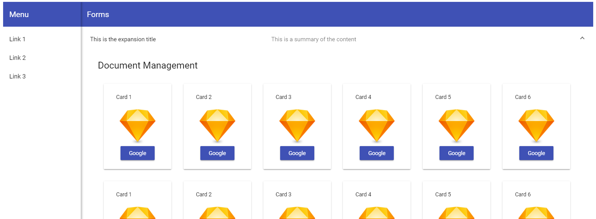
带有材料部件的角度6计划。这是一个内部使用的小型网站。它的目的是链接到外部资源。每个资源都由一张卡片表示,我想将其分类为扩展面板。然而,我无法达到预期的效果。
扩大小组开幕:
扩大小组关闭:
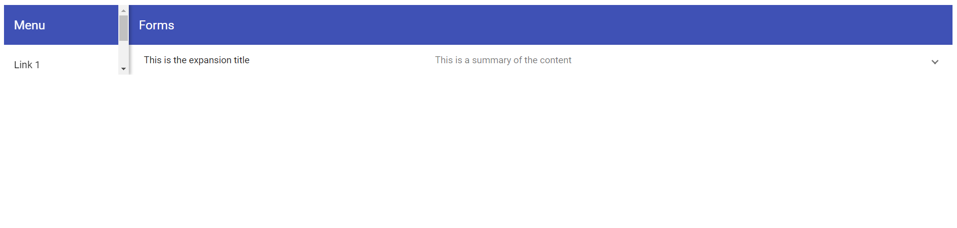
如您所见,当展开面板打开和关闭时,它会影响整个屏幕。
仪表板组件HTML
<div class="grid-container">
  <h1 class="mat-h1">Document Management</h1>
  <mat-grid-list cols="6" rowHeight="250px">
    <mat-grid-tile *ngFor="let card of cards" [colspan]="card.cols" [rowspan]="card.rows">
      <mat-card class="dashboard-card">
        <mat-card-header>
          <mat-card-title>
            {{card.title}}
          </mat-card-title>
        </mat-card-header>
        <mat-card-content class="dashboard-card-content">
           <img src="https://www.sketchapp.com/images/app-icon.png">
          <a mat-raised-button color="primary" onClick="window.open('//google.com')">Google</a>
        </mat-card-content>
      </mat-card>
    </mat-grid-tile>
  </mat-grid-list>
</div>

</mat-expansion-panel>
仪表板组件CSS
.grid-container {
  margin: 20px;
}

.dashboard-card {
  position: absolute;
  top: 15px;
  left: 15px;
  right: 15px;
  bottom: 15px;
  max-height: 180px;
}

.more-button {
  position: absolute;
  top: 5px;
  right: 10px;
}

.dashboard-card-content {
  text-align: center;
}
仪表板组件TS
import { Component } from '@angular/core';

@Component({
  selector: 'irgdashboard',
  templateUrl: './irgdashboard.component.html',
  styleUrls: ['./irgdashboard.component.css']
})
export class IRGDashboardComponent {
  cards = [
    { title: 'Card 1', cols: 1, rows: 1 },
    { title: 'Card 2', cols: 1, rows: 1 },
    { title: 'Card 3', cols: 1, rows: 1 },
    { title: 'Card 4', cols: 1, rows: 1 },
    { title: 'Card 5', cols: 1, rows: 1 },
    { title: 'Card 6', cols: 1, rows: 1 },
    { title: 'Card 1', cols: 1, rows: 1 },
    { title: 'Card 2', cols: 1, rows: 1 },
    { title: 'Card 3', cols: 1, rows: 1 },
    { title: 'Card 4', cols: 1, rows: 1 },
    { title: 'Card 5', cols: 1, rows: 1 },
    { title: 'Card 6', cols: 1, rows: 1 },
  ];
}
侧导航组件HTML
<mat-sidenav-container class="sidenav-container">
  <mat-sidenav
    #drawer
    class="sidenav"
    fixedInViewport="false"
    [attr.role]="(isHandset$ | async) ? 'dialog' : 'navigation'"
    [mode]="(isHandset$ | async) ? 'over' : 'side'"
    [opened]="!(isHandset$ | async)">
    <mat-toolbar color="primary">Menu</mat-toolbar>
    <mat-nav-list>
      <a mat-list-item href="#">Link 1</a>
      <a mat-list-item href="#">Link 2</a>
      <a mat-list-item href="#">Link 3</a>
    </mat-nav-list>
  </mat-sidenav>
  <mat-sidenav-content>
    <mat-toolbar color="primary">
      <button
        type="button"
        aria-label="Toggle sidenav"
        mat-icon-button
        (click)="drawer.toggle()"
        *ngIf="isHandset$ | async">
        <mat-icon aria-label="Side nav toggle icon">menu</mat-icon>
      </button>
      <span>Forms</span>
    </mat-toolbar>
    <irgdashboard></irgdashboard>
  </mat-sidenav-content>
</mat-sidenav-container>
侧导航组件CSS
.sidenav-container {
  height: 100%;
}

.sidenav {
  width: 200px;
  box-shadow: 3px 0 6px rgba(0,0,0,.24);
}
侧导航TS
import { Component } from '@angular/core';
import { BreakpointObserver, Breakpoints, BreakpointState } from '@angular/cdk/layout';
import { Observable } from 'rxjs';
import { map } from 'rxjs/operators';

@Component({
  selector: 'irgsidenav',
  templateUrl: './irgsidenav.component.html',
  styleUrls: ['./irgsidenav.component.css']
})
export class IRGSidenavComponent {

isHandset$: Observable<boolean> = this.breakpointObserver.observe(Breakpoints.Handset)
    .pipe(map(result => result.matches));

  constructor(private breakpointObserver: BreakpointObserver) {}

  }
App组件HTML
<irgsidenav></irgsidenav>我刚刚开始深入开发带有角度的web应用程序,相信我可能错过了一些简单的东西。如果您需要更多的信息,请告诉我。如有任何意见,我们将不胜感激。
回答 1
Stack Overflow用户
回答已采纳
发布于 2018-05-29 22:10:58
它看起来像您的irgdashboard元素是整个主要内容区域,并且它只包含扩展列表。这使得应用程序高度遵循扩展列表高度,从而产生问题。您需要您的主要内容区域是一个DIV或其他元素,扩展到在任何时候(100%)占据应用程序的全部高度(在工具栏下)。然后将扩展列表添加到该容器中,展开和折叠将不会调整应用程序的大小。
页面原文内容由Stack Overflow提供。腾讯云小微IT领域专用引擎提供翻译支持
原文链接:
https://stackoverflow.com/questions/50585626
复制相关文章
相似问题
腾讯云开发者

Copyright © 2013 - 2026 Tencent Cloud. All Rights Reserved. 腾讯云 版权所有
深圳市腾讯计算机系统有限公司 ICP备案/许可证号:粤B2-20090059  粤公网安备44030502008569号
腾讯云计算(北京)有限责任公司 京ICP证150476号 | 京ICP备11018762号