
角高图动态x轴不工作
角高图动态x轴不工作
提问于 2018-05-17 05:52:12
如何生成动态x轴以及如何在图表中呈现,
Package.json
所用版本
enter code here"angular-highcharts": "5.2.12"app.module.ts
在app模块中导入高级图表模块
import { ChartModule, HIGHCHARTS_MODULES } from 'angular-highcharts';
providers: [
    {
      provide: HIGHCHARTS_MODULES,
      useFactory: highchartsModules
    },

  ]
app.component.ts
通过json创建动态x轴,但x轴显示为空。
        import { Chart,Highcharts } from 'angular-highcharts';
    public adherenceData = new Chart({
        chart: {
          type: 'column'
        },
        title: {
          text: ''
        },
        credits: {
          enabled: false
        },
        xAxis: {
          labels:{
            enabled:false
          },
          categories: [],
          crosshair: true
        },
        yAxis: {
          min: 0,
          title: {
            text: 'Percentage'
          }
        },
        legend:{
          enabled:false
        },
        plotOptions: {
          column: {
            pointPadding: 0.2,
            borderWidth: 0
          },
          series:{
            dataLabels: {
                enabled: true,
                rotation: 0,
                color: '#000000',
                align: 'right',
                format: '{point.y:.1f}', // one decimal
                y: 0, // 10 pixels down from the top
                x: 0,
                style: {
                    fontSize: '12px'
                }
            }
          },
        },
        series: []
      }
      );
    let cArr=[]
    response.payload.forEach((e,i)=>{
crArr.push(e.username)
              this.adherenceData.addSerie({'name': e.username,'data':[e.visitAdherence]} , true,{
                duration: 2000,
                easing: 'easeOutBounce'
              })
在CArr中,x轴的值被推送到x轴类别中。
this.adherenceData.options.xAxis[0].categories = cArr;
this.adherenceData.ref.redraw();
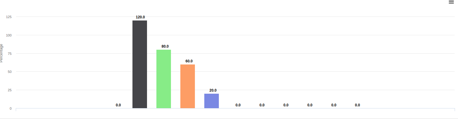
})结果,img x轴显示为空。
结果:
回答 1
Stack Overflow用户
发布于 2018-12-27 03:37:22
您可以尝试图表方法setCategories,就像在chart.xAxis[0].setCategories(curr)中一样,然后重新绘制。我通常使用这种方法来设置类别。
页面原文内容由Stack Overflow提供。腾讯云小微IT领域专用引擎提供翻译支持
原文链接:
https://stackoverflow.com/questions/50384188
复制相关文章
相似问题
腾讯云开发者

Copyright © 2013 - 2026 Tencent Cloud. All Rights Reserved. 腾讯云 版权所有
深圳市腾讯计算机系统有限公司 ICP备案/许可证号:粤B2-20090059 ![]() 粤公网安备44030502008569号
粤公网安备44030502008569号
腾讯云计算(北京)有限责任公司 京ICP证150476号 | 京ICP备11018762号