
引导和Internet 11期
引导和Internet 11期
提问于 2018-05-14 13:24:01
所以我的Internet 11有一个小的格式化问题。
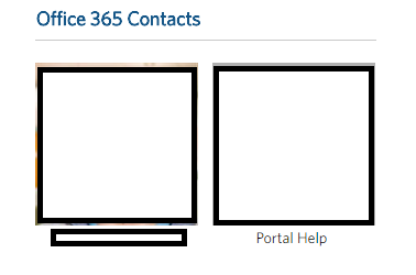
这是谷歌Chrome的图片(这是完美的):
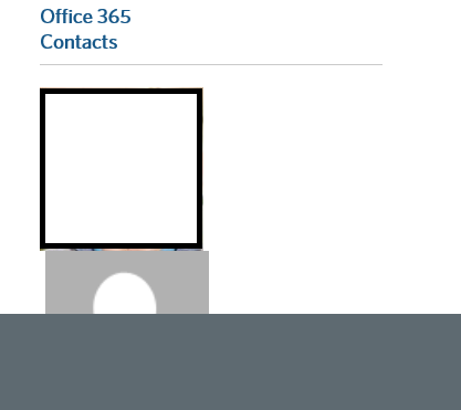
这是11的图片
以下是代码:
.bottomRightBox {
  height: 170px;
  width: 310px;
  /* background-color: #4B92DB;
  border: 1px black solid; //BOTTOM RIGHT BOX BORDER */
}

#contactsPicture {
  align: left;
  valign: top;
  height: 98px;
  /* padding-top: 10px; //PADDING FOR CONTACT PICTURE */
}

#contactImg {
  width: auto;
  height: 148px;
}

.contactsPictureName {
  color: black!important;
  font-weight: normal!important;
  padding-left: 15px!important;
  padding-top: 2px;
}

#rightBottomHeading {
  float: right;
  clear: right;
  padding-right:176px;
  font-size: 18px!important;
  font-weight: bold!important;
}<link rel="stylesheet" href="https://maxcdn.bootstrapcdn.com/bootstrap/3.3.7/css/bootstrap.min.css" integrity="sha384-BVYiiSIFeK1dGmJRAkycuHAHRg32OmUcww7on3RYdg4Va+PmSTsz/K68vbdEjh4u" crossorigin="anonymous">
<div class="col-sm-offset-0 col-sm-12 col-md-4" style="padding-right: 0px;">
<h4 id="rightBottomHeading">Office 365 Contacts</h4>
<hr id="bottomRightLineBreaker"/>
<div class="bottomRightBox">
<table>
<tbody>
<tr valign="top" id="ctl00_m_g_63062bfa_96b4_4d90_b7c4_92ac5983dbfe_ctl00_uxGenericListView_ctrl0_ctl09_genericPicRow">
<td id="contactsPicture">
<div class="UserPhoto">
<a href="IMAGE LINK" target="_blank" style="padding-right: 5px;"><img id="contactImg" src="IMAGE URL" alt="A" /></a>
<a href="mailto:Portalhelp" style="padding-left: 5px;"><img id="contactImg" src="IMAGE URL" alt="P" /></a>
</div>
</td></tr>
<tr valign="top">
<td style="width: 106px" valign="top">
<div class="contactsPictureName">
<a href="PICTURE LINK" target="_black" style="color: black;"><p id="name" style="width: auto; float: left; clear: none;">NAME</p></a>
<a href="URL" style="color: black;"><p id="name" style="width: auto; float: right; clear: none; margin-right: 45px;">PORTALHELP</p></a>
</div>
</td></tr>
</tbody>
</table>
</div>
</div>
任何带有CSS格式和样式的输入都将是非常感谢的。目前使用的引导带3。
回答 2
Stack Overflow用户
回答已采纳
发布于 2018-05-14 13:38:43
明白了伙计们!
多亏了Girdharilal和他的努力,我才能用:
.UserPhoto a {
  display: -ms-inline-flexbox;
}
结果效果很好。
Stack Overflow用户
发布于 2018-05-14 13:42:13
我建议对你的显示方法采取不同的方法。与其依赖一堆定制的css和float声明,为什么不在这种情况下使用网格呢?考虑以下实施:
.contactBox {
  padding-bottom: 1.5rem;
}<link rel="stylesheet" href="https://maxcdn.bootstrapcdn.com/bootstrap/3.3.7/css/bootstrap.min.css" integrity="sha384-BVYiiSIFeK1dGmJRAkycuHAHRg32OmUcww7on3RYdg4Va+PmSTsz/K68vbdEjh4u" crossorigin="anonymous">
<div class="container-fluid">
<div class="row">
<!-- The Left Column (Implied but never specified) -->
<div class="col-sm-12 col-md-8">
<p>This area is intentionally left blank.</p>
</div>
<!-- Your Right Column -->
<div class="col-sm-12 col-md-4">
<h4>Office 365 Contacts</h4>
<div class="row">
<div class="contactBox col-xs-6 col-md-4 text-center">
<a href="#userPhotoLink"><img src="https://placehold.it/250x150" class="img-responsive" /></a>
<a href="#userEmailLink">Name</a>
</div>
<div class="contactBox col-xs-6 col-md-4 text-center">
<a href="#userPhotoLink"><img src="https://placehold.it/250x150" class="img-responsive" /></a>
<a href="#userEmailLink">Name</a>
</div>
<div class="contactBox col-xs-6 col-md-4 text-center">
<a href="#userPhotoLink"><img src="https://placehold.it/250x150" class="img-responsive" /></a>
<a href="#userEmailLink">Name</a>
</div>
<div class="contactBox col-xs-6 col-md-4 text-center">
<a href="#userPhotoLink"><img src="https://placehold.it/250x150" class="img-responsive" /></a>
<a href="#userEmailLink">Name</a>
</div>
</div>
</div>
</div>
</div>
在上面的代码中,我们更多地依赖于Bootstrap 3.x Grid组件以及其他一些实用工具类。一个额外的好处是,通过更多地依赖Bootstrap,您有机会提供更好的反应行为。
它实际上只需要一个自定义的CSS行;.contactBox .这实际上只是为了确保您有适当的底部填充,而不需要重新迭代row或添加换行。
您可能需要展开代码段,以查看布局如何根据屏幕分辨率进行调整。或者,您可以通过以下引导链接查看相同的代码:https://www.bootply.com/LK0cVLrCBm
页面原文内容由Stack Overflow提供。腾讯云小微IT领域专用引擎提供翻译支持
原文链接:
https://stackoverflow.com/questions/50331425
复制相关文章
相似问题
腾讯云开发者

Copyright © 2013 - 2026 Tencent Cloud. All Rights Reserved. 腾讯云 版权所有
深圳市腾讯计算机系统有限公司 ICP备案/许可证号:粤B2-20090059  粤公网安备44030502008569号
腾讯云计算(北京)有限责任公司 京ICP证150476号 | 京ICP备11018762号