
scale_x_continuous变量标签
scale_x_continuous变量标签
提问于 2018-04-11 19:28:19
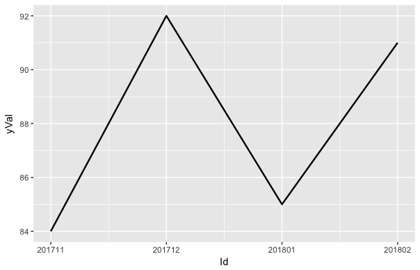
我正在开发一个闪亮的应用程序,它将绘制出x轴上各种因素的变化量。这些X值是按月形式表示的,(例如。2018年4月= 201804),因此,按照顺序划分不同年份相邻年份的年月值,我为它们分配“ID”。使用x_scale_discrete函数,我能够以我想要的方式绘制这些值。但是,x标签没有正确显示。请见下文
dat1 = as.data.frame(matrix(c(201711,201712,201801,201802, 1,2,3,4,
84,92,85,91), nrow = 4, ncol = 3, byrow = FALSE))
colnames(dat1) = c("yrmonth", "Id", "yVal")


plot1 = ggplot(data = dat1, aes(x = Id)) +
        geom_line(aes(y = yVal), size = .85)
#scale_x_discrete(breaks = 1:nrow(dat1), labels = c("1" = "201711", "2" = "201712", "3" = "201801", "4" = "201802")回答 1
Stack Overflow用户
回答已采纳
发布于 2018-04-11 21:01:08
你可以试试
ggplot(data = dat1, aes(x = Id, y = yVal)) +
  geom_line(size = .85) +
  scale_x_continuous(labels = dat1$yrmonth)
但这不能显示时间点之间的正确距离。
页面原文内容由Stack Overflow提供。腾讯云小微IT领域专用引擎提供翻译支持
原文链接:
https://stackoverflow.com/questions/49783059
复制相关文章
相似问题
腾讯云开发者

Copyright © 2013 - 2026 Tencent Cloud. All Rights Reserved. 腾讯云 版权所有
深圳市腾讯计算机系统有限公司 ICP备案/许可证号:粤B2-20090059 ![]() 粤公网安备44030502008569号
粤公网安备44030502008569号
腾讯云计算(北京)有限责任公司 京ICP证150476号 | 京ICP备11018762号