
使用sklean.mixture.GaussianMixture的组件订单问题
使用sklean.mixture.GaussianMixture的组件订单问题
提问于 2018-03-25 03:40:35
我使用sklearn.mixture.GaussianMixture将一组2D数据分类为3个组件,组件1使用蓝色,component2使用红色,component3使用绿色。我使用一个for循环来处理不同文件中的8组数据。但是,我不能为每个组获得一致的颜色。
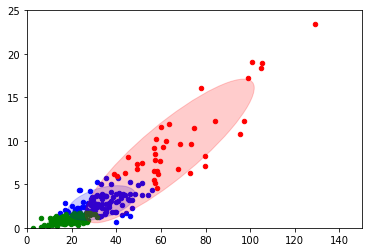
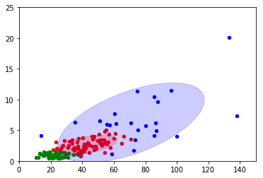
我想使所有数字的顺序一致。
import numpy as np
import matplotlib.mlab as mlab
import matplotlib.pyplot as plt
from sklearn.mixture import GaussianMixture
import itertools
import matplotlib as mpl


file_list_x1=["1.txt","2","3.txt","4.txt","5.txt","6.txt","7.txt","8.txt"]

color_iter = itertools.cycle(['blue', 'red', 'green'
                              ])
def perform(filename):

    X=np.genfromtxt(filename, skip_header=1)

    gmm = GaussianMixture(n_components=3).fit(X)
    means=gmm.means_
    var=gmm.covariances_
    lables = gmm.predict(X)


    ax1=plt.subplot(111)
    #ax1.scatter(X[:, 0], X[:, 1], c=labls, s=20,cmap='brg')

    print filename
    print "Mean is:"
    print means
    print "\n\nvar is:"
    print var

    for i, (mean, cov, color) in enumerate(zip(gmm.means_, gmm.covariances_,
                                               color_iter)):
        v, w = np.linalg.eigh(cov)
        if not np.any(lables == i):
            continue
        ax1.scatter(X[lables == i, 0], X[lables == i, 1], 20, color=color)

        # Plot an ellipse to show the Gaussian component
        angle = np.arctan2(w[0][1], w[0][0])
        angle = 180. * angle / np.pi  # convert to degrees
        v = 2. * np.sqrt(2.) * np.sqrt(v)
        ell = mpl.patches.Ellipse(mean, v[0]*1.2, v[1]*1.2, 180. + angle, color=color)
        ell.set_clip_box(ax1.bbox)
        ell.set_alpha(.2)
        ax1.add_artist(ell)
        ax1.set_xlim([0,150])
        ax1.set_ylim([0,25])
    plt.show()


for each in file_list_x1:
    perform(each)
print"\n\n\n\n"回答 1
Stack Overflow用户
回答已采纳
发布于 2018-03-26 13:26:31
没有明确的方法来做它与科学工具包-学习,因为没有共同的事情,为2型。但是,如果您希望在类似的位置看到类似的集群,那么您可以自己比较它们。
下面是一个示例:
import numpy as np
import matplotlib.pyplot as plt
from sklearn.mixture import GaussianMixture
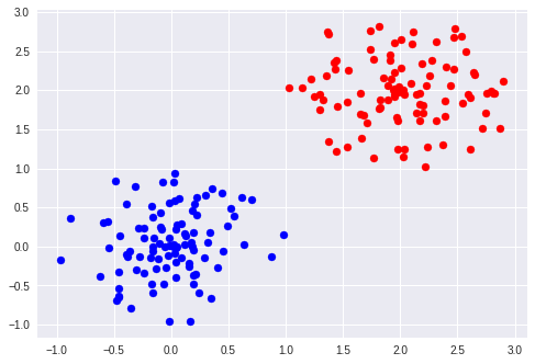
def generate_2_cluster():
length = np.random.uniform(0, 1, 100)
angle = np.pi * np.random.uniform(0, 2, 100)
c1 = np.array((length * np.cos(angle), length * np.sin(angle))).T
length = np.random.uniform(0, 1, 100)
angle = np.pi * np.random.uniform(0, 2, 100)
c2 = np.array((2 + length * np.cos(angle), 2 + length * np.sin(angle))).T
X = np.vstack((c1, c2))
return X
X = generate_2_cluster()
gmm1 = GaussianMixture(n_components=2).fit(X)
Y = gmm.predict(X)
plt.scatter(X[:, 0][Y==0], X[:, 1][Y==0], c="blue")
plt.scatter(X[:, 0][Y==1], X[:, 1][Y==1], c="red")
plt.show()
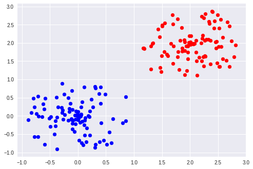
X = generate_2_cluster()
gmm2 = GaussianMixture(n_components=2).fit(X)
Y = gmm.predict(X)
d0_to_0 = np.linalg.norm(gmm1.means_[0]-gmm1.means_[0])
d0_to_1 = np.linalg.norm(gmm1.means_[0]-gmm2.means_[1])
if d0_to_0 < d0_to_1:
plt.scatter(X[:, 0][Y==0], X[:, 1][Y==0], c="blue")
plt.scatter(X[:, 0][Y==1], X[:, 1][Y==1], c="red")
else:
plt.scatter(X[:, 0][Y==0], X[:, 1][Y==0], c="red")
plt.scatter(X[:, 0][Y==1], X[:, 1][Y==1], c="blue")
plt.show()在这里,我比较平均值,如果它们的平均距离比其他对更近的话,则考虑两对相同的聚类。您还可能需要比较协方差矩阵。
页面原文内容由Stack Overflow提供。腾讯云小微IT领域专用引擎提供翻译支持
原文链接:
https://stackoverflow.com/questions/49472306
复制相关文章
相似问题
腾讯云开发者

Copyright © 2013 - 2026 Tencent Cloud. All Rights Reserved. 腾讯云 版权所有
深圳市腾讯计算机系统有限公司 ICP备案/许可证号:粤B2-20090059 ![]() 粤公网安备44030502008569号
粤公网安备44030502008569号
腾讯云计算(北京)有限责任公司 京ICP证150476号 | 京ICP备11018762号